Upload date
All time
Last hour
Today
This week
This month
This year
Type
All
Video
Channel
Playlist
Movie
Duration
Short (< 4 minutes)
Medium (4-20 minutes)
Long (> 20 minutes)
Sort by
Relevance
Rating
View count
Features
HD
Subtitles/CC
Creative Commons
3D
Live
4K
360°
VR180
HDR
14,742 results
Want to preview your websites on multiple devices at once without switching tabs? In this video, I'll show you how the fantastic ...
7,898 views
8 months ago
Develop responsive websites 5 times faster! A MUST-HAVE extension for front-end developers. Open any website you want in ...
94,319 views
11 months ago
I have a FREE COURSE on conquering responsive layouts https://courses.kevinpowell.co/conquering-responsive-layouts ...
333,570 views
2 years ago
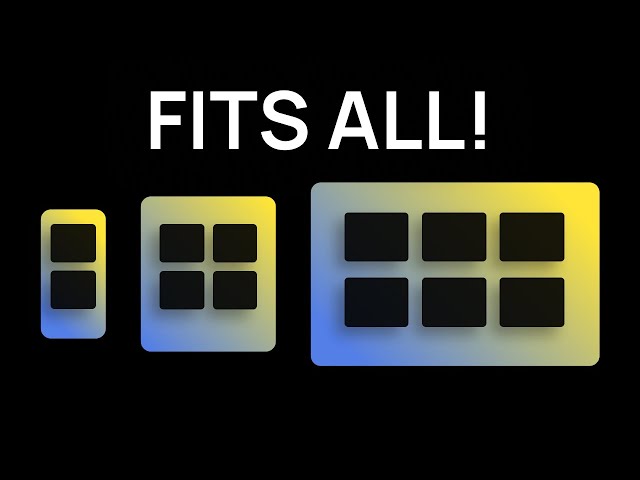
By the end of this video, you'll be able to design and build responsive websites that work on a 4K monitor, a tiny smartphone and ...
186,833 views
Desarrolla o diseña tus webs mucho más rápido con esto! Te permite ver tu página en distintos dispositivos móviles y tablets.
42,276 views
1 year ago
Get the full source code of application here:
178 views
5 months ago
Responsively App an open-source tool for testing UX in multiple devices. Our team was playing with it. Impressive.
703 views
5 years ago
En "responsively.app" puedes ver las diferentes vistas de tu proyecto hasta en 5 vistas sumultaneas !
734 views
https://bit.ly/4bTD5zu Design & code like me. Use "UI2024" for 25% Off! https://bit.ly/4dVpgRa - Get notified when my Rive ...
10,330 views
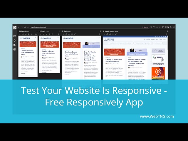
The Responsively app is a free tool for testing that your web pages display correctly at different screen sizes.
11,202 views
In this video, we are going to create a responsive layout in Figma using a plugin called Breakpoints. It essentially allows you to ...
225,068 views
3 years ago
Herramienta para probar si tu sitio web es responsive y explorar como se visualizará en diferentes dispositivos.
1,821 views
Optimize your Divi website for mobile devices using these awesome responsive design settings. In this tutorial I'll share my ...
12,714 views
It's never been easier to add responsive breakpoints directly into your design tool as is it is now using the plugin Breakpoints.
75,594 views
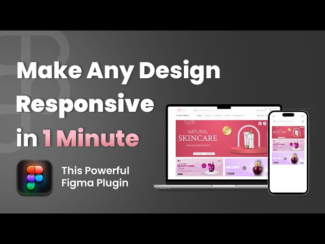
Tired of manually resizing frames for different devices? This Figma plugin lets you turn any static layout into a fully responsive ...
3,062 views
In this video, I'm going to show you how to make your web design responsive in Figma using Auto Layout and Constraints in just ...
968,900 views
Working with grids and designing responsively in Sketchapp has never been easier. In this lesson I cover how to create and ...
57,779 views
8 years ago
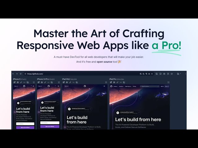
Responsively.app is a web development tool designed to aid in creating responsive web designs. It provides a platform for ...
172 views
One thing is for sure, we want our visitors to have a great experience on our site no matter what device they're visiting from.
8,239 views
9 months ago
If you struggle with responsive desktop, tablet or mobile design in Figma — this is the video for you to finally grasp it. learn ...
182,854 views