Upload date
All time
Last hour
Today
This week
This month
This year
Type
All
Video
Channel
Playlist
Movie
Duration
Short (< 4 minutes)
Medium (4-20 minutes)
Long (> 20 minutes)
Sort by
Relevance
Rating
View count
Features
HD
Subtitles/CC
Creative Commons
3D
Live
4K
360°
VR180
HDR
1,160,075 results
In this one, I look at two simple ways to make maintaining your site's typography much simpler! 🔗 Links ✓ The codepen: ...
197,897 views
4 years ago
Today we're going to learn how we can use the CSS clamp function to create responsive, fluid typography! 📚 Project Links code: ...
72,801 views
3 years ago
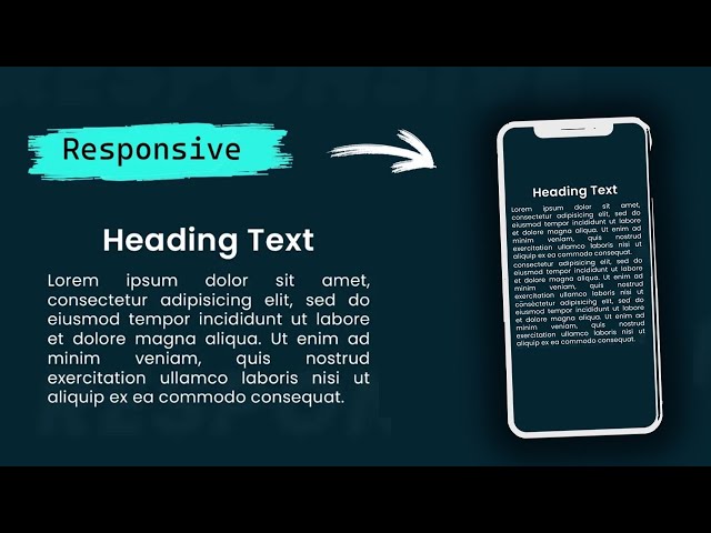
Struggling to make your website's headings and text responsive? In this video, I'll show you a simple yet powerful solution: one ...
3,523 views
1 year ago
In this video, I'll show you how to set up a fluid responsive typography scale with the CSS clamp property. 🔗 Key Links ...
14,256 views
5 MINDBLOWING CSS Tips and Tricks for better responsiveness and modern css solutions for typical problems with CSS ONLY.
462,980 views
Start writing CSS with confidence with my course CSS Demystified: https://cssdemystified.com When people find out about ...
34,637 views
Learn how the best design systems build their typography and apply the common patterns and insights for yourself. Chapters Intro ...
73,050 views
https://bit.ly/2IPcPgA - Become a frontend developer (50% off limited time!) -- Want to learn UI/UX? https://designcourse.com ...
54,069 views
5 years ago
Responsive Typography Text in HTML CSS On this tutorial learn very simple and easy trick to make typography text responsive ...
41 views
5 months ago
In this video, you will learn how to responsive font size in CSS. You can learn and use this method for Mobile and Tablet screens.
25,167 views
The real math starts at 7:07. Today we're looking into my fascination with having perfect typography on every single screen size ...
10,172 views
Updated version of this video – https://youtu.be/eW2-ghXuYC8 In this video we look at how to quickly set up our typography in ...
48,965 views
Get 2 free months of Skillshare Premium & watch my design course for free: https://skl.sh/2TVhf8z In this video, I will show you how ...
6,993 views
In this video we talk through how to get started with setting up typography in web design. We go over what sizes, and how many ...
36,605 views
2 years ago
To create Responsive Typography in your websites, you might immediately want to reach for Media Queries. Well, the clamp ...
9,947 views
By the end of this video, you'll be able to design and build responsive websites that work on a 4K monitor, a tiny smartphone and ...
187,663 views
8 months ago
Welcome to this in-depth tutorial on Responsive Web Design using CSS functions — specifically min(), max(), clamp(), and calc()!
7,241 views
6 months ago
Please LIKE our Facebook page for daily updates...
50,514 views
7 years ago
I have a FREE COURSE on conquering responsive layouts https://courses.kevinpowell.co/conquering-responsive-layouts ...
333,800 views
Learn how to build a responsive website from a Figma design with HTML, SCSS, JS ➡️ https://coder-coder.com/responsive/ ...
265,983 views
Learn how to use the CSS clamp function to create responsive and flexible designs without the need for multiple media queries!
19,794 views
Get access to my free course here: https://bradhussey.hopp.to/wix-studio-course Looking for perfectly responsive typography?
18,034 views
Pimp my Type Newsletter with weekly font recommendations: https://pimpmytype.com/newsletter 📰 Corresponding article with ...
25,846 views
Tired of manually adjusting font sizes for every device? 😩 In this video, I'll show you how to use CSS clamp() to create responsive ...
2,955 views
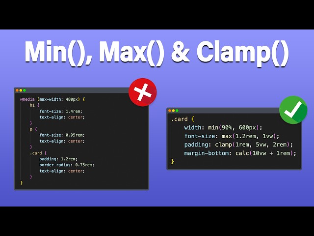
CSS has come a long way, but min(), max(), and clamp() make a lot of things a lot easier than they used to be, and really open up ...
315,590 views
In this Figma tutorial, you will learn how to create and use a typography scale in Figma to bring consistency to your UI designs.
40,945 views
Handy hands-on tips to improve your CSS Typography, explaining in detail how to implement fluid typography using clamp(), ...
5,046 views
Fluid typography is adjusting font size fluidly as view port or screen size is changed. You can use only CSS to apply responsive ...
1,992 views
Variable Fonts allow typography on the web to adapt to the flexible nature of screens, environments and devices. We can use ...
3,750 views
6 years ago