Upload date
All time
Last hour
Today
This week
This month
This year
Type
All
Video
Channel
Playlist
Movie
Duration
Short (< 4 minutes)
Medium (4-20 minutes)
Long (> 20 minutes)
Sort by
Relevance
Rating
View count
Features
HD
Subtitles/CC
Creative Commons
3D
Live
4K
360°
VR180
HDR
1,243,362 results
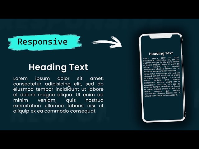
responsive web design using bootstrap
clamp css
responsive portfolio website html css
In this one, I look at two simple ways to make maintaining your site's typography much simpler! 🔗 Links ✓ The codepen: ...
197,630 views
4 years ago
Today we're going to learn how we can use the CSS clamp function to create responsive, fluid typography! 📚 Project Links code: ...
72,593 views
3 years ago
Struggling to make your website's headings and text responsive? In this video, I'll show you a simple yet powerful solution: one ...
3,234 views
11 months ago
Start writing CSS with confidence with my course CSS Demystified: https://cssdemystified.com When people find out about ...
34,422 views
1 year ago
5 MINDBLOWING CSS Tips and Tricks for better responsiveness and modern css solutions for typical problems with CSS ONLY.
453,506 views
In this video, I'll show you how to set up a fluid responsive typography scale with the CSS clamp property. 🔗 Key Links ...
14,229 views
https://bit.ly/2IPcPgA - Become a frontend developer (50% off limited time!) -- Want to learn UI/UX? https://designcourse.com ...
54,053 views
5 years ago
Learn how the best design systems build their typography and apply the common patterns and insights for yourself. Chapters Intro ...
72,294 views
Responsive Typography Text in HTML CSS On this tutorial learn very simple and easy trick to make typography text responsive ...
41 views
5 months ago
FREE GOLDEN CANON GRID COURSE → https://bit.ly/3OhrFLM If you are a Freelance Web Designer, spending time learning ...
34,115 views
I've been joined by Roel Nieskens for a deep dive into Typography, exploring the awesome things we can do with variable fonts, ...
21,715 views
In this video, I explain what the CSS clamp() function is, how it works, and why it's a powerful way for responsive design. We'll go ...
1,655 views
4 months ago
Font size, line height and vertical margins always take more time from a frontend developer because he has to tackle ...
10,692 views
The real math starts at 7:07. Today we're looking into my fascination with having perfect typography on every single screen size ...
9,481 views
In this video with the topic Crazy Text Animation with CSS and SVG, I will share with everyone an extremely interesting idea to ...
166,151 views
In this video, width topic Crazy Scroll Animation Using CSS Only, I will guide everyone to create extremely smooth page scrolling ...
258,933 views
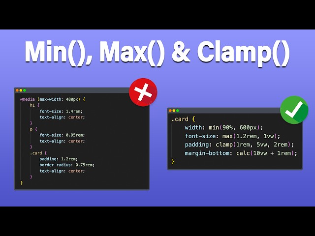
Welcome to this in-depth tutorial on Responsive Web Design using CSS functions — specifically min(), max(), clamp(), and calc()!
6,695 views
In this video we talk through how to get started with setting up typography in web design. We go over what sizes, and how many ...
36,180 views
2 years ago
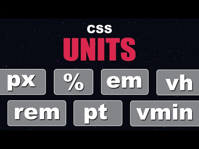
In this video, we're diving deep into one of the most fundamental topics in web development — CSS Units. Whether you're just ...
12,936 views
Learn how to use the CSS clamp function to create responsive and flexible designs without the need for multiple media queries!
19,237 views
Learn how to build a responsive website from a Figma design with HTML, SCSS, JS ➡️ https://coder-coder.com/responsive/ ...
265,770 views
Get access to my free course here: https://bradhussey.hopp.to/wix-studio-course Looking for perfectly responsive typography?
17,935 views
CSS has come a long way, but min(), max(), and clamp() make a lot of things a lot easier than they used to be, and really open up ...
315,204 views
Did you know you can create truly dynamic fonts, widths, margins, paddings, and more with clamp(), the native CSS function?
9,474 views