ViewTube

ViewTube
Sign inSign upSubscriptions
Filters

Upload date

Type

Duration

Sort by

Features

Reset

642 results

Saul Beisaga
Seaborn en Python desde Cero 🐍 | Visualización de Datos con el Dataset Iris

En este video aprenderemos a utilizar Seaborn en Python desde cero, trabajando con el conocido dataset Iris. Vamos a conocer ...

34:09
Seaborn en Python desde Cero 🐍 | Visualización de Datos con el Dataset Iris

78 views

4w ago

Josue Zurita
De Matplotlib FEO a Seaborn PROFESIONAL en 12 Minutos 🐍🔥 (Tutorial Python)

Hola a todos! En este video aprenderemos a dominar la librería Seaborn en Python para crear visualizaciones de datos ...

7:01
De Matplotlib FEO a Seaborn PROFESIONAL en 12 Minutos 🐍🔥 (Tutorial Python)

52 views

4w ago

Data Geek is my name
Are These Revenue Values Outliers? | Python Box Plot Explained

Learn how to create and interpret a box plot in Python using Seaborn and Matplotlib. In this beginner-friendly Python data ...

8:46
Are These Revenue Values Outliers? | Python Box Plot Explained

64 views

1d ago

Abaysa with AI
Python Data Visualization: Master Matplotlib & Seaborn Fast

Stop looking at ugly spreadsheets and start building beautiful, visual stories with Python. Welcome back to ABAYSA with AI, your ...

5:57
Python Data Visualization: Master Matplotlib & Seaborn Fast

195 views

9d ago

Diego Mlxo
Seaborn 2  Visualización de Datos en Python   Google Colab

En este video se presenta el trabajo práctico “Seaborn 2”, realizado en Python mediante Google Colab. Se utiliza la librería ...

13:47
Seaborn 2 Visualización de Datos en Python Google Colab

11 views

3w ago

FAGGIO
Seaborn Scatter Plot Tutorial | Simple Data Visualization with Python (Part 3)

Welcome to Part 3 of my Seaborn data visualization series! In Part 1, we introduced Seaborn and created a simple bar plot.

7:55
Seaborn Scatter Plot Tutorial | Simple Data Visualization with Python (Part 3)

81 views

4w ago

Data Geek is my name
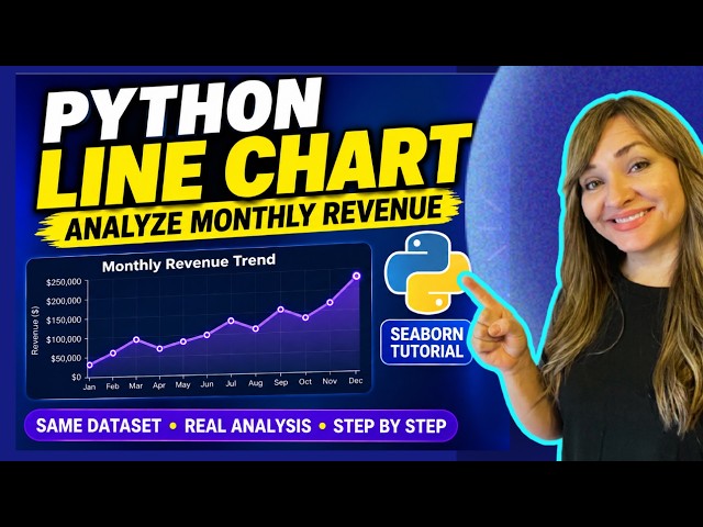
Python Line Chart Tutorial | Analyze Monthly Revenue with Seaborn

Learn how to create a colorful line chart in Python using Seaborn and Matplotlib while analyzing monthly revenue trends.

13:46
Python Line Chart Tutorial | Analyze Monthly Revenue with Seaborn

310 views

2w ago

Data Geek is my name
Python Data Visualization for Beginners | Create a Bar Chart with Seaborn

Learn how to create a colorful bar chart in Python using Seaborn and Matplotlib — step by step. In this beginner-friendly Python ...

12:11
Python Data Visualization for Beginners | Create a Bar Chart with Seaborn

188 views

4w ago

Utkarsh Minds-Data Science, analytics, AI
Data Correlation & Regplot in Python | Seaborn Data Visualization

How do two variables relate to each other? In this tutorial, we explore Correlation and Regplot using Python to understand ...

13:32
Data Correlation & Regplot in Python | Seaborn Data Visualization

1 view

2d ago

FAGGIO
Seaborn Line Plot Tutorial | Simple Data Visualization with Python (Part 2)

Welcome to Part 2 of my Seaborn data visualization series. In the first video, we introduced Seaborn and created a simple bar plot.

4:50
Seaborn Line Plot Tutorial | Simple Data Visualization with Python (Part 2)

61 views

4w ago

Mathew K Analytics
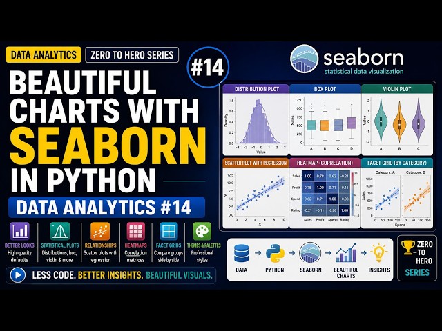
Beautiful Charts with Seaborn in Python | Data Analytics #14

Seaborn gives you better-looking, more statistical charts in far less code than Matplotlib. What you'll learn: - How Seaborn builds ...

11:37
Beautiful Charts with Seaborn in Python | Data Analytics #14

46 views

3w ago

FAGGIO
Seaborn Histogram Tutorial | Visualize Data Distributions with Python (Part 4)

YouTube Description Welcome to Part 4 of my Seaborn data visualization series! So far in this series, we've explored: Part 1: ...

8:14
Seaborn Histogram Tutorial | Visualize Data Distributions with Python (Part 4)

24 views

4w ago

Cristian Rojas
De 0 a PRO en Visualización de Datos con Seaborn📈🐍

En este video aplicamos el Modelo de Aprendizaje Experiencial de Kolb para llevar la visualización de datos en Python al ...

9:55
De 0 a PRO en Visualización de Datos con Seaborn📈🐍

12 views

3w ago

VPro Skills
Day-26 | Seaborn & Python Loops | Data Visualization and Iteration Fundamentals

Learn Seaborn for creating powerful statistical visualizations and understand Python loops for repeating tasks efficiently. Explore ...

1:20:19
Day-26 | Seaborn & Python Loops | Data Visualization and Iteration Fundamentals

16 views

3d ago

Yoel Rios Condori
Seaborn en Python: Visualización de Datos con Dataset Iris | Scatterplot y Regresión
22:51
Seaborn en Python: Visualización de Datos con Dataset Iris | Scatterplot y Regresión

10 views

4w ago

Noelia Blanca Llanos Gutierrez
Graficas en Python con Seaborn

Aprendiendo a crear graficas en Python con Seaborn y Matplotlib usando el dataset iris.

30:58
Graficas en Python con Seaborn

34 views

4w ago

Data Geek is my name
Python Histogram Tutorial | Understand Revenue Distribution with Seaborn

Learn how to create and interpret a histogram in Python using Seaborn and Matplotlib. In this beginner-friendly data visualization ...

7:25
Python Histogram Tutorial | Understand Revenue Distribution with Seaborn

121 views

3d ago

Emanuel A. Mora Ch.
Dataset Iris en Python (Seaborn)

Practica 2.

27:11
Dataset Iris en Python (Seaborn)

19 views

4w ago

Sarveshwaran R
Data Visualization in Python | Matplotlib & Seaborn Tutorial for Beginners

Learn Data Visualization in Python using Matplotlib and Seaborn and understand how to turn raw data into clear, meaningful ...

18:47
Data Visualization in Python | Matplotlib & Seaborn Tutorial for Beginners

29 views

11d ago

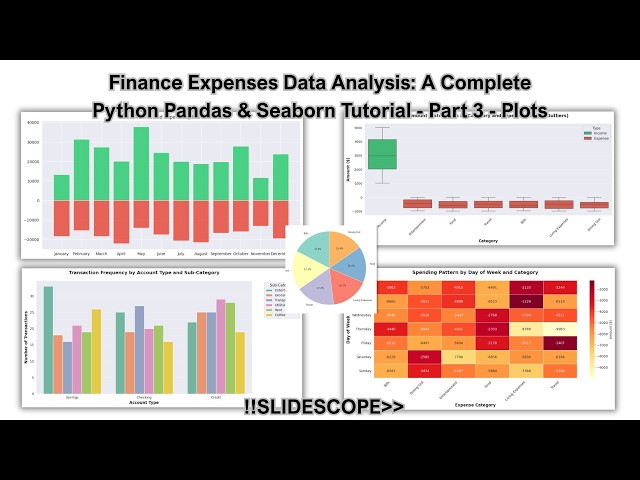
Colorstech Training (By Slidescope)
Creating Financial Analysis Plots with Python Seaborn and Matplotlib -  Data Analysis:  Part 3

dataanalytics #python #pythonprogramming #seaborn #seabornanalysis In this chapter you will learn 5 Professional ...

54:57
Creating Financial Analysis Plots with Python Seaborn and Matplotlib - Data Analysis: Part 3

243 views

3w ago