Upload date
All time
Last hour
Today
This week
This month
This year
Type
All
Video
Channel
Playlist
Movie
Duration
Short (< 4 minutes)
Medium (4-20 minutes)
Long (> 20 minutes)
Sort by
Relevance
Rating
View count
Features
HD
Subtitles/CC
Creative Commons
3D
Live
4K
360°
VR180
HDR
53,399 results
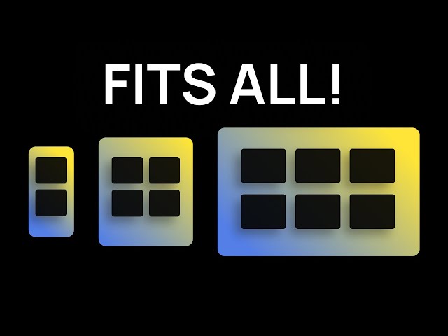
By the end of this video, you'll be able to design and build responsive websites that work on a 4K monitor, a tiny smartphone and ...
198,996 views
9 months ago
Learn how to create responsive websites using CSS! This video will cover essential CSS techniques like media queries to make ...
3,958 views
10 months ago
Build a responsive CSS layout without using any media queries. The most powerful CSS trick you're not using. No More Media ...
16,694 views
7 months ago
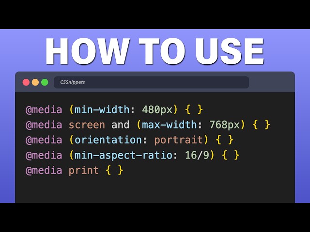
This video explains how to use Media Queries in CSS to achieve a fully responsive webpage and covers essential concepts ...
32,870 views
11 months ago
In this video, you will finally understand when Flexbox is the right tool and when CSS Grid is a better choice. Most developers use ...
155,584 views
3 months ago
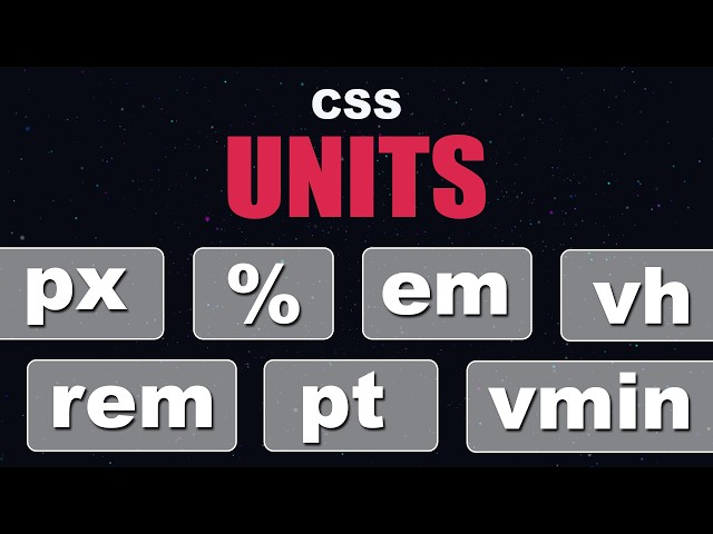
In this video, we're diving deep into one of the most fundamental topics in web development — CSS Units. Whether you're just ...
15,633 views
6 months ago
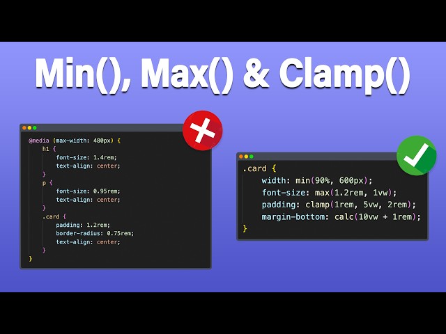
... sizes Topics in this video CSS, min(), max(), clamp(), css clamp tutorial, css min max functions, fluid typography, responsive css, ...
118,178 views
2 months ago
How to Make Responsive Websites Without Media Queries! | Stop Using Media Queries! Try This Instead ...
33,234 views
Want to learn how to build a responsive website that looks perfect on all screen sizes — mobile, tablet, laptop, or desktop? In this ...
11,507 views
8 months ago
Responsive Web Design is extremely important in 2026 and this is the best video to learn all the methods on how to make ...
3,365 views
Welcome to this in-depth tutorial on Responsive Web Design using CSS functions — specifically min(), max(), clamp(), and calc()!
7,971 views
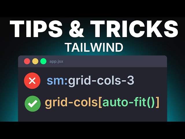
In this video, you will learn some Tailwind tips and tricks that every web developer should know. I hope you find it helpful and ...
1,709 views
This responsive CSS tutorial will help you create better, cleaner, and faster designs. Perfect for beginners and pros who want to ...
6,666 views
... flexbox tutorial, css responsive, responsive web design, responsive website, html and css for beginners, flexbox css tutorial, ...
836 views
5 months ago
How to build a responsive website with HTML, CSS, and JavaScript (first 3 hours of my course) Build a Responsive Website ...
18,099 views
Want to learn how to make any website responsive from scratch? This complete tutorial covers everything step by step — perfect ...
148,286 views
Ready to upgrade your website with stunning navigation bars? In today's video, we'll explore how to create different types of ...
33,217 views
4 months ago
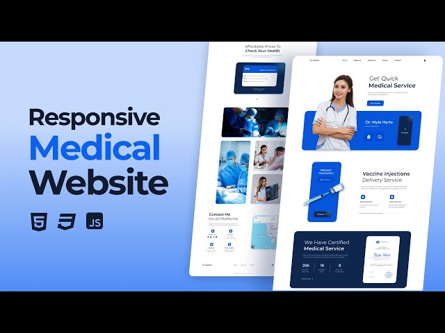
Responsive medical website using html css javascript, responsive website html css, website html css, responsive website using ...
17,451 views
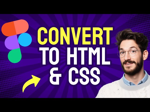
Want to turn your Figma design into a live website? This step-by-step tutorial shows you how to convert a Figma layout into clean ...
39,805 views
Kostenloses Beratungsgespräch: ...
27,327 views