Upload date
All time
Last hour
Today
This week
This month
This year
Type
All
Video
Channel
Playlist
Movie
Duration
Short (< 4 minutes)
Medium (4-20 minutes)
Long (> 20 minutes)
Sort by
Relevance
Rating
View count
Features
HD
Subtitles/CC
Creative Commons
3D
Live
4K
360°
VR180
HDR
152,198 results
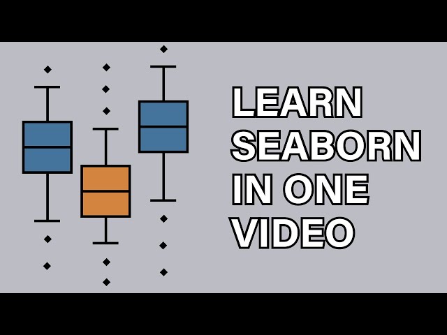
seaborn heatmap
plotly in python
seaborn python hindi
seaborn python tamil
matplotlib wscube tech
scikit learn wscube tech
This video is about Seaborn, an external Python data visualization library, which is based on Matplotlib.
220,716 views
3 years ago
New Data Science / Machine Learning Video Everyday at 1 PM EST!!! [ Click Notification Bell ] This video provides complete ...
253,433 views
5 years ago
This French Python tutorial introduces you to Seaborn, the best library for data visualization. Seaborn allows you to create ...
121,703 views
6 years ago
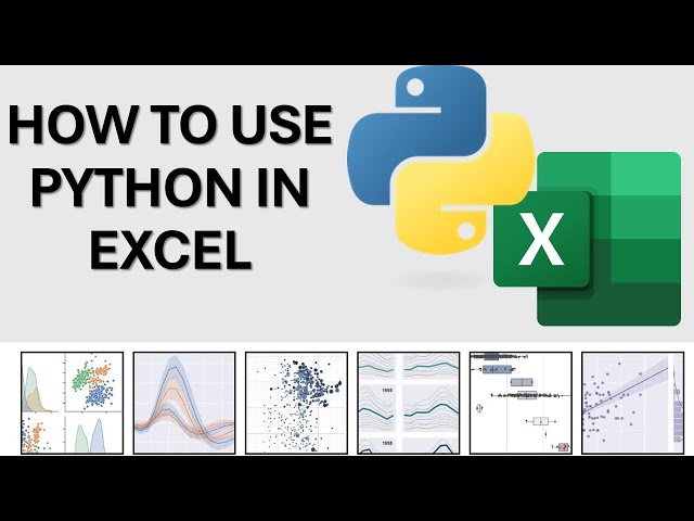
See how Python is transforming Excel into a data powerhouse. In this video, we'll demonstrate: • The groundbreaking PY function ...
4,549 views
7 months ago
An introduction to the Dash web application framework. Dash is used to create browser-based interactive data visualization ...
853,654 views
Take my Full Python Course Here: https://www.analystbuilder.com/courses/pandas-for-data-analysis In this series we will be ...
111,476 views
2 years ago
Master Python and Build Awesome AI Projects https://python-course-earlybird.framer.website/?&utm_source=pyvizdash ...
582,542 views
In this video, I will provide a high-level overview of the Top 5 Python libraries for Data Visualization that you can use to create ...
54,539 views
4 years ago
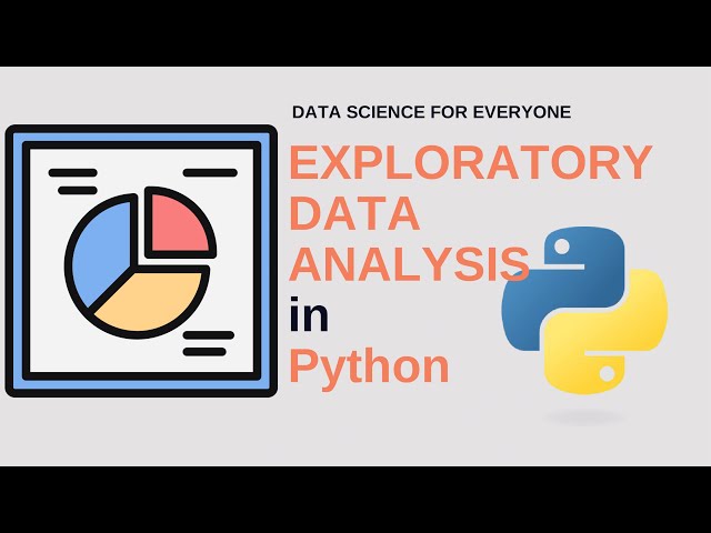
In this video, we dive into Exploratory Data Analysis (EDA) using powerful Python libraries like pandas, numpy, matplotlib, and ...
3,211 views
6 months ago
Line Plots, Bar plots, Box Plots, Scatter Plots, Histograms, Distributions plots and many more examples! Start practising on how to ...
3,297 views
Seaborn is a popular visualization library for Python. It makes it easy to create great graphs and charts -- even when using only a ...
3,231 views
In this video we take a quick look at the Plotly framework in Python. At the end we compare it to Matplotlib.
104,841 views
The Seaborn heatmap is a simple visual that allows you to display tables of data through color. This Seaborn heatmap tutorial ...
72,430 views
In this video, we dive deep into the world of data visualization in Python using three powerful libraries: Matplotlib, Seaborn, and ...
1,439 views
1 year ago
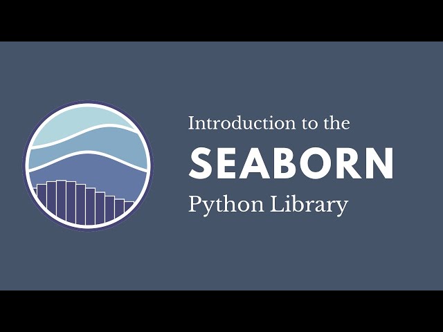
This first video of my "Introduction to Seaborn" series covers the basics of seaborn, a Python library for data visualization. Here ...
79,162 views
This Seaborn Full Course by Intellipaat is your one-stop guide to mastering data visualization in Python using Seaborn. Perfect for ...
38,521 views
5 months ago
Don't miss out! Get FREE access to my Skool community — packed with resources, tools, and support to help you with Data, ...
7,836 views
"️️ Professional Certificate in AI and Machine Learning, delivered by Simplilearn in collaboration with Purdue University ...
52,845 views
In this video Rob, a Kaggle Grandmaster, quickly and humorously walks through each of the popular plotting and data ...
107,715 views
If you work with data in Python, at some point you'll need to visualize it. In this video, I'll show you the differences ...
1,522 views
8 months ago
Curso Estadística Descriptiva: https://codificandobits.com/curso/estadistica-descriptiva/ Asesorías y formación ...
2,299 views
4 months ago
Python Certification Training: https://www.edureka.co/data-science-python-certification-course ** This Edureka video on 'Python ...
132,113 views
Streamed 6 years ago
Para citar este recurso educativo utiliza la siguiente referencia: Gutiérrez-García, J.O. [Código Máquina]. (2022, 1° de Agosto).
12,010 views
In my last video, I showed how elegant and simple plotnine makes the Grammar of Graphics in Python. This time, I put Seaborn's ...
323 views
3 months ago