Upload date
All time
Last hour
Today
This week
This month
This year
Type
All
Video
Channel
Playlist
Movie
Duration
Short (< 4 minutes)
Medium (4-20 minutes)
Long (> 20 minutes)
Sort by
Relevance
Rating
View count
Features
HD
Subtitles/CC
Creative Commons
3D
Live
4K
360°
VR180
HDR
58 results
Dans cet épisode, on découvre Matplotlib, la bibliothèque Python de référence pour visualiser des données en Machine Learning ...
57 views
3 days ago
نواصل في هذا الفيديو تبسيط مادة البرمجة والحساب العلمي باستعمال البايثن، وتحديداً من خلال الشرح التفصيلي لـ مجلة Scientific ...
11 views
3 weeks ago
Matplotlib is a core tool in the data science toolkit. It is the most developed and widely used plotting package in Python.
10 views
10 days ago
Learn Matplotlib, one of the most important Python libraries for Machine Learning and Data Science. In this beginner-friendly ...
18 views
4 weeks ago
4 views
2 weeks ago
Matplotlib Tutorial Part 1 | Python Data Visualization in Nepali Welcome to **Part 1 of the Matplotlib Tutorial Series in ...
5 days ago
Learn data visualisation in Python with Matplotlib — plot and style line charts, markers, colours, labels, and grids in this hands-on ...
9 views
21 – Matplotlib Basics ○ Line Plot ○ Bar Chart ○ Scatter Plot ○ Histogram Here is a quick, cheat-sheet style guide to the four ...
5 views
6 days ago
Creating Line Chart using plot Function | xlabel() | ylabel() | grid() | figure() | attributes of plot() Hello viewers, Myself Sandip ...
40 views
1 month ago
Primeros gráficos con la librería matplotlib.pyplot (plot y bar_label)
In this beginner-friendly Python tutorial, you'll learn what Matplotlib is, why it is one of the most important libraries in Python, and ...
30 views
🔥 Welcome to Matplotlib Part 1 in Telugu! After completing Pandas and NumPy, it's time to learn one of the most important ...
61 views
1 view
A comprehensive guide to using scatter plots in data visualization and machine learning. Unlock the power of scatter plots in ...
2 days ago
Dive into essential data distribution concepts for machine learning. Unlock the power of data distribution in machine learning.
7 views
4 days ago
시계열 시각화. 선그래프. matplotlib.pyplot.plot() 함수.
3 views
Explore the significance of the bell curve in data analysis and machine learning. Unlock the secrets of normal distribution!
How to change the naming of the legend when hue is given in pyplot? Helpful? Please use the *Thanks* button above! Or, thank ...
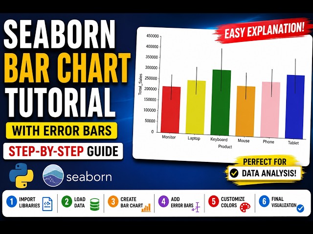
Learn how to create a beautiful Bar Chart using Seaborn in Python. palette="Set1" palette="Set2" palette="Set3" palette="Pastel" ...
14 views