ViewTube

ViewTube
Sign inSign upSubscriptions
Filters

Upload date

Type

Duration

Sort by

Features

Reset

149 results

Rahim Zulfiqar Ali
Pandas Data Visualization, EDA and AI-Powered Analytics Python | Excel AI Mastery 2026-2027

Pandas Data Visualization, EDA and AI-Powered Analytics | Python in Excel 365 Net Sales by Region Net Sales by Category Top ...

10:25
Pandas Data Visualization, EDA and AI-Powered Analytics Python | Excel AI Mastery 2026-2027

55 views

4 hours ago

QED Realized
Ep 21: See Your Data or Ship Wrong Answers | Plotting with Matplotlib

Plotting is not decoration. Summary statistics lie by omission: four datasets can share the same means, the same variances, and ...

15:00
Ep 21: See Your Data or Ship Wrong Answers | Plotting with Matplotlib

0 views

2 hours ago

VPro Skills
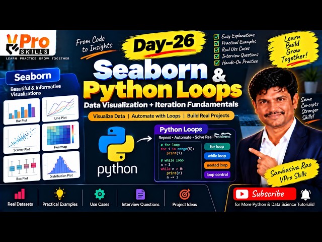
Day-26 | Seaborn & Python Loops | Data Visualization and Iteration Fundamentals

Learn Seaborn for creating powerful statistical visualizations and understand Python loops for repeating tasks efficiently. Explore ...

1:20:19
Day-26 | Seaborn & Python Loops | Data Visualization and Iteration Fundamentals

3 views

5 hours ago

codingjanta
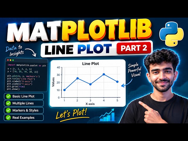
Line Plot in Matplotlib 📈 | Python Tutorial Part 2

... line plot python matplotlib tutorial python matplotlib tutorial line graph python matplotlib part 2 data visualization python python ...

6:14
Line Plot in Matplotlib 📈 | Python Tutorial Part 2

5 views

7 hours ago

yitayew solomon
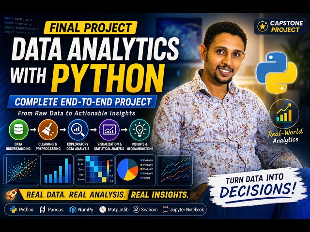
79. Data Analytics with Python Project | Complete End-to-End Data Analytics| Capstone Project Part 8

Welcome to the final project of our Data Analytics with Python playlist! This capstone project is designed to demonstrate how the ...

10:16
79. Data Analytics with Python Project | Complete End-to-End Data Analytics| Capstone Project Part 8

13 views

12 hours ago

IT Practice
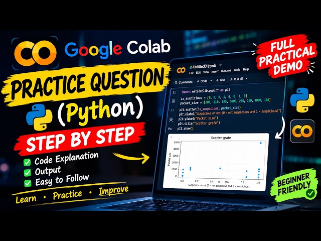
Suspicious Packet Detection with Python | Scatter Plot in Google Colab | Cybersecurity Practical

Suspicious Packet Detection with Python | Packet Size Analysis | Scatter Plot in Google Colab In this cybersecurity practical, we ...

5:36
Suspicious Packet Detection with Python | Scatter Plot in Google Colab | Cybersecurity Practical

2 views

13 hours ago

Digital Skills Academy
Webinar on Data Analysis with Python and Generative AI

Webinar on Data Analysis with Python and Generative AI | Digital Skills Academy & SA Consulting Discover how Python, Data ...

1:40:43
Webinar on Data Analysis with Python and Generative AI

17 views

16 hours ago

RR Consultancy Assignment Guidance
Comparing Individual Values with Dot Plots in Python - #python #matplotlib #datascience #coding

Dot plots in Python Data visualization in Python Matplotlib dot plot tutorial Seaborn data visualization Comparing individual values ...

1:45
Comparing Individual Values with Dot Plots in Python - #python #matplotlib #datascience #coding

3 views

11 hours ago

RR Consultancy Assignment Guidance
Comparing Average Values Across Categories with Mean Plots in Python

Welcome to this tutorial on Comparing Average Values Across Categories with Mean Plots in Python! When analyzing data ...

1:39
Comparing Average Values Across Categories with Mean Plots in Python

1 view

11 hours ago

The_Learning Muse
Top Data Science Libraries Explained (Python, R, Apache Spark)

Want to master data science? In this video, we break down the most essential data science libraries across Python, R, Scala, and ...

6:44
Top Data Science Libraries Explained (Python, R, Apache Spark)

19 views

15 hours ago

Posit PBC
Teaching modern data science through sports | Michael Czahor | Data Science Hangout

ADD THE DATA SCIENCE HANGOUT TO YOUR CALENDAR HERE: https://pos.it/dsh - All are welcome! We'd love to see you!

54:25
Teaching modern data science through sports | Michael Czahor | Data Science Hangout

18 views

47 minutes ago

Aftab Alam
Pandas Lecture 7 | GroupBy, Aggregation & Data Visualization | EDA with Pandas

Pandas Lecture 7 | GroupBy, Aggregation & Data Visualization In today's lecture, I taught my students how to analyze and ...

12:43
Pandas Lecture 7 | GroupBy, Aggregation & Data Visualization | EDA with Pandas

11 views

8 hours ago

Shakti Education Institute
Episod - 16  Data Science Full Course 2026 | Python to Machine Learning & Deep Learning | Live Daily

Complete Data Science Course 2026 – Beginner to Advanced Start your Data Science journey with our FREE Daily Live Classes ...

50:58
Episod - 16 Data Science Full Course 2026 | Python to Machine Learning & Deep Learning | Live Daily

61 views

Streamed 4 hours ago

Raj Institute of Coding and Robotics (RICR)
Categorical Plot Using Seaborn  | Applied Python #15

In this video, we continue our Seaborn series and learn about Categorical Plots for analyzing numerical data across different ...

28:39
Categorical Plot Using Seaborn | Applied Python #15

17 views

7 hours ago

Raj Institute of Coding and Robotics (RICR)
Distribution Plot Using Seaborn  | Applied Python #14

In this video, we continue our Seaborn series and learn how to create and analyze Distribution Plots for understanding data ...

26:18
Distribution Plot Using Seaborn | Applied Python #14

11 views

11 hours ago

Engenharia de Dados | Data Engineer Help
Data Engineering Roadmap 2026: How to Become a Data Engineer from Scratch

In this video, we'll build a B3 financial dashboard using Python and Streamlit, transforming ETF data into an interactive web ...

34:15
Data Engineering Roadmap 2026: How to Become a Data Engineer from Scratch

976 views

7 hours ago

CodeTimelapse
387 Files: See This Financial Python Project Grow! 🔥

You'll see the anthropics/financial-services GitHub repository visually expand and contract in this Gource visualization.

1:18
387 Files: See This Financial Python Project Grow! 🔥

3 views

16 hours ago

Learn with Dr. Jyoti
9. PCA Explained Simply | Dimensionality Reduction | Python

PCA (Principal Component Analysis) Explained | Dimensionality Reduction + Python | Machine Learning In this video, we learn ...

31:02
9. PCA Explained Simply | Dimensionality Reduction | Python

10 views

14 hours ago