ViewTube

ViewTube
Sign inSign upSubscriptions
Filters

Upload date

Type

Duration

Sort by

Features

Reset

1,358 results

Data Geek is my name
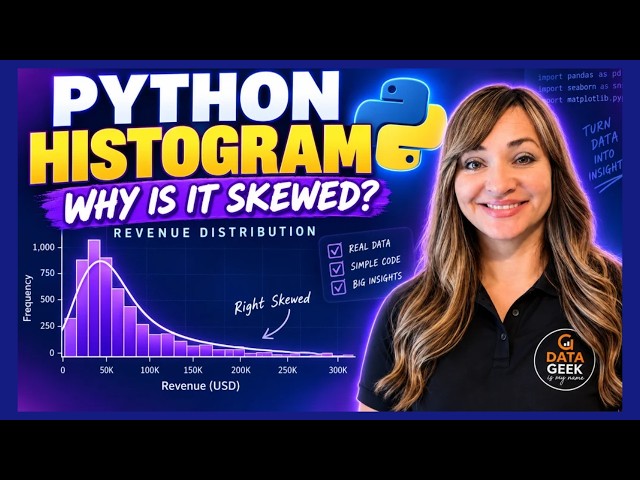
Python Histogram Tutorial | Understand Revenue Distribution with Seaborn

Learn how to create and interpret a histogram in Python using Seaborn and Matplotlib. In this beginner-friendly data visualization ...

7:25
Python Histogram Tutorial | Understand Revenue Distribution with Seaborn

2 views

2h ago

Rahim Zulfiqar Ali
Pandas Data Visualization, EDA and AI-Powered Analytics Python | Excel AI Mastery 2026-2027

Pandas Data Visualization, EDA and AI-Powered Analytics | Python in Excel 365 Net Sales by Region Net Sales by Category Top ...

10:25
Pandas Data Visualization, EDA and AI-Powered Analytics Python | Excel AI Mastery 2026-2027

103 views

14h ago

Abaysa with AI
Python Data Visualization: Master Matplotlib & Seaborn Fast

Stop looking at ugly spreadsheets and start building beautiful, visual stories with Python. Welcome back to ABAYSA with AI, your ...

5:57
Python Data Visualization: Master Matplotlib & Seaborn Fast

194 views

6d ago

VPro Skills
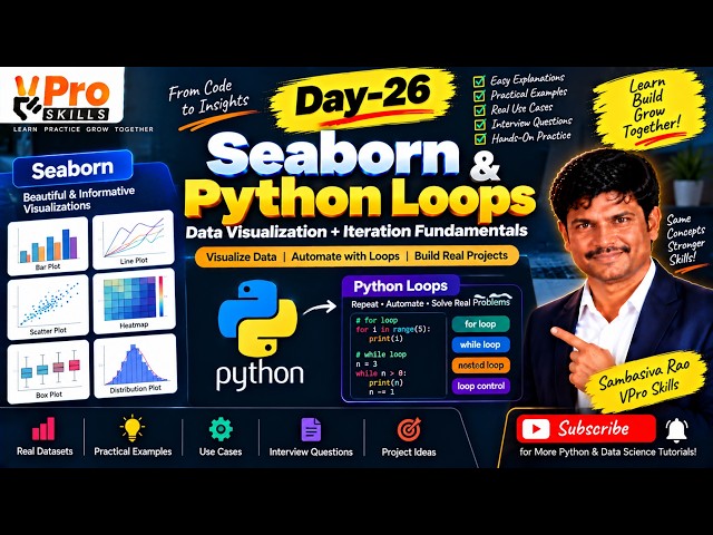
Day-26 | Seaborn & Python Loops | Data Visualization and Iteration Fundamentals

Learn Seaborn for creating powerful statistical visualizations and understand Python loops for repeating tasks efficiently. Explore ...

1:20:19
Day-26 | Seaborn & Python Loops | Data Visualization and Iteration Fundamentals

6 views

14h ago

DEPTH OF BIOLOGY
Data Visualization with Matplotlib | Creating line plot | Labeling axes | Interpretation of plots

Data Visualization with Matplotlib | Creating line plot | Labeling axes,Legends & Interpretation In this One Shot Lecture, we cover ...

59:31
Data Visualization with Matplotlib | Creating line plot | Labeling axes | Interpretation of plots

528 views

2d ago

Edcited
Master Data Visualization using Python | Part 3 Step-by-Step Guide

Welcome to Part 3 of the Data Visualization with Python course! In this video, we build on the fundamentals to explore advanced ...

13:19
Master Data Visualization using Python | Part 3 Step-by-Step Guide

133 views

6d ago

answersQ
6 Best Free Data Visualization Courses (Certs Checked)

Six free data visualization courses, checked by hand — and the one thing most "free courses" lists leave out: whether the ...

6:05
6 Best Free Data Visualization Courses (Certs Checked)

555 views

6d ago

Simplilearn
Applied Data Science with Python  2026 | Applied Data Science Full Course | Simplilearn

IIT Kanpur - Professional Certificate Course in AI-Powered Data Analytics ...

4:10:28
Applied Data Science with Python 2026 | Applied Data Science Full Course | Simplilearn

15,630 views

Streamed 6d ago

The Industry Portal
Python Day 184: Introduction to Interactive Dashboards with Plotly and Dash

Welcome to Day 184 of The Complete Python Bootcamp. In this session, you will explore an introduction to creating interactive ...

0:56
Python Day 184: Introduction to Interactive Dashboards with Plotly and Dash

31 views

6d ago

yitayew solomon
79. Data Analytics with Python Project | Complete End-to-End Data Analytics| Capstone Project Part 8

Welcome to the final project of our Data Analytics with Python playlist! This capstone project is designed to demonstrate how the ...

10:16
79. Data Analytics with Python Project | Complete End-to-End Data Analytics| Capstone Project Part 8

20 views

21h ago

cctmexico
🧹 Data Aggregation in Python: From 🤦🏻‍♀️ undecipherable chart to a ✨️ Professional ✨️ heatmap

💙 🤗 Thank you so much for liking this video if you found it helpful! Does your heatmap look saturated, illegible, or have ...

16:45
🧹 Data Aggregation in Python: From 🤦🏻‍♀️ undecipherable chart to a ✨️ Professional ✨️ heatmap

247 views

6d ago

codingjanta
Line Plot in Matplotlib 📈 | Python Tutorial Part 2

... line plot python matplotlib tutorial python matplotlib tutorial line graph python matplotlib part 2 data visualization python python ...

6:14
Line Plot in Matplotlib 📈 | Python Tutorial Part 2

6 views

16h ago

RR Consultancy Assignment Guidance
Comparing Individual Values with Dot Plots in Python - #python #matplotlib #datascience #coding

Dot plots in Python Data visualization in Python Matplotlib dot plot tutorial Seaborn data visualization Comparing individual values ...

1:45
Comparing Individual Values with Dot Plots in Python - #python #matplotlib #datascience #coding

6 views

21h ago

Digital Skills Academy
Webinar on Data Analysis with Python and Generative AI

Webinar on Data Analysis with Python and Generative AI | Digital Skills Academy & SA Consulting Discover how Python, Data ...

1:40:43
Webinar on Data Analysis with Python and Generative AI

20 views

1d ago

IT Practice
Suspicious Packet Detection with Python | Scatter Plot in Google Colab | Cybersecurity Practical

Suspicious Packet Detection with Python | Packet Size Analysis | Scatter Plot in Google Colab In this cybersecurity practical, we ...

5:36
Suspicious Packet Detection with Python | Scatter Plot in Google Colab | Cybersecurity Practical

2 views

22h ago

SK DataLabs
Data Visualization in Python using Matplotlib | Bar Plot & Pie Plot | Part 2

DATA VISUALIZATION USING MATPLOTLIB — PART 2 Welcome to SK DataLabs! In this lecture, we continue our journey into ...

31:10
Data Visualization in Python using Matplotlib | Bar Plot & Pie Plot | Part 2

39 views

5d ago

Omar Kweidy
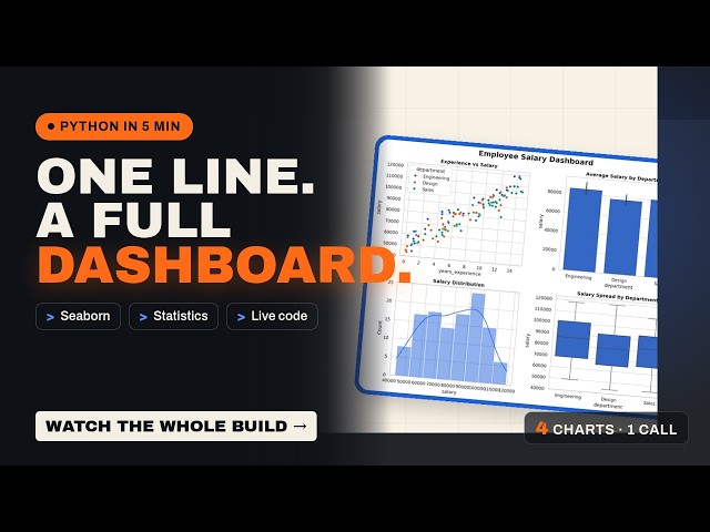
One Line, A Full Dashboard: The Complete Seaborn Guide in Python #python #pythonprogramming

Seaborn turns a DataFrame into statistical charts with a fraction of the Matplotlib code. The complete guide: what it adds, when to ...

4:53
One Line, A Full Dashboard: The Complete Seaborn Guide in Python #python #pythonprogramming

19 views

4d ago

Analytics in 10 Minutes
How to Calculate Rolling Average in Power BI Using Variables in DAX

Learn two different ways to calculate a rolling average (moving average) in Power BI — using native DAX measures and using a ...

9:08
How to Calculate Rolling Average in Power BI Using Variables in DAX

815 views

3d ago

AI Growth Library
Install NumPy, Pandas & Matplotlib | Python for Beginners

Want to get started with NumPy, Pandas, and Matplotlib? This video is a beginner-friendly introduction to three of the most widely ...

7:28
Install NumPy, Pandas & Matplotlib | Python for Beginners

62 views

1d ago

Knowledge Thrust-Pharmacy
Create plots using matplotlib: Python: B.pharma

... we will again customize and finalize the visualization data So in this way for example we have to draw a line plot in the python ...

4:44
Create plots using matplotlib: Python: B.pharma

3 views

4d ago