Upload date
All time
Last hour
Today
This week
This month
This year
Type
All
Video
Channel
Playlist
Movie
Duration
Short (< 4 minutes)
Medium (4-20 minutes)
Long (> 20 minutes)
Sort by
Relevance
Rating
View count
Features
HD
Subtitles/CC
Creative Commons
3D
Live
4K
360°
VR180
HDR
112 results
Every Senior Dev Writes This Line First (You Should Too) ━━━━━━━━━━━━━━━ In this video I'll show you what ...
114 views
4 days ago
max-width genuinely caps an element's real width without forcing a fixed size, essential for actual readable, responsive text.
0 views
6 days ago
Learn how CSS width, height, and CSS units actually work — and how to use them to build responsive layouts. In this CSS tutorial ...
1,019 views
Download Full Project Code and Mockup Files:* https://github.com/Practical-Web-Dev/html-css-shark-site-full *Download CSS ...
180 views
5 days ago
The border property genuinely combines real width, style, and color into one shorthand, drawing an actual line around an element ...
4 views
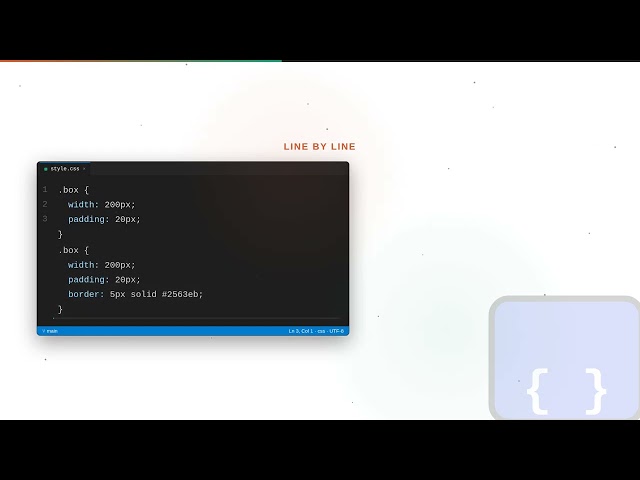
box-sizing: border-box genuinely changes how width is calculated, including padding and border INSIDE it, instead of adding ...
6 views
A simple real max-width: 100% genuinely makes images and videos actually shrink to fit their container, the foundation of real ...
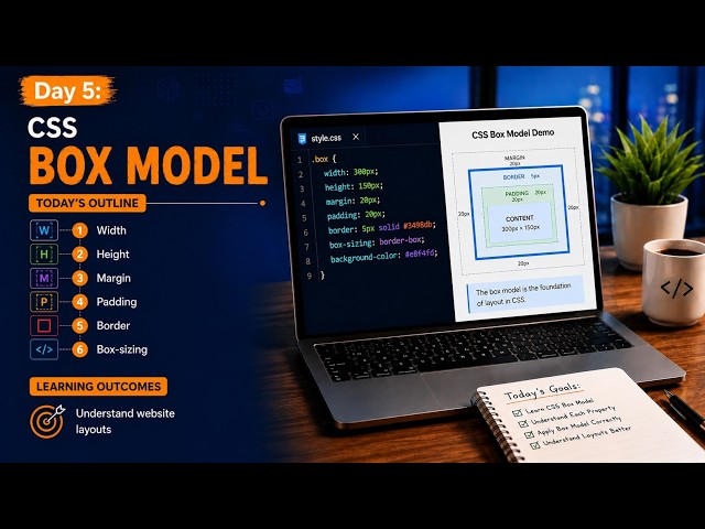
What You Will Learn In Day 5, we cover: ✓ CSS Width ✓ CSS Height ✓ CSS Margin ✓ CSS Padding ✓ CSS Border ✓ CSS ...
21 views
1 day ago
Download Full Project Code and Mockup Files:* https://github.com/Practical-Web-Dev/html-css-shark-site-full *HTML Only ...
97 views
In CSS Part 17, we will learn how to calculate the actual width and height of an element when margin, padding, and border are ...
53 views
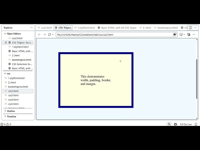
In this video, we continue learning **CSS fundamentals** by covering four important CSS topics with a practical HTML example.
2 views
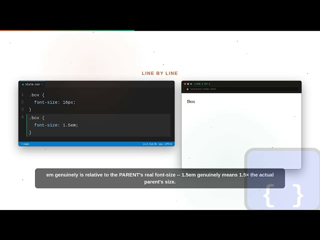
CSS genuinely offers several real sizing units -- px, %, em, rem, vw/vh -- each behaving actually differently. In this video you'll ...
1 view
Learn how to use CSS Units & Styles to style your HTML elements and create more visually appealing webpages. Perfect for ...
7 views
media queries genuinely apply real CSS rules only when actual conditions -- like screen width -- are met. In this video you'll build ...
CSS Borders | Complete CSS Tutorial for Beginners** Welcome to another lesson in our **CSS Tutorial Series**! In this ...
24 views
Streamed 1 day ago
Learn Responsive CSS in Easy Way — fluid widths, clamp(), media queries, breakpoints, and mobile-first CSS explained from ...
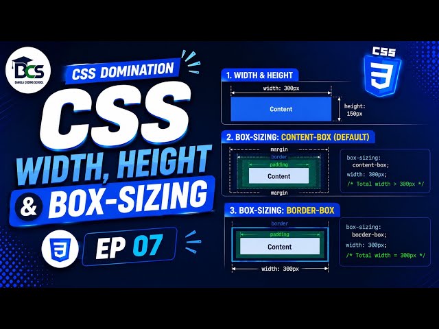
CSS Width, Height & Box-Sizing Explained 🔥 | CSS DOMINATION EP 07 🔴 CSS PREVIOUS EPISODE : https://youtube.com/playlist?list ...
9 views
object-fit genuinely controls how a real image fills its actual container when the aspect ratios don't match. In this video you'll use ...
float genuinely was the original real CSS layout technique, with actual real quirks flexbox was later built to fix. In this video you'll ...
Every real HTML element genuinely is a box made of content, padding, border, and margin, in that real nested order. In this video ...