Upload date
All time
Last hour
Today
This week
This month
This year
Type
All
Video
Channel
Playlist
Movie
Duration
Short (< 4 minutes)
Medium (4-20 minutes)
Long (> 20 minutes)
Sort by
Relevance
Rating
View count
Features
HD
Subtitles/CC
Creative Commons
3D
Live
4K
360°
VR180
HDR
5,082,348 results
IMPORTANT: Learn CSS Today Course: ...
883,230 views
6 years ago
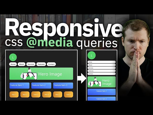
Want to learn how to build a responsive website that looks perfect on all screen sizes — mobile, tablet, laptop, or desktop? In this ...
9,986 views
7 months ago
Learn the most important concepts of Responsive CSS Media Queries in simple and easy manner. ✉️ Reach out to us at: ...
127,623 views
1 year ago
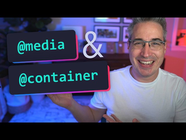
A dive into the world of media queries and container queries, covering the basics of how each works, the differences between ...
110,708 views
Start creating responsive layouts with confidence with my free responsive layouts course: ...
420,051 views
9 years ago
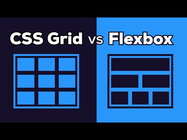
In this video, you will finally understand when Flexbox is the right tool and when CSS Grid is a better choice. Most developers use ...
123,599 views
2 months ago
Las media queries nos pueden ayudar mucho pero también añaden complejidad a nuestro código. Te enseñamos como crear ...
192,395 views
4 years ago
In this video, we'll explore the differences between CSS Grid and Flexbox for building websites and layouts. 🚀 Web Design ...
406,199 views
How to Make Responsive Websites Without Media Queries! | Stop Using Media Queries! Try This Instead ...
33,043 views
10 months ago
Hoy vamos a ver CÓMO hacer MEDIA QUERIES EN CSS y te voy a contar TODO lo que DEBES SABER: Desde cómo se escribe ...
18,657 views
3 years ago
Exploraremos una serie de temas fundamentales en CSS que te ayudarán a mejorar tus habilidades de diseño web. Desde el ...
211,113 views
2 years ago
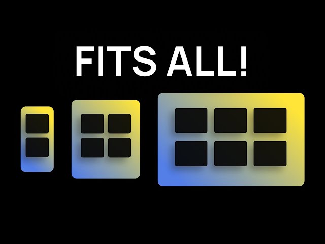
By the end of this video, you'll be able to design and build responsive websites that work on a 4K monitor, a tiny smartphone and ...
185,084 views
yacklyon #css #avanzado CSS: Es el estilo que le aplicamos a cada uno de los elementos creados previamente en el HTML.
28,590 views
5 years ago
Container Queries are a powerful tool for defining responsive design in CSS. Unlike Media Queries, which let you apply styles to ...
6,562 views
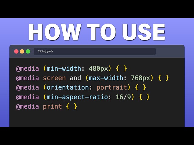
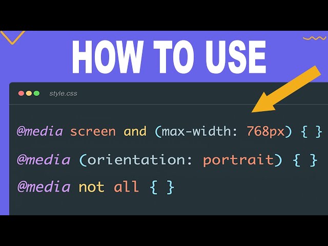
Learn how to do CSS Media Queries with the latest techniques of calling @media, max-width, min-width to allow your HTML code ...
198,634 views
This video explains how to use Media Queries in CSS to achieve a fully responsive webpage and covers essential concepts ...
30,639 views
9 months ago
Learn what media queries are and how to use them to create responsive design for mobile devices. 📣 Need hosting and a domain ...
97,227 views
COURSES - https://slayingthedragon.io Join the discord - https://discord.gg/Ccz9nQSfQB You might be wondering why ...
485,962 views
Web Dev Roadmap for Beginners (Free!): https://bit.ly/DaveGrayWebDevRoadmap Learn CSS media queries and responsive ...
68,971 views
In this video, you'll explore everything you need to know about media query in CSS to create fully responsive websites. I'll guide ...
16,654 views
Quieres aprender flexbox de la mejor forma posible? ACCEDE al CURSO GRATIS Si quieres aprender más sobre flexbox ...
50,645 views
Learn how to use CSS Media Queries, which are essential to creating websites responsive to different screen sizes. After learning ...
146,636 views
5 MINDBLOWING CSS Tips and Tricks for better responsiveness and modern css solutions for typical problems with CSS ONLY.
459,658 views
What are CSS media queries and what are they used for? What does a Media Query mean? What does @media CSS mean? How to create ...
10,434 views
Build a responsive CSS layout without using any media queries. The most powerful CSS trick you're not using. No More Media ...
16,347 views
6 months ago