ViewTube

ViewTube
Sign inSign upSubscriptions
Filters

Upload date

Type

Duration

Sort by

Features

Reset

17,187 results

Steve Griffith - Prof3ssorSt3v3
CSS min-width, max-width, and width

This tutorial explains the differences between the min-width, max-width, width, min-height, max-height, and height properties in ...

5:11
CSS min-width, max-width, and width

82,774 views

7 years ago

Scrimba
5. min width and max width - Responsive CSS Tutorial

View our courses: https://scrimba.com/links/all-courses This tutorial is a part of "The Responsive Web Design Bootcamp" on ...

2:50
5. min width and max width - Responsive CSS Tutorial

27,358 views

6 years ago

Learn Code with Alex
CSS Responsive Design: Why to use min-width & max-width?

Master min-width and max-width in CSS for better responsive web design! In this tutorial, I'll show you how to use these ...

1:12
CSS Responsive Design: Why to use min-width & max-width?

1,127 views

1 year ago

Dorian Desings
RELATIVE MEASUREMENTS Min-Width, Min-Height, Max-Width and Min-Width CSS COURSE starting at 0 #47

I TEACH YOU Step by step how to Limit Sizes When Using Relative Measures | Min-width, min-height, max-width and min-width ...

9:36
RELATIVE MEASUREMENTS Min-Width, Min-Height, Max-Width and Min-Width CSS COURSE starting at 0 #47

20,687 views

4 years ago

Kevin Powell
One of the most common CSS issues people run into

Feel like you have the basics of CSS down, but you still get frustrated by it? I have a course just for you!

6:21
One of the most common CSS issues people run into

75,046 views

2 years ago

Kevin Powell
min-content, max-content, fit-content - intrinsic sizing with CSS

A look at the min-content, max-content, and fit-content values. Links ✓ Building the layout: https://youtu.be/sKFW3wek21Q ...

8:52
min-content, max-content, fit-content - intrinsic sizing with CSS

115,464 views

4 years ago

Bro Code
Learn CSS height and width in 6 minutes! 📏

CSS #course #tutorial CSS height width box-sizing tutorial example explained.

6:54
Learn CSS height and width in 6 minutes! 📏

146,122 views

2 years ago

Cem Eygi Media
CSS Width, Height and Overflow | max-width & min-width Properties Explained

CSS Width, Height and Overflow | max-width & min-width Properties Explained SECTIONS: (00:00) - INTRO (00:15) - Creating a ...

6:45
CSS Width, Height and Overflow | max-width & min-width Properties Explained

15,075 views

4 years ago

Kevin Powell
CSS width auto vs 100% | What's the difference?

A look at the difference between width: auto and width: 100% #css -- Come hang out with other dev's in my Discord Community ...

2:09
CSS width auto vs 100% | What's the difference?

120,419 views

5 years ago

People also watched

Alex Gasol
CSS min() y max() no sirven para NADA 👎 | clamp() MOLA 🤗

Veamos como hacer las cosas responsive SIN media queries usando funcionas de CSS (si, las hay) Hay muchas funciones en ...

16:18
CSS min() y max() no sirven para NADA 👎 | clamp() MOLA 🤗

4,353 views

4 years ago

Eduardo Fierro
🆘 DIFERENCIA entre REM y EM en CSS: Qué son, Cómo funcionan, Cuál es la mejor y PLUGIN DE REGALO 😊

Hoy vamos a descubrir la DIFERENCIA entre las medidas REM, EM y PX y vamos a responder preguntas como ¿Qué es rem en ...

17:29
🆘 DIFERENCIA entre REM y EM en CSS: Qué son, Cómo funcionan, Cuál es la mejor y PLUGIN DE REGALO 😊

10,318 views

3 years ago

Dorian Desings
TUTORIAL ▶ How VIEWPORT RESPONSIVE Measures Work【FULL CSS COURSE #46】

Viewport Units, Complete CSS Course from 0 2021 UPDATED Learn to Program Step by Step 👋Hi, I'm Dorian and I'm going to teach ...

12:40
TUTORIAL ▶ How VIEWPORT RESPONSIVE Measures Work【FULL CSS COURSE #46】

18,588 views

4 years ago

Dorian Desings
LEARN ▶ How HEIGHT % AND HEIGHT AUTO are used and work 🔵FULL CSS COURSE 2021 - #45

DISCOVER why with HEIGHT % and HEIGHT AUTO things work differently, Learn CSS Step by Step. 👋Hello, I'm Dorian and I'm going ...

12:22
LEARN ▶ How HEIGHT % AND HEIGHT AUTO are used and work 🔵FULL CSS COURSE 2021 - #45

24,486 views

4 years ago

Eduardo Fierro
✅ BREAKPOINTS RESPONSIVE  | QUE es RESPONSIVE DESIGN | Eduardo Fierro Pro

Vamos a revisar todo lo que DEBES saber sobre RESPONSIVE DESIGN, qué es un BREAKPOINT y CUALES son para poder ...

10:55
✅ BREAKPOINTS RESPONSIVE | QUE es RESPONSIVE DESIGN | Eduardo Fierro Pro

32,783 views

4 years ago

jonyl
Units of measurement in CSS

In this video, I'm going to explain the units of measurement in CSS and how to differentiate them. FREE Web Design from ...

5:36
Units of measurement in CSS

14,956 views

6 years ago

Eureka Tutoriales
Tipografía RESPONSIVE sin MEDIAQUERIES con la función CSS clamp()

Hoy vamos a ver como utilizar la función CSS clamp() para hacer todos nuestros textos responsive. Con esta función ya no nos ...

20:29
Tipografía RESPONSIVE sin MEDIAQUERIES con la función CSS clamp()

2,106 views

2 years ago

Vida MRR - Programacion web
Unidades de medida vh y vw en CSS

Aprende a usar las unidades de medida para calcular el viewport y crea diseños alineados a esta parte de la pantalla ...

5:59
Unidades de medida vh y vw en CSS

19,247 views

6 years ago

Carpi Coder
Por qué debemos evitar usar Height en CSS

Bienvenidos a este nuevo video! ‍ Les explico por qué siempre recomiendo NO usar la propiedad Height en CSS, por qué ...

14:50
Por qué debemos evitar usar Height en CSS

6,648 views

3 years ago

Dorian Desings
All about ▶ COLOR CODES IN CSS【 KEYWORDS 】Complete CSS COURSE FROM ZERO 2021 |#48

Color Keywords: These are identifiers or color codes in which there is no distinction between uppercase and lowercase and are ...

10:20
All about ▶ COLOR CODES IN CSS【 KEYWORDS 】Complete CSS COURSE FROM ZERO 2021 |#48

11,106 views

4 years ago

AleCode
Contenido del box model. height, width, min-height, min-width, overflow

Te explico las propiedades con las que podemos modificar el contenido del box model Redes sociales: Instagram: ...

7:21
Contenido del box model. height, width, min-height, min-width, overflow

1,646 views

3 years ago

midudev
¡Aprende la nueva Sintaxis de Media Queries en CSS! Ya no necesitas usar min-width ni max-width  ¡El

Aprende la nueva Sintaxis de Media Queries en CSS! Ya no necesitas usar min-width ni max-width ¡El soporte es de más del ...

0:21
¡Aprende la nueva Sintaxis de Media Queries en CSS! Ya no necesitas usar min-width ni max-width ¡El

11,285 views

9 months ago

dcode
Using the max-width CSS property - CSS Tutorial

You can use the max-width CSS property to set the maximum width of an element. Combing it with the width property allows you ...

3:46
Using the max-width CSS property - CSS Tutorial

16,125 views

7 years ago

CSSnippets
Responsive Web Design with min(), max(), clamp(), and calc()

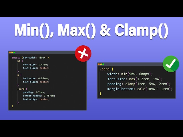
Welcome to this in-depth tutorial on Responsive Web Design using CSS functions — specifically min(), max(), clamp(), and calc()!

7:07
Responsive Web Design with min(), max(), clamp(), and calc()

8,034 views

7 months ago

Yahu Baba
CSS Min-Width & Max-Width Tutorial in Hindi / Urdu

In this tutorial you are going to learn css min-width and css max-width in hindi, urdu language.These two properties extend the ...

4:56
CSS Min-Width & Max-Width Tutorial in Hindi / Urdu

150,931 views

7 years ago

Success By Coading
explain css min-width and max-width#css #csswidth #CSSMin #cssmax #learncss #csstutorial #csstips

explain css min-width and max-width #css #csswidth #CSSMin #cssmax #learncss #csstutorial #csstips #successbydesign ...

0:26
explain css min-width and max-width#css #csswidth #CSSMin #cssmax #learncss #csstutorial #csstips

150 views

1 year ago

Héctor BlisS
¿Cómo se usa min(), max() y clamp()? Te enseño bien fácil.

Te enseño a usar min(), max() y clamp() de forma supersencilla. Checa mi curso: Mínimo JS para React: ...

5:31
¿Cómo se usa min(), max() y clamp()? Te enseño bien fácil.

3,094 views

2 years ago

Kevin Powell
The problem with min-width: 0

After Adam Wathan, and then @t3dotgg both posted and talked about the min-width: 0 thing, I've been getting a lot of questions ...

24:34
The problem with min-width: 0

31,594 views

2 years ago

Simple HTML Studio
What Is the Difference Between Min-Width and Max-Width in Media Queries? | Simple HTML Studio News

What Is the Difference Between Min-Width and Max-Width in Media Queries? Have you ever needed to create responsive web ...

3:16
What Is the Difference Between Min-Width and Max-Width in Media Queries? | Simple HTML Studio News

29 views

6 months ago

Carlos Azaustre - Aprende JavaScript
CSS: Deja de usar min-width y max-width | @Garajedeideas

css #desarrolloweb.

0:39
CSS: Deja de usar min-width y max-width | @Garajedeideas

36,377 views

2 years ago

Web Dev Simplified
Stop Using Pixels/Rems/Percentages To Define Widths In CSS

Find Me Here: My Blog: https://blog.webdevsimplified.com My Courses: https://courses.webdevsimplified.com Patreon: ...

1:00
Stop Using Pixels/Rems/Percentages To Define Widths In CSS

484,487 views

4 years ago