Upload date
All time
Last hour
Today
This week
This month
This year
Type
All
Video
Channel
Playlist
Movie
Duration
Short (< 4 minutes)
Medium (4-20 minutes)
Long (> 20 minutes)
Sort by
Relevance
Rating
View count
Features
HD
Subtitles/CC
Creative Commons
3D
Live
4K
360°
VR180
HDR
133,415 results
Struggling to make your website's headings and text responsive? In this video, I'll show you a simple yet powerful solution: one ...
5,304 views
1 year ago
In this one, I look at two simple ways to make maintaining your site's typography much simpler! Links ✓ The codepen: ...
199,837 views
4 years ago
5 MINDBLOWING CSS Tips and Tricks for better responsiveness and modern css solutions for typical problems with CSS ONLY.
530,220 views
I have strong opinions on fonts. Especially the right sizes for them. Y'all know me, bigger is better (for text). This article was ...
74,000 views
2 years ago
Start writing CSS with confidence with my course CSS Demystified: https://cssdemystified.com When people find out about ...
35,937 views
If you're building your own SaaS, I built a production-ready AI SaaS foundation https://www.saasbymonday.io/ Learn how to ...
23,372 views
10 MINDBLOWING CSS Tips and Tricks that solve typical JavaScript problems with CSS ONLY. You will learn elegant solutions ...
758,988 views
In this video, I'll show you how to set up a fluid responsive typography scale with the CSS clamp property. Key Links ...
14,432 views
To create Responsive Typography in your websites, you might immediately want to reach for Media Queries. Well, the clamp ...
10,180 views
My course: Responsive Design for Beginners! https://coder-coder.com/responsive/ Become a full-stack web dev with Zero to ...
53,506 views
My free course, Conquering Responsive Layouts: https://courses.kevinpowell.co/conquering-responsive-layouts A look at how we ...
220,727 views
The first 500 people to sign up using my link will get two free months of Skillshare premium: https://skl.sh/kevinpowell2 A lot of ...
136,766 views
7 years ago
Using Elementor's breakpoints for Desktop, Tablet, Mobile Font Sizes is fine but you will notice jumps in the fonts as you shrink ...
15,698 views
3 years ago
In this video we talk through how to get started with setting up typography in web design. We go over what sizes, and how many ...
39,536 views
Conquering responsive layouts: https://courses.kevinpowell.co/conquering-responsive-layouts Here's 5 quick responsive layouts ...
201,228 views
Building digital products in public. Sharing lessons around Design, Framer, Startups, and Online Businesses. Founders Shop ...
41,960 views
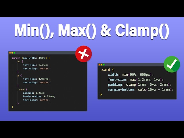
... largest allowed size, and safe range between min and max Creating fluid font sizes without media queries Making responsive ...
144,089 views
7 months ago
Learn how to build a responsive website from a Figma design with HTML, SCSS, JS ➡️ https://coder-coder.com/responsive/ ...
267,490 views
In this video, we're diving deep into one of the most fundamental topics in web development — CSS Units. Whether you're just ...
22,312 views
11 months ago
Today we're going to learn how we can use the CSS clamp function to create responsive, fluid typography! Project Links code: ...
73,954 views
There are a lot of different units that we can use when writing CSS, in this video I give some general rules of thumb of which ones ...
506,932 views
5 years ago
Learn CSS Today Course: ...
49,994 views
This text scale in Editor X feature will allow you to create prefect responsive text. Web design and text sizing doesn't have to be ...
19,037 views
Learn how the best design systems build their typography and apply the common patterns and insights for yourself. Chapters Intro ...
78,096 views
Pimp my Type Newsletter with weekly font recommendations: https://pimpmytype.com/newsletter Corresponding article with ...
26,264 views
Become a CSS wizard with my 6+ hour masterclass only at https://chriscourses.com/courses/css/videos/introduction-to-css Em ...
48,386 views
Enroll in this course for FREE - get additional lessons, written content, interactive exercises, and more: learn.kevinpowell.co Get ...
14,424 views
Please LIKE our Facebook page for daily updates...
50,528 views
Welcome to this in-depth tutorial on Responsive Web Design using CSS functions — specifically min(), max(), clamp(), and calc()!
10,584 views
Stop wasting time manually adjusting font sizes for every single device! In this video, I'm showing you the massive shift in Divi 5.0: ...
1,738 views
4 months ago