ViewTube

ViewTube
Sign inSign upSubscriptions
Filters

Upload date

Type

Duration

Sort by

Features

Reset

80 results

Sunshine_Tech
Python for Data Analysis Complete Training Material with Practical Examples

Level: Beginner to Intermediate Tools: Python, Jupyter Notebook, Pandas, NumPy, Matplotlib, and OpenPyXL Module 1: ...

19:33
Python for Data Analysis Complete Training Material with Practical Examples

19 views

5 days ago

SK DataLabs
Data Visualization in Python using Matplotlib | Bar Plot & Pie Plot | Part 2

DATA VISUALIZATION USING MATPLOTLIB — PART 2 Welcome to SK DataLabs! In this lecture, we continue our journey into ...

31:10
Data Visualization in Python using Matplotlib | Bar Plot & Pie Plot | Part 2

32 views

1 day ago

Code Your Future
Customize Professional Charts with Python | Matplotlib in Tamil S5 E3

In this Matplotlib Tutorial in Tamil, we'll learn how to transform a basic chart into a clear, professional and easy-to-understand data ...

28:19
Customize Professional Charts with Python | Matplotlib in Tamil S5 E3

69 views

14 hours ago

VPro Skills
Day-23 | Matplotlib in Python | Line Plot, Bar Chart & Scatter Plot Explained

In Day 23, learn Matplotlib in Python and create powerful visualizations using Line Plots, Bar Charts, and Scatter Plots.

1:23:57
Day-23 | Matplotlib in Python | Line Plot, Bar Chart & Scatter Plot Explained

60 views

Streamed 1 day ago

HaiderWithCode
Master Scatter Plots in Python — Complete Matplotlib Guide

... scatter plot in python matplotlib scatter plot plt scatter python python data visualization matplotlib tutorial for beginners python ...

14:58
Master Scatter Plots in Python — Complete Matplotlib Guide

15 views

5 days ago

Code Your Future
Histogram, Scatter & Box Plot | Matplotlib in Tamil S5 E2

Python Data Visualization Tutorial in Tamil | Histogram, Scatter Plot & Box Plot Using Matplotlib Learn Python data visualization in ...

17:16
Histogram, Scatter & Box Plot | Matplotlib in Tamil S5 E2

217 views

2 days ago

webitya
Matplotlib Pie Charts & Histograms in Python | plt.pie(), autopct, explode, startangle & plt.hist()

Learn Matplotlib Pie Charts and Histograms in Python with this practical Data Science lesson. In this tutorial, you will learn how to ...

36:00
Matplotlib Pie Charts & Histograms in Python | plt.pie(), autopct, explode, startangle & plt.hist()

39 views

1 day ago

Ultralytics
How to Create Heatmaps with Ultralytics YOLO26 | Visualize Object Activity | VisionAI in Retail 🚀

See where activity happens most within a video or live stream using Ultralytics YOLO26 and heatmaps. By combining object ...

6:03
How to Create Heatmaps with Ultralytics YOLO26 | Visualize Object Activity | VisionAI in Retail 🚀

693 views

1 day ago

Pivotalstats
Storytelling With Data: 12 Rules to Make Any Chart Clear

CREDIT Inspired by "Storytelling with Data" by Cole Nussbaumer Knaflic. All examples, data, and visuals in this video are original.

9:52
Storytelling With Data: 12 Rules to Make Any Chart Clear

992 views

6 days ago

Corporate King
Lecture 3: Line Plot, Scatter Plot & Facet Plot in Seaborn | Complete Practical Guide

... seaborn data visualization | data visualization python | python data visualization | python for data science | data science python ...

1:05:29
Lecture 3: Line Plot, Scatter Plot & Facet Plot in Seaborn | Complete Practical Guide

82 views

5 days ago

Intellipaat
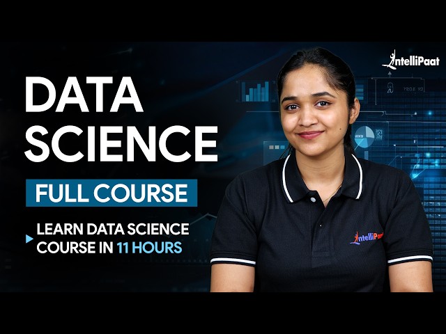
Learn Data Science For Free (2026) | Complete Full Data Science Course | Intellipaat

You'll also learn Python for Data Science, Pandas, Data Visualization with Matplotlib, and Exploratory Data Analysis (EDA) with ...

10:57:53
Learn Data Science For Free (2026) | Complete Full Data Science Course | Intellipaat

12,777 views

3 days ago

Corporate King
Lecture 6: Categorical Plots in Python | Bar Plot, Box Plot, Violin Plot & Swarm Plot
56:24
Lecture 6: Categorical Plots in Python | Bar Plot, Box Plot, Violin Plot & Swarm Plot

0 views

0

Corporate King
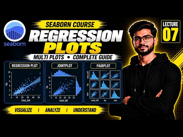
Lecture 7: Seaborn Regression Plots & Multi Plots in Python | Regplot, JointPlot & PairPlot
37:30
Lecture 7: Seaborn Regression Plots & Multi Plots in Python | Regplot, JointPlot & PairPlot

0 views

0

Intellipaat
Supply Chain Analytics Explained with Real-World Examples | AI + Data | Intellipaat

Enroll now for Supply Chain Management Course: https://intellipaat.com/supply-chain-management-course/ PPT/Resources: ...

13:26
Supply Chain Analytics Explained with Real-World Examples | AI + Data | Intellipaat

6,188 views

6 days ago

Sarveshwaran R
Data Cleaning with Pandas | Duplicates & Outliers

Learn essential Data Cleaning techniques using Python Pandas in this practical tutorial. In this video, you'll learn how to remove ...

16:02
Data Cleaning with Pandas | Duplicates & Outliers

3 views

6 days ago

Arpana Chaturvedi
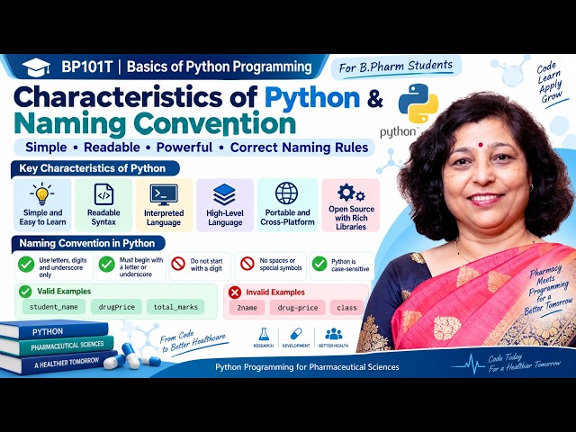
5. Characteristics of Python & Naming Conventions | BP101T B.Pharm Python

Welcome to BP101T Basics of Python Programming for B.Pharm | Complete Semester 1 Fast Track Series. In this lesson, you will ...

10:33
5. Characteristics of Python & Naming Conventions | BP101T B.Pharm Python

16 views

6 days ago

VLR Training
Python Data science in Telugu Class14 by Balaji     VlrTraining    Learn Python for Data Science

Python Data science in Telugu Class14 by Balaji VlrTraining Learn Python for Data Science 00:00:00 - Introduction & Recap of ...

1:32:13
Python Data science in Telugu Class14 by Balaji VlrTraining Learn Python for Data Science

216 views

4 days ago

Anfa Code
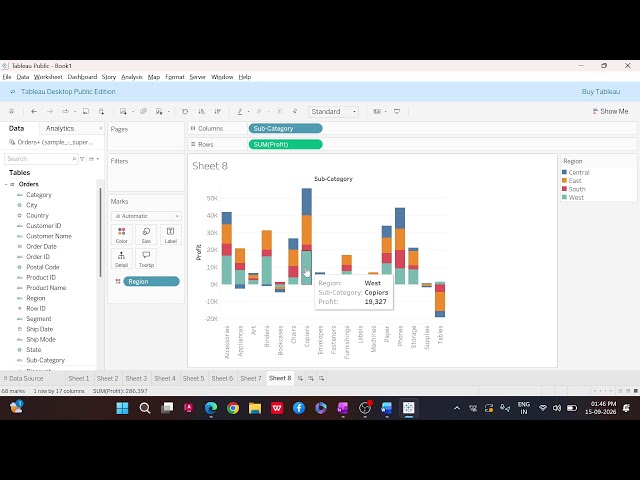
Tableau Part 3

In this video: In this video, we will learn Tableau Part 3 with simple explanation and practical examples. Welcome to ANFA ...

24:07
Tableau Part 3

150 views

Streamed 2 days ago

Simplilearn
Data Analytics With R Full Course 2026 | Complete R Programming For Data Analytics | Simplilearn

Micrososft Azure - Data Analyst Course ...

20:08:36
Data Analytics With R Full Course 2026 | Complete R Programming For Data Analytics | Simplilearn

10,664 views

3 days ago