Upload date
All time
Last hour
Today
This week
This month
This year
Type
All
Video
Channel
Playlist
Movie
Duration
Short (< 4 minutes)
Medium (4-20 minutes)
Long (> 20 minutes)
Sort by
Relevance
Rating
View count
Features
HD
Subtitles/CC
Creative Commons
3D
Live
4K
360°
VR180
HDR
1,136 results
Even though the goal of data visualization is to communicate clearly, there are some common mistakes you might be making that ...
3,585 views
2 days ago
Excel Sparklines Tutorial Create Mini Charts for Data Visualization Learn how to use **Excel Sparklines** to turn your sales data ...
114 views
Streamed 1 day ago
Must Watch some MS Excel videos: How to calculate count if in excel: https://youtu.be/ve1KM2wzfTQ How to do VlookUP in Excel ...
33 views
3 days ago
https://www.other-levels.com The #1 Website Worldwide for Excel Dashboard Templates, Reports, and Professional ...
618 views
How to Quickly Make Multiple Charts in Excel [2026 Guide] [2026 Tutorial] Learn how to quickly make multiple charts in Excel ...
7 views
7 days ago
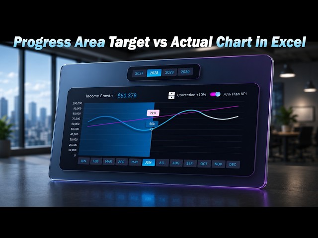
How to Create a Progress Area Target vs Actual Chart in Excel KPI Chart Template: ...
576 views
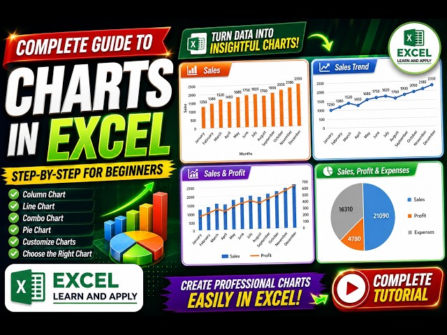
In this video, we will learn how to turn simple Excel data into clear and professional-looking charts. You will learn: ✓ How to ...
14 views
... excel tutorial, data visualization, pie chart tips, chart formatting, highlight category, slice separation, visualize data, how to, excel ...
1 view
6 days ago
WhatsApp: https://whatsapp.com/channel/0029VbCIu9XHVvTSpnBDWr0e Telegram: https://t.me/+aBQXL9Kwg_FhM2Jl ...
5,574 views
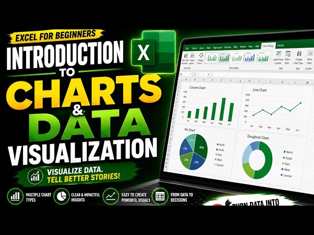
EXCEL CHARTS & DATA VISUALIZATION — PRACTICAL SESSION In this practical lesson, we move from theory to hands-on ...
6 views
4 days ago
Day 18/100 — Data Visualisation I'm learning that good visualisation isn't about adding more. It's about removing the noise and ...
2 views
5 days ago
How to draw an arrow in Excel, add an arrow in Excel, insert arrows in Excel, create arrows in Excel, customize Excel arrows, and ...
13 views
1 day ago
How to Quickly Make Multiple Charts in Excel [2026 Guide] Learn how to quickly make multiple charts in Excel by copying ...
3 views
Replaced manual spreadsheet reporting with an automated chain: Excel → validated ETL → SQL warehouse → live dashboard.
Learn how to visualize continuous data effectively using Line Charts in Excel! In this video, you'll learn how to create and use Line ...
41 views
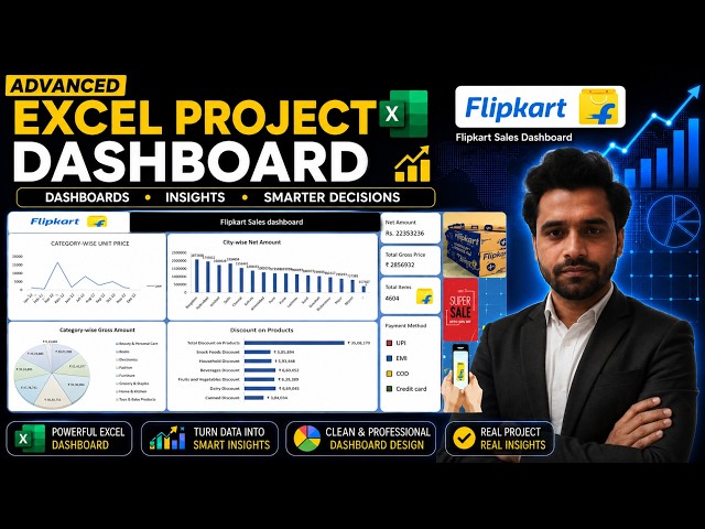
Advanced Excel Project | Flipkart Sales Dashboard 📊 In this project, we have created a professional Flipkart Sales Dashboard ...
157 views
20 hours ago
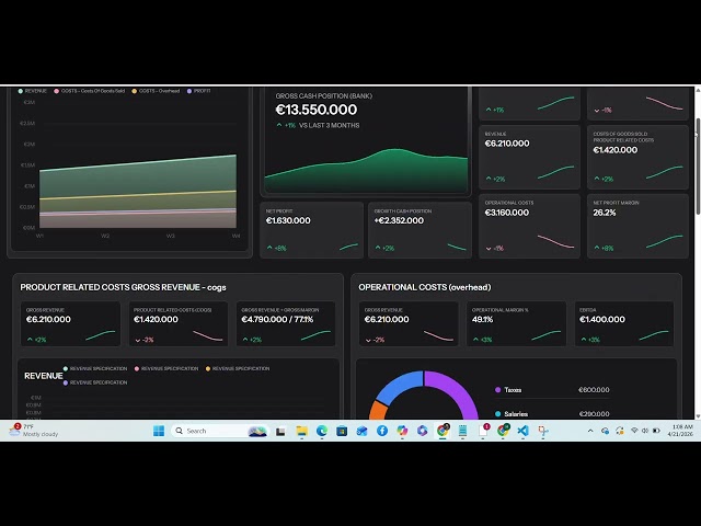
Explore this Data Analyst project: a sales and orders excel dashboard designed to transform business data into clear, actionable ...
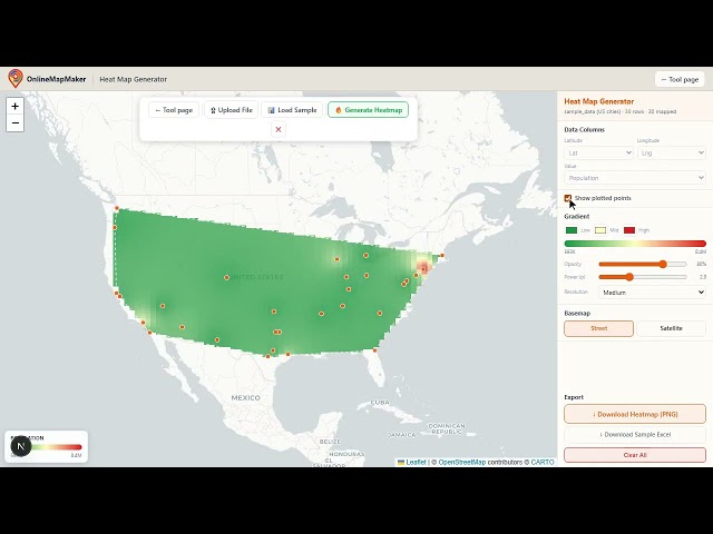
https://onlinemapmaker.com/heat-map-generator-from-excel-online/ Maps for the Rest of Us is a collection of free, browser-based ...
How to Use 3d Charts in Excel [2026 Easy Guide] Learn how to use 3d charts in Excel, so you can present data with depth and ...
How to Make a Wind Rose in Excel [2026 Fast Tutorial] Learn how to make a wind rose in Excel step by step, with clear ...





![How to Quickly Make Multiple Charts in Excel [2026 Guide] [2026 Tutorial]](/api/proxy/image?url=https%3A%2F%2Fi.ytimg.com%2Fvi%2FbMDv5OgkGzI%2Fsddefault.jpg)
![How to Explode a Slice in an Excel Pie Chart [2026 Easy Guide]](/api/proxy/image?url=https%3A%2F%2Fi.ytimg.com%2Fvi%2F2Z9b6-_SoaI%2Fsddefault.jpg)


![How to Quickly Make Multiple Charts in Excel [2026 Guide]](/api/proxy/image?url=https%3A%2F%2Fi.ytimg.com%2Fvi%2Fr4krMTAO-Og%2Fsddefault.jpg)


![How to Use 3d Charts in Excel [2026 Easy Guide]](/api/proxy/image?url=https%3A%2F%2Fi.ytimg.com%2Fvi%2Fc5JJFFvWL0M%2Fsddefault.jpg)
![How to Make a Wind Rose in Excel [2026 Fast Tutorial]](/api/proxy/image?url=https%3A%2F%2Fi.ytimg.com%2Fvi%2F7foikdwC-u0%2Fsddefault.jpg)