Upload date
All time
Last hour
Today
This week
This month
This year
Type
All
Video
Channel
Playlist
Movie
Duration
Short (< 4 minutes)
Medium (4-20 minutes)
Long (> 20 minutes)
Sort by
Relevance
Rating
View count
Features
HD
Subtitles/CC
Creative Commons
3D
Live
4K
360°
VR180
HDR
33,718 results
OFF My Dashboards Course (code: SAVE50) https://chandoo.org/wp/excel-school-program/ ~ Become an Excel Dashboard ...
215,352 views
9 months ago
Download the free course files and follow along here: ...
4,072 views
... #aitools2026 #aitools2026 #nocodingjobs #datavisualization #claudeaitutorial #1million #claudecowork #claude #claudecode ...
264,943 views
3 months ago
In this step-by-step tutorial, I create a complete interactive global emissions analysis dashboard. Dataset: ...
91 views
7 months ago
... #aitools2026 #aitools2026 #nocodingjobs #datavisualization #claudeaitutorial #1 #claudecowork #claude #claudecode ...
360,793 views
Build your next dashboard in minutes with SureThing (Paid Link) https://link.surething.io/Vedakarna9 ✓Get your Free VBA ...
287,195 views
4 months ago
#claudeai #aitools2026 #aitools2026 #nocodingjobs #datavisualization #claudeaitutorial #1million #claudecowork #claude ...
33,650 views
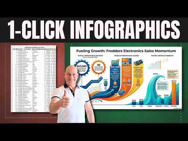
1 click infographics in Excel — this one-click trick turns raw data into a finished infographic instantly. Designing an infographic by ...
38,799 views
8 months ago
We're bringing you the best Excel tips and tricks to help you become a spreadsheet expert! Don't forget to hit that like button to ...
564,577 views
11 months ago
Learn how to create clear, impactful charts in Excel to turn raw data into compelling visuals. This beginner-friendly tutorial covers ...
63 views
10 months ago
Save 75% on our AI Literacy for Excel Course during Black Friday/Cyber Monday ...
110,270 views
Learn how to create infographics form Excel data. This amazing AI tool turns your data into powerful and insightful infographic ...
267 views
Managing your personal finances becomes much easier when you can clearly see where your money goes each month.
126,868 views
Stay Connected: Subscribe Now & Start Your Web Development Journey Today!
387 views
Nano Banana + Gemini 3: The Data Visualization Workflow You Need | Stop Making Boring Charts – Use This Nano Banana + ...
27,455 views
Make axes text horizontal Change interval between numbers Turn 5000000 into 5 million Multilevel axis Format dates Change ...
190 views
Learn how to turn Excel data into an interactive visual report using Power BI. This tutorial covers importing an Excel workbook, ...
15 views
9 days ago
Join Our Community: WhatsApp: https://whatsapp.com/channel/0029VbCIu9XHVvTSpnBDWr0e Telegram: ...
89,028 views
Want to make your data easier to understand and more impactful? In this video, you'll get a solid introduction to data ...
135 views
Master Microsoft Excel from absolute zero! This is your full beginner tutorial to master spreadsheets. Forget the overwhelm, we'll ...
620 views
5 months ago







![How to Transform Excel Data into a Visual Report with Power BI [2026 Guide]](/api/proxy/image?url=https%3A%2F%2Fi.ytimg.com%2Fvi%2F5IJAzNzwOkc%2Fsddefault.jpg)