Upload date
All time
Last hour
Today
This week
This month
This year
Type
All
Video
Channel
Playlist
Movie
Duration
Short (< 4 minutes)
Medium (4-20 minutes)
Long (> 20 minutes)
Sort by
Relevance
Rating
View count
Features
HD
Subtitles/CC
Creative Commons
3D
Live
4K
360°
VR180
HDR
950 results
Learn how to automatically create interactive dashboards from Excel and CSV files using Dashboard Builder's AI Dashboard ...
14 views
6 days ago
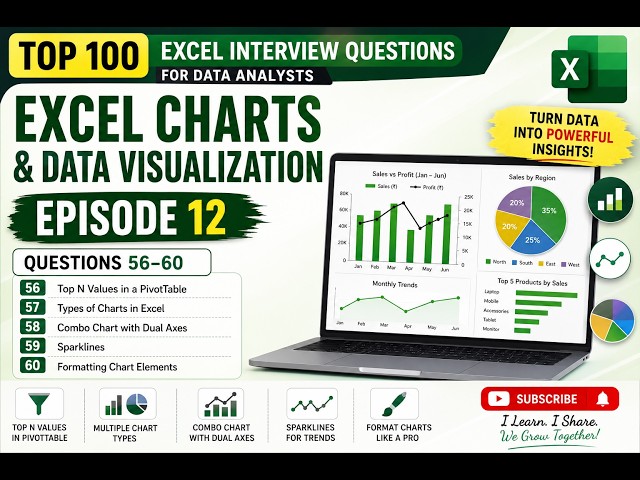
Welcome to Episode 12 of the Top 100 Excel Interview Questions for Data Analysts series! In this episode, we move from data ...
28 views
3 days ago
Avail 35% Discount- Enroll Now at https://www.udemy.com/course/data-analytics-for-finance-professionals/?
43,431 views
5 days ago
dataanalytics #excel #exceltutorial #excelforbeginners #insuranceanalysis Excel dashboards are one of the most practical ways ...
31 views
1 day ago
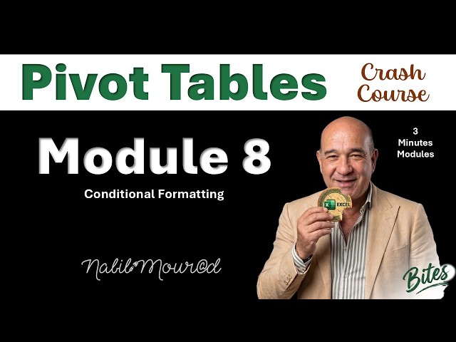
Pivot Tables Crash Course: Excel Bites Did you watch the Intro Video? Did you Download the Exercise Files? FULL PLAYLIST ...
53 views
How to Create a Forest Plot in Excel [2026 Guide] Learn how to create a forest plot in Excel step by step using built-in charts and ...
0 views
1 hour ago
... Clean Excel Dashboard Design, Fast Excel Dashboard Tutorial, Executive Dashboard Excel, Excel Data Visualization, Step by ...
23 views
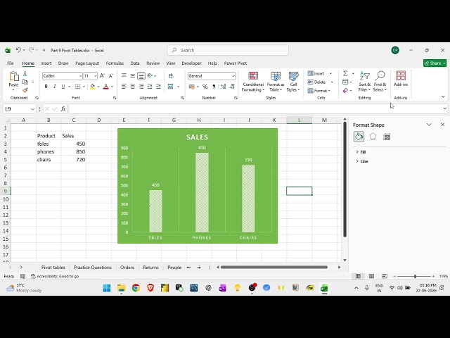
In this video, you'll learn how to graph multiple variables in a single Excel chart to clearly compare data and visualize ...
26 views
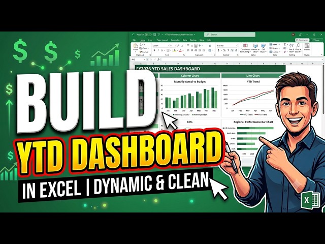
How to Create an Interactive Excel Dashboard [2026 Tutorial] Learn how to create an interactive Excel dashboard step by step ...
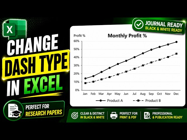
Learn how to change the dash type in an Excel line chart to create professional black and white graphs that are perfect for ...
5 views
Data Analyst Roadmap | Learn Statistics → Excel → SQL → Python → Visualization → Power BI #DataAnalyst ...
📊 Data ko sirf dekhna nahi, samajhna bhi seekho! Raw data ➡️ Patterns ➡️ Insights ➡️ Better Decisions 🚀 Data Analytics ki ...
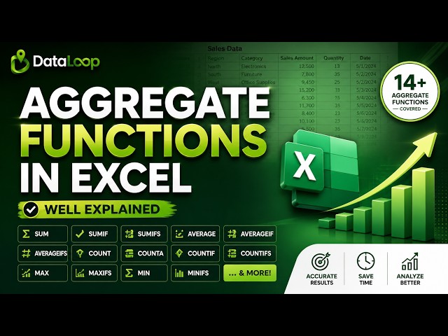
Want to master Excel Aggregate Functions and perform calculations like a professional? In this comprehensive Excel tutorial, ...
30 views
7 days ago
... excel, plum pudding chart tutorial, excel plum pudding chart, scatter chart excel, bubble chart excel, data visualization excel, ...
6 views
Enroll for Data Analytics Course: https://intellipaat.com/data-analytics-master-training-course/ Book your Free ...
695 views
4 hours ago
Adding Error Bars Correctly | Why Your Excel Graphs Look Wrong | Excel mein error bars kaise add karein? Is video mein ...
44 views
Excel Budget Tracker: Turn On/Off Expenses to Simulate Your Fastest Route to Financial Freedom. Excel PF Dashboard ...
4,314 views
How to Make a Line Graph in Excel (Full Guide) In Today's Video We Cover: how to make a line graph in excel, how to make a ...
21 views
12 views
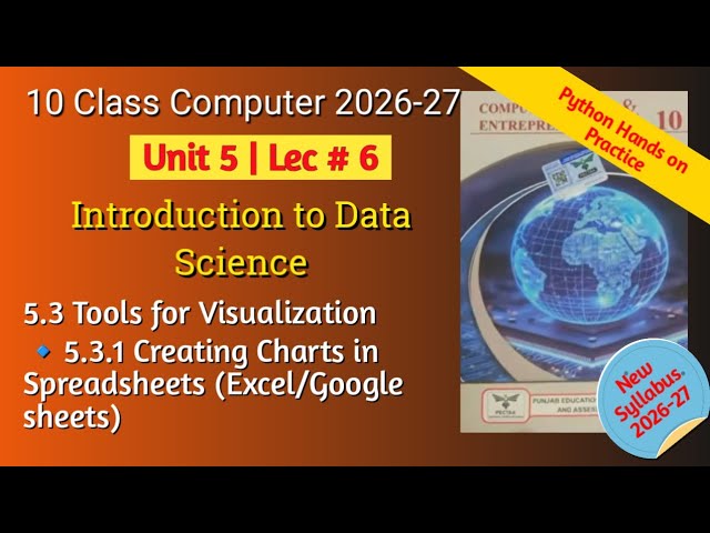
10th Class Computer Science | Punjab Board New Syllabus 2026–2027** Welcome to **Learn IT With Aneela**! In this lecture ...
4 days ago




![How to Create a Forest Plot in Excel [2026 Guide]](/api/proxy/image?url=https%3A%2F%2Fi.ytimg.com%2Fvi%2FaRE9zdhYnWY%2Fsddefault.jpg)

![How to Create an Interactive Excel Dashboard [2026 Tutorial]](/api/proxy/image?url=https%3A%2F%2Fi.ytimg.com%2Fvi%2F375LWU6eT4o%2Fsddefault.jpg)


![How to Make a Plum Pudding Chart in Excel [2026 Easy Guide]](/api/proxy/image?url=https%3A%2F%2Fi.ytimg.com%2Fvi%2FbYVYdqAHW_8%2Fsddefault.jpg)