Upload date
All time
Last hour
Today
This week
This month
This year
Type
All
Video
Channel
Playlist
Movie
Duration
Short (< 4 minutes)
Medium (4-20 minutes)
Long (> 20 minutes)
Sort by
Relevance
Rating
View count
Features
HD
Subtitles/CC
Creative Commons
3D
Live
4K
360°
VR180
HDR
125,078 results
Join my Academy, learn Data & AI skills and land a job https://go.analyticsautomation.academy/d8guJS Mind map available ...
6,920 views
10mo ago
Python for Data Science — Day 12** Data visualization is an essential part of Data Science. In this session, we learn how to ...
9 views
1d ago
Data means nothing if users can't make sense of it. In this video, we break down how to design clear, actionable, and beautiful ...
487 views
Micrososft Azure - Data Analyst Course ...
4,438 views
1mo ago
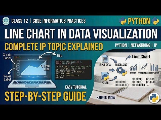
Python Code to create line chart for data visualization.
18 views
In this practical Python Data Analysis tutorial, we'll learn how to create a WordCloud to visually represent the most frequently ...
8 views
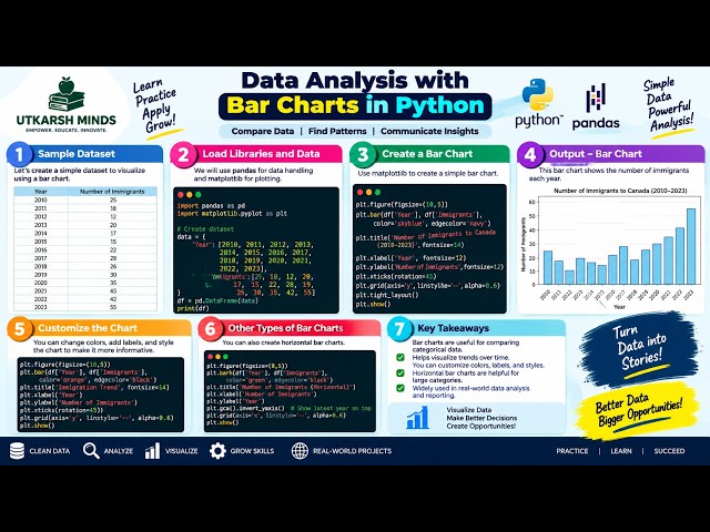
In this practical Python Data Analysis tutorial, we'll learn how to create and understand Bar Charts to compare different categories ...
1 view
2d ago
In this practical Python Data Analysis tutorial, we'll learn how to create Subplots to display multiple charts or visualizations in a ...
5 views
Nano Banana + Gemini 3: The Data Visualization Workflow You Need | Stop Making Boring Charts – Use This Nano Banana + ...
27,747 views
9mo ago
Hey Tech People!! Welcome to my channel! I am back with another important video for this 'ServiceNow System Administrator' ...
14,107 views
8mo ago
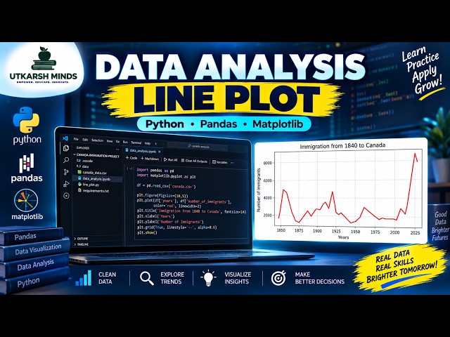
In this practical Python Data Analysis tutorial, we'll learn how to create and understand a Line Plot to visualize data and identify ...
4 views
How do two variables relate to each other? In this tutorial, we explore Correlation and Regplot using Python to understand ...
In this video we compare Jotform AI Data Assistant, Julius AI, Bricks, Zebra AI, Gemini in Google Sheets, ChatGPT, and Claude ...
4,301 views
7d ago
In this practical Python Data Analysis tutorial, we'll learn how to create and understand an Area Plot to visualize data, compare ...
In Day 7 of my Excel for Data Analytics series, we're focusing on Data Visualization, turning raw data into clear and meaningful ...
3 views
15h ago
Are you deciding between Tableau and Qlik Sense for your next data visualization project? This tutorial provides a ...
877 views
11mo ago
In this practical Python Data Analysis tutorial, we'll learn how to create and understand a Boxplot to analyze the distribution, ...
0 views
In this practical Python Data Analysis tutorial, we'll learn how to create and understand a Scatter Plot to visualize the relationship ...
6 views