Upload date
All time
Last hour
Today
This week
This month
This year
Type
All
Video
Channel
Playlist
Movie
Duration
Short (< 4 minutes)
Medium (4-20 minutes)
Long (> 20 minutes)
Sort by
Relevance
Rating
View count
Features
HD
Subtitles/CC
Creative Commons
3D
Live
4K
360°
VR180
HDR
466 results
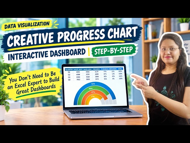
Learn how to build a modern, creative progress chart to instantly ...
2 views
10h ago
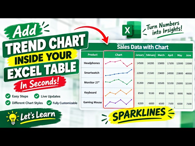
Learn how to add Excel Sparklines directly into your data tables to visualize trends instantly. This tutorial shows you how to select ...
3 min ago
This video compares MrBeast's YouTube subscriber count with the population of every country and territory, month by month from ...
9,540 views
16h ago
Countries resized by economic size: https://www.youtube.com/watch?v=Djp4HGYYinM US states resized by GDP: ...
56 views
In this beginner Tableau tutorial, you'll learn how to create individual date filters for days, weeks, months, and years so users can ...
3 views
5h ago
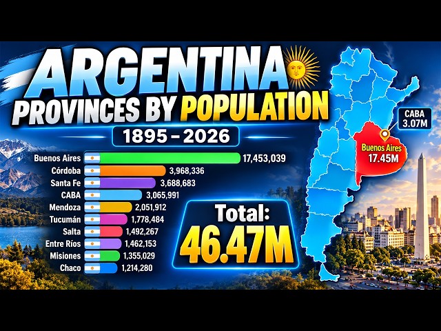
Explore more than 130 years of population change across Argentina's provinces in this animated bar chart race covering the ...
11,443 views
19h ago
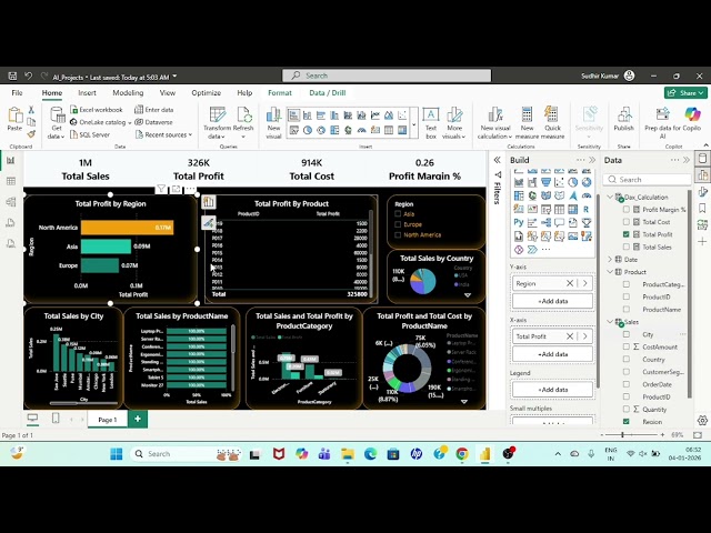
powerbitutorialforbeginners #powerbitutorial ...
11 views
13h ago
Who are the 10 richest people in the United States in 2026, and how did they build their enormous fortunes? In this video ...
0 views
6h ago
A monthly sales chart can never tell you whether the customers you won in January are still here in June. A cohort grid can.
5 views
Build Beautiful Excel Charts in 10 Seconds with ChatGPT! ⚡ Choosing the right chart in Microsoft Excel or Google Sheets can be ...
1 view
15h ago