Upload date
All time
Last hour
Today
This week
This month
This year
Type
All
Video
Channel
Playlist
Movie
Duration
Short (< 4 minutes)
Medium (4-20 minutes)
Long (> 20 minutes)
Sort by
Relevance
Rating
View count
Features
HD
Subtitles/CC
Creative Commons
3D
Live
4K
360°
VR180
HDR
15,451 results
Looking to sharpen your data visualization and storytelling skills? In this video, I cover: 1. The three chart mistakes I see most often ...
116 views
3w ago
160 subscribers
How to Create Heat Map in Tableau (Step By Step) Learn how to create a heat map in Tableau with this easy step-by-step tutorial.
43 views
In this tutorial, I'll show you step-by-step how to turn boring data into stunning, easy-to-read dashboards. ⏱️ Timestamps: 0:00 ...
1 view
2w ago
News https://www.meetup.com/chicagolandpowerbi/events/315787998/?eventOrigin=group_upcoming_events ...
454 views
Streamed 4w ago
How to Set Up Custom Data Visualizations in TrueProfit in 2026 Learn how to set up custom data visualizations inside dashboard ...
26 views
8d ago
Learn how to smartly showcase your top performers in an ...
56 views
10d ago
Welcome to my YouTube channel, your ultimate destination for mastering Microsoft Excel! Whether you are a beginner taking your ...
10 views
13d ago
This video is from the Solver Masterclass — a poker solver training course with 100+ videos covering how to think about solver ...
189 views
921 views
Streamed 2w ago
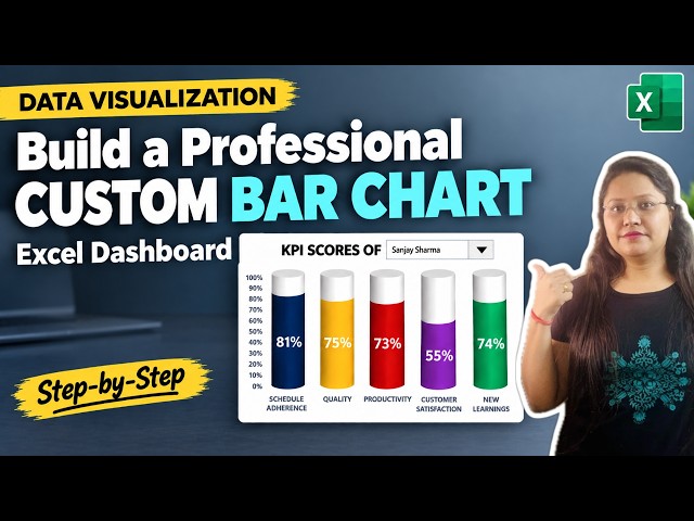
Learn how to visualize and track your key performance indicator ...
46 views
7d ago
14 views
4w ago
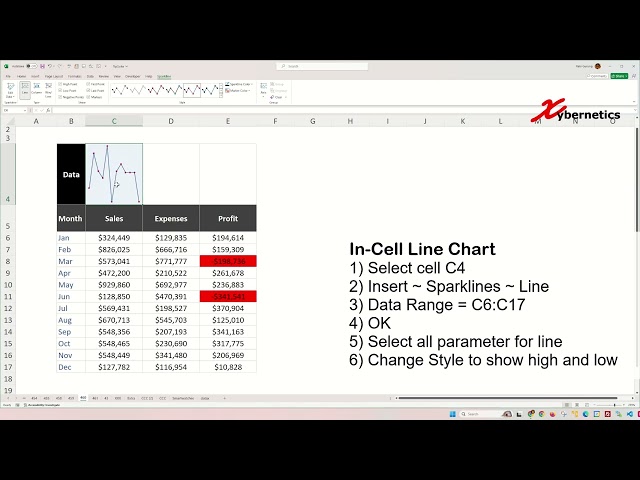
Learn how to create win loss line and column sparklines in Excel for data visualization. Win-loss sparkline charts, particularly ...
470 views
4d ago
Excel Sparklines And Charts In Cells [Easy Hack] Excel,Excel tutorial,Excel Sparklines,Excel charts in cells,how to add Sparklines ...
2 views
Want to learn how to use Looker Studio? In this beginner-friendly Looker Studio tutorial, I'll show you how to create reports, ...
76 views
Learn how to use the Charts section in Microsoft Excel with this complete step-by-step tutorial! In this video, you'll learn how to ...
276 views
Discover advanced visualization techniques in OpendTect that can help turn seismic data and attribute responses into clearer ...
321 views
How to Master Excel Pivot Tables, Slicers And Interactive Dashboards [2026 Quick Guide] Learn how to master Excel pivot tables, ...
48 views
CR-8000 Main Path View improves PCB net visualization by highlighting the signal and power paths between major components.
174 views










![Excel Sparklines And Charts In Cells [Easy Hack]](/api/proxy/image?url=https%3A%2F%2Fi.ytimg.com%2Fvi%2Fsvthw8TZYf4%2Fsddefault.jpg)



![How to Master Excel Pivot Tables, Slicers And Interactive Dashboards [2026 Quick Guide]](/api/proxy/image?url=https%3A%2F%2Fi.ytimg.com%2Fvi%2FF3xRY7aMRqk%2Fsddefault.jpg)
