ViewTube

ViewTube
Sign inSign upSubscriptions
Filters

Upload date

Type

Duration

Sort by

Features

Reset

32 results

coinslive
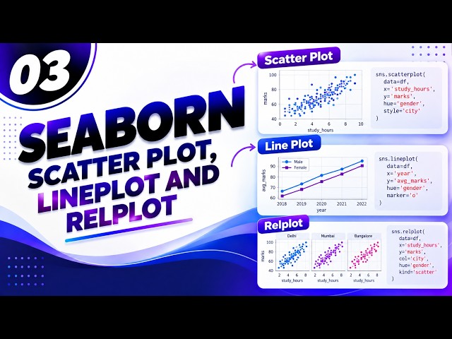
Data Visualisation with Matplotlib & Seaborn | Beginner Data Science Day 7

A table may hide an important pattern that becomes obvious within seconds when you create the right chart. In Day 7 of our ...

46:36
Data Visualisation with Matplotlib & Seaborn | Beginner Data Science Day 7

0 views

43 minutes ago

Variablz Academy and Parthiban Kannan | AI & Analytics Expert
Paired Bar Plot | Grouped Bar Plot using Matplotlib - Python Data Visualization Tutorial

In this chapter of our free Matplotlib Full Course (Tamil), we build a grouped (side-by-side) bar chart comparing Men vs Women ...

27:06
Paired Bar Plot | Grouped Bar Plot using Matplotlib - Python Data Visualization Tutorial

0 views

2 minutes ago

Stats Wire
From Zero to AI Engineer in 6 Months | Complete Roadmap

... Data Structures & Algorithms • Data Analysis with Pandas & NumPy • Data Visualization • Machine Learning Fundamentals ...

8:18
From Zero to AI Engineer in 6 Months | Complete Roadmap

1 view

2 minutes ago

Datavizn Stack
Tableau for Beginners: Load, Clean & Visualize Your First Dataset

Drop it in the comments #Tableau #DataVisualization #DataAnalytics #TableauTutorial #LearnTableau #DataCleaning ...

15:07
Tableau for Beginners: Load, Clean & Visualize Your First Dataset

1 view

41 minutes ago

WorldByTheNumbers
Egypt vs Nigeria: The Population Gap That Explodes

Egypt vs Nigeria — the population race, year by year, from 1960 to a projected 2050. There's no crossover in this one: Nigeria was ...

0:59
Egypt vs Nigeria: The Population Gap That Explodes

0 views

32 minutes ago

Kalyanam Chakrawarty
The Only Data Science Roadmap You Need in 2026 | Beginner to Job Ready

... Data Analysis (NumPy, Pandas) ✓ Data Visualization ✓ Machine Learning ✓ Deep Learning Basics ✓ Generative AI & LLMs ...

21:18
The Only Data Science Roadmap You Need in 2026 | Beginner to Job Ready

2 views

1 minute ago

NEF NEWS
Iran–U.S. Conflict 2026: Casualties & Damage Report

... #Infographic #WarStatistics #CurrentAffairs #InternationalRelations #NewsUpdate #GlobalConflict #DataVisualization #Facts.

Live
Iran–U.S. Conflict 2026: Casualties & Damage Report

0 views

0

Sedhu's knowledge Hub
Design Thinking on Big Data Analytics Tools | SNS INSTITUTIONS

... YARN) ✓ Apache Spark for Large-Scale Data Processing ✓ Hive, Pig, HBase, and NoSQL Databases ✓ Data Visualization ...

7:29
Design Thinking on Big Data Analytics Tools | SNS INSTITUTIONS

0 views

2 minutes ago

Melo
Meet RevLink: Your AccessPort Data, From Any Device

Meet RevLink—a browser-based workspace that makes AccessPort data easier to sync, organize, analyze, and share.

2:36
Meet RevLink: Your AccessPort Data, From Any Device

44 views

49 minutes ago

Sedhu's knowledge Hub
Case Study on Big Data Analytics Tools and Applications | SNS INSTITUTIONS

... for Fast Data Processing ✓ Hive, Pig, and HBase Overview ✓ Data Visualization and Business Insights ✓ Industry Applications ...

6:36
Case Study on Big Data Analytics Tools and Applications | SNS INSTITUTIONS

0 views

2 minutes ago

LiveStream07
Top 20 large countries by population | Population  live

Population live counter 24/7. Worldwide All countries' data are in this live video. Displaying Top 20 large countries in 1st column ...

9:18:43
Top 20 large countries by population | Population live

122 views

Streamed 34 minutes ago

TecHno RayZ
Lecture 12# Toffoli Gate Visualized in Quantum Circuits | Quantum Computing

In this video, we explore the Toffoli Gate, also known as the Controlled-Controlled-NOT (CCNOT) Gate, one of the most important ...

5:03
Lecture 12# Toffoli Gate Visualized in Quantum Circuits | Quantum Computing

1 view

17 minutes ago

Sachin Mehra
Master Pie, Donut & Area Charts in Excel | Day 14 Excel Course

Pie, Donut, Area Charts Explained #Shorts #Tutorial.

9:03
Master Pie, Donut & Area Charts in Excel | Day 14 Excel Course

0 views

14 minutes ago

DAMON Group
Damon Four way Pallet Shuttle System Case Collection

Additionally, when integrated with the Warehouse Management System (WMS), this solution enables real-time data visualization, ...

0:28
Damon Four way Pallet Shuttle System Case Collection

1 view

32 minutes ago

World In Data YT
Most Champions League Wins Ever 1956–2024 🏆 📊

Watch the full race! Data-driven sports history. #BarChartRace #DataVisualization #SportsHistory.

1:55
Most Champions League Wins Ever 1956–2024 🏆 📊

0 views

34 minutes ago

Arena Radar
Tauras Taurage vs Kauno Zalgiris II - Lithuanian I Lyga - Live Score

... and data visualization stream, not a broadcast of any official match footage. #LithuanianILyga #TaurasTaurage #KaunoZalgirisII ...

3:09:20
Tauras Taurage vs Kauno Zalgiris II - Lithuanian I Lyga - Live Score

183 views

Streamed 12 hours ago

TerraDecoded
Why Does Google Maps Hide These Places? A Big Suspense

See how the Cannikin blast size compares to Hiroshima in this data-driven visual breakdown of nuclear energy. This video ...

13:22
Why Does Google Maps Hide These Places? A Big Suspense

1 view

43 minutes ago

divagantehistory
NASA Lost a Spacecraft on Mars (And No One Knows Why)

In 2014, NASA sent a probe to Mars designed for a one-year mission. It lasted eleven. And when it died in December 2025—the ...

5:25
NASA Lost a Spacecraft on Mars (And No One Knows Why)

12 views

1 hour ago

How Did It Happen?
Mount St  Helens  The Day the Mountain Exploded

On the morning of May 18, 1980, Mount St. Helens erupted in the deadliest and most destructive volcanic eruption in the history of ...

23:14
Mount St Helens The Day the Mountain Exploded

2 views

54 minutes ago

Scale Verse
How many stars are there on the flags |Comparison Videos

... #EstadioAzteca #SportsData #3DComparison #SizeComparison #ScaleVerse #DataVisualization #3DAnimation #Perspective.

4:10
How many stars are there on the flags |Comparison Videos

0 views

1 hour ago