Upload date
All time
Last hour
Today
This week
This month
This year
Type
All
Video
Channel
Playlist
Movie
Duration
Short (< 4 minutes)
Medium (4-20 minutes)
Long (> 20 minutes)
Sort by
Relevance
Rating
View count
Features
HD
Subtitles/CC
Creative Commons
3D
Live
4K
360°
VR180
HDR
6,039 results
In this video, we explore the stark contrast in poverty rates between European and Asian nations, analyzing data from the last few ...
13,605 views
3 days ago
... subscribe for more global data visualizations. #CarProduction #CarProductionRace #AutomobileProduction #CarManufacturing ...
18,806 views
2 days ago
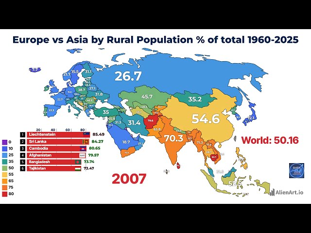
In this video, we analyze the shifting landscape of rural populations across European and Asian nations from 1960 to 2025.
2,736 views
4 days ago
In this video, we analyze the average daily income of the bottom 10% of the population across various European and Asian ...
2,353 views
1 day ago
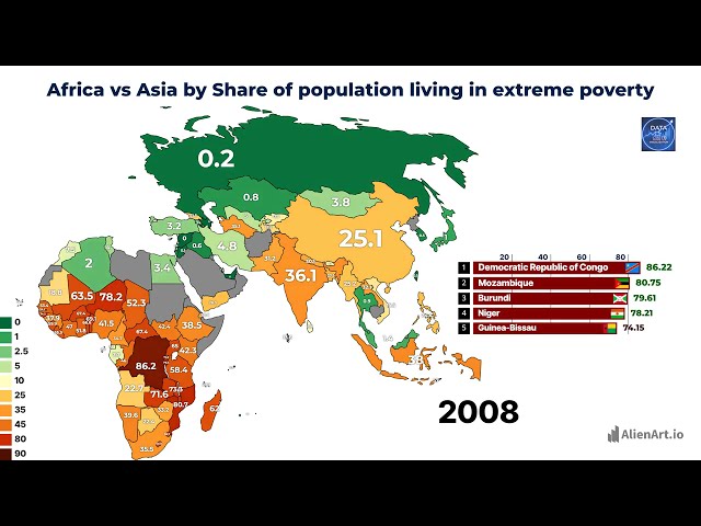
This video provides a comparative data visualization analyzing the trajectory of extreme poverty rates across African and Asian ...
2,467 views
Build an intuitive mental model of core data structures and algorithms using relatable, real-world analogies. Topics range from ...
76,751 views
... from 1960 to 2026, tracking the epic battle between American Airlines and Delta Air Lines through a dynamic data visualization.
5,122 views
Discover how obesity rates have evolved across Eurasia from 1980 to 2025 in this comprehensive data visualization. This video ...
2,235 views
6 days ago
In this course, you'll learn key Business Analytics concepts, work with tools such as Excel and Power BI, explore data visualization ...
861 views
18 hours ago
Host Avery Osen interviews Jennifer Hanni.
58 views
We often ask clients and collaborators to visualise their data and, at times, their statistical outputs. But how do we do this in a way ...
24 views
Welcome to Part 2 of our End-to-End Data Analytics Project! In Part 1, we extracted and cleaned our data using SQL. Now, it's time ...
117 views
... people build data visualizations. In this video, I go through some of the data science websites I think are actually worth knowing.
42,657 views
Prepare for a Data Visualization Intern interview with practical questions and sample answers covering data visualization, ...
18 views
𝖫𝖾𝖺𝗋𝗇 𝗁𝗈𝗐 𝗍𝗈 𝖽𝖾𝗌𝗂𝗀𝗇 𝖺 𝗉𝗋𝗈𝖿𝖾𝗌𝗌𝗂𝗈𝗇𝖺𝗅 infographic chart 𝖺𝗇𝖽 ...
6 views
7 days ago
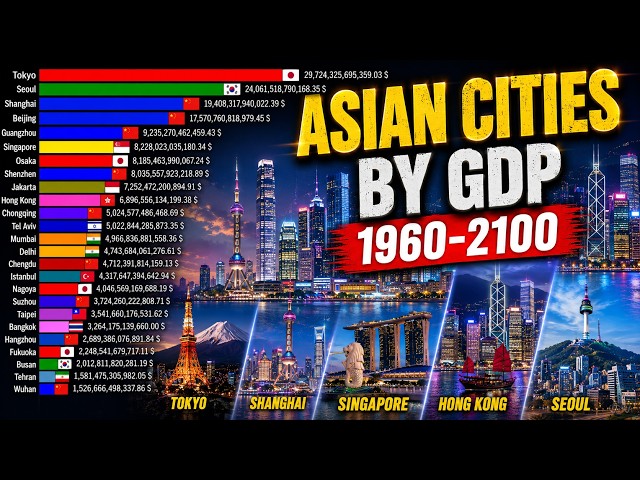
Discover the massive economic shift of Asian cities from 1960 to projected estimates in 2100. Watch as Tokyo, Shanghai, Beijing, ...
1,312 views
Data Visualization – CMA USA Section F | Technology & Analytics In this episode of CMA USA Exam Coach, we continue Section ...
37 views
Principles and Practices of Visual Data Communication Data and information visualization is the interdisciplinary practice of ...
10 views
It covers topics like data analysis, data visualization, regression techniques, and supervised learning in-depth via our applied ...
1,645 views
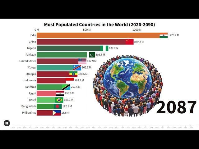
Watch the Most Populated Countries in the World from 2026 to 2090 in an exciting animated Bar Chart Race. See how population ...
74 views