Upload date
All time
Last hour
Today
This week
This month
This year
Type
All
Video
Channel
Playlist
Movie
Duration
Short (< 4 minutes)
Medium (4-20 minutes)
Long (> 20 minutes)
Sort by
Relevance
Rating
View count
Features
HD
Subtitles/CC
Creative Commons
3D
Live
4K
360°
VR180
HDR
29 results
... over here to my notebook and i am going to import matplotlib dot pi plot as as plt and then i say plt.subplots and um and in some ...
396 views
5 years ago
Multiple plots overlays linspace give one with very few points, more points show smoothness of the curve legend figure 1, figure2 ...
4,201 views
11 years ago
Week 4: Tutorial 04 Part 01: Plotting In 1 D Using Python.
1,165 views
3 years ago
This lesson expands on the optogenetic spike train data we worked with in the previous chapter. Now we have data recorded from ...
520 views
4 years ago
RubyConf 2018 - RubyPlot - Creating a Plotting Library for Ruby by Pranav Garg The talk introduces Rubyplot - the plotting library ...
932 views
7 years ago
Hi everyone, welcome back to our channel. In this video, We're going to show how to view count plot for the data, and profiling the ...
323 views
2 years ago
Heat maps are a more condensed, information-rich, and efficient version of the peri-stimulus time histograms (PSTHs) we saw in ...
679 views
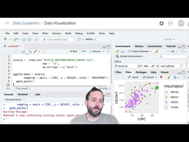
And that says: create a separate facet or subplot for each group that we want to divide things by. And to tell it which group, we put ...
553 views
Week 4: Tutorial 04 Part 02: Plotting In 2 D Using Python.
795 views
651 views
Using the plot command interactively ipython -pylab pylab brings in the libraries necessary for Scientific Computing. linspace, len ...
50 views
Plotting the data plot L vs. T2 using square function problem with 3 cols 3rd column is error error bar.
108 views
4,520 views
275 views
117 views
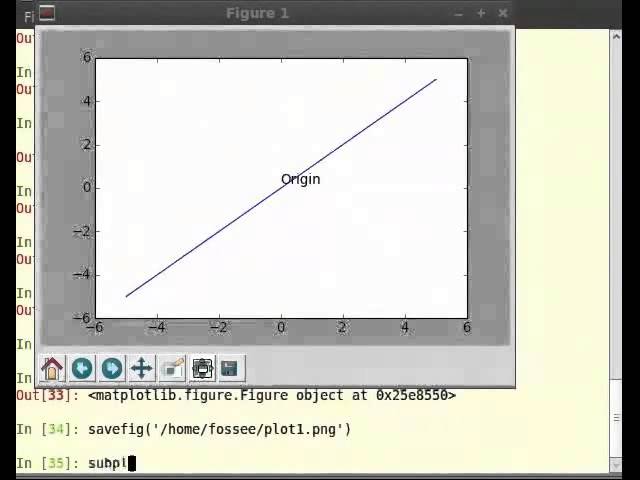
Saving plots basic savefig png, pdf, ps, eps, svg going to OS and looking at the file.
572 views
224 views
1,123 views
This chapter introduces data obtained from recordings of individual neurons, which we typically call single unit data (“units” being ...
1,814 views
Other types of plots scatter pie chart bar chart log illustration of other plots, matplotlib help.
67 views