ViewTube

ViewTube
Sign inSign upSubscriptions
Filters

Upload date

Type

Duration

Sort by

Features

Reset

129 results

The DataScience Boy
Python for Data Science #12 | Data Visualization with Matplotlib | Python

Python for Data Science — Day 12** Data visualization is an essential part of Data Science. In this session, we learn how to ...

1:04:13
Python for Data Science #12 | Data Visualization with Matplotlib | Python

8 views

1 day ago

Aftab Alam
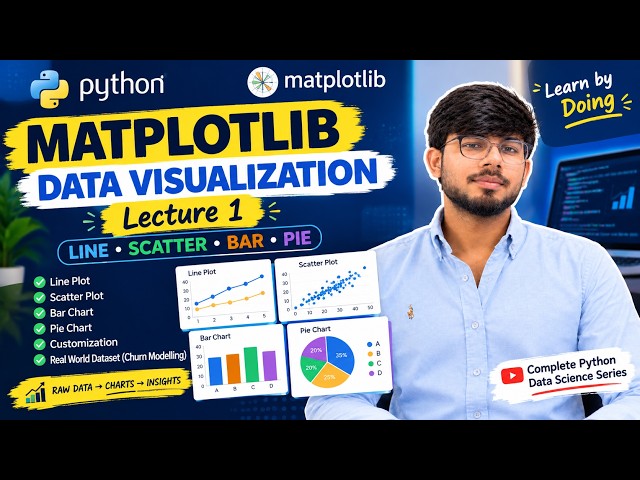
Matplotlib Lecture 1 | Data Visualization in Python | Line, Scatter, Bar & Pie Charts

Matplotlib Lecture 1 | Data Visualization in Python In today's class, I taught my students how to visualize data using Matplotlib, one ...

29:19
Matplotlib Lecture 1 | Data Visualization in Python | Line, Scatter, Bar & Pie Charts

101 views

2 days ago

VPro Skills
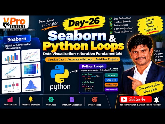
Day-26 | Seaborn & Python Loops | Data Visualization and Iteration Fundamentals

Learn Seaborn for creating powerful statistical visualizations and understand Python loops for repeating tasks efficiently. Explore ...

1:20:19
Day-26 | Seaborn & Python Loops | Data Visualization and Iteration Fundamentals

15 views

3 days ago

codingjanta
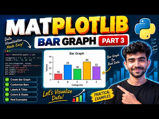
Matplotlib Bar Graph Tutorial in Python 🔥 | Part 3 | Data Visualization Made Easy 🚀

In this video, we will learn how to create Bar Graphs using Matplotlib in Python This is Part 3 of our Matplotlib series where ...

6:02
Matplotlib Bar Graph Tutorial in Python 🔥 | Part 3 | Data Visualization Made Easy 🚀

23 views

2 days ago

StatisticsMart
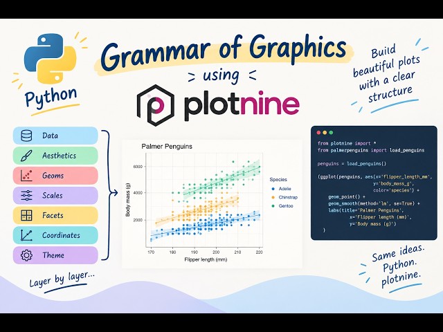
Data Visualisation in Python: The Grammar of Graphics Grammar of Graphics with Python & Plotnine

Learn how to create data visualisations in Python using plotnine and the Grammar of Graphics approach. Plotnine follows a ...

19:18
Data Visualisation in Python: The Grammar of Graphics Grammar of Graphics with Python & Plotnine

33 views

15 hours ago

CS AI Hub Hindi
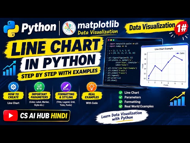
Python Line Chart using Matplotlib | Data Visualization 1# | Easy Explanation + Examples

Welcome to CS AI Hub Hindi! इस वीडियो में हम Python के Matplotlib Library की मदद से Data Visualization ...

11:36
Python Line Chart using Matplotlib | Data Visualization 1# | Easy Explanation + Examples

101 views

4 days ago

VPro Skills
Day-23 | Matplotlib in Python | Line Plot, Bar Chart & Scatter Plot Explained

In Day 23, learn Matplotlib in Python and create powerful visualizations using Line Plots, Bar Charts, and Scatter Plots.

1:23:57
Day-23 | Matplotlib in Python | Line Plot, Bar Chart & Scatter Plot Explained

144 views

Streamed 7 days ago

Aftab Alam
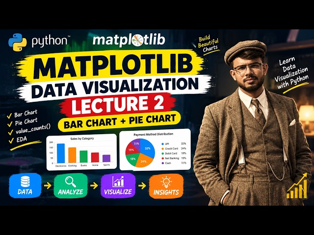
Matplotlib Lecture 2 | Bar Chart, Pie Chart & Data Visualization with Python

Welcome to Matplotlib Lecture 2! In this lecture, we continue our journey into Data Visualization with Python using Matplotlib.

15:28
Matplotlib Lecture 2 | Bar Chart, Pie Chart & Data Visualization with Python

36 views

11 hours ago

DEPTH OF BIOLOGY
Data Visualization with Matplotlib | Creating line plot | Labeling axes | Interpretation of plots

Data Visualization with Matplotlib | Creating line plot | Labeling axes,Legends & Interpretation In this One Shot Lecture, we cover ...

59:31
Data Visualization with Matplotlib | Creating line plot | Labeling axes | Interpretation of plots

748 views

4 days ago

Code Your Future
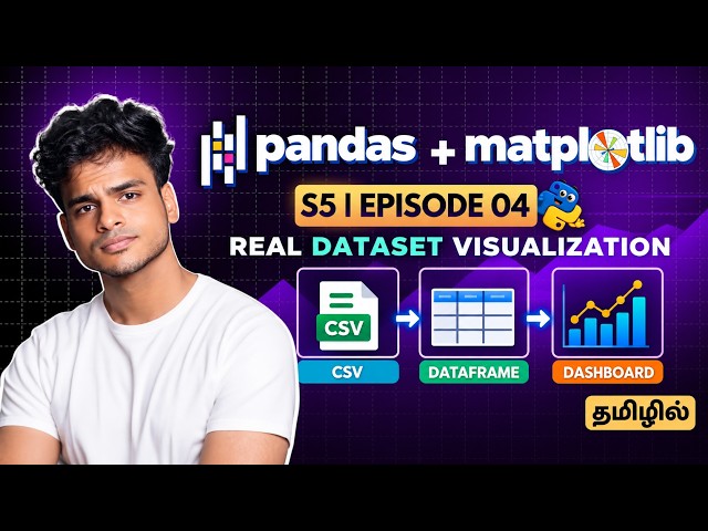
Pandas + Matplotlib Real Dataset Visualization | Matplotlib in Tamil S5 E4

In this episode, we move from simple chart examples to real-world data visualization using Pandas and Matplotlib. Learn Python ...

20:09
Pandas + Matplotlib Real Dataset Visualization | Matplotlib in Tamil S5 E4

415 views

6 days ago

Code Your Future
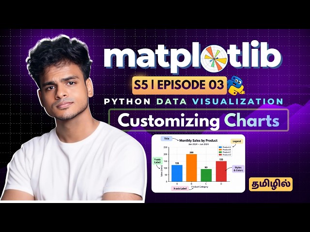
Customize Professional Charts with Python | Matplotlib in Tamil S5 E3

In this Matplotlib Tutorial in Tamil, we'll learn how to transform a basic chart into a clear, professional and easy-to-understand data ...

28:19
Customize Professional Charts with Python | Matplotlib in Tamil S5 E3

520 views

7 days ago

Study Hard IP
Data Visualization using Pyplot & Matplotlib | Class 12 IP Complete Chapter | CBSE Board

Master Data Visualization using Matplotlib & Pyplot for CBSE Class 12 Informatics Practices (IP)! In this video, we cover the ...

19:43
Data Visualization using Pyplot & Matplotlib | Class 12 IP Complete Chapter | CBSE Board

16 views

2 days ago

Data Geek is my name
Are These Revenue Values Outliers? | Python Box Plot Explained

Learn how to create and interpret a box plot in Python using Seaborn and Matplotlib. In this beginner-friendly Python data ...

8:46
Are These Revenue Values Outliers? | Python Box Plot Explained

47 views

15 hours ago

VPro Skills
Day-24 | Matplotlib Pie Chart, Heatmap & Box Plot Explained | Python

In Day 24, learn how to create Pie Charts, Heatmaps, and Box Plots using Matplotlib with simple practical examples. Understand ...

1:14:31
Day-24 | Matplotlib Pie Chart, Heatmap & Box Plot Explained | Python

260 views

6 days ago

codingjanta
Matplotlib Pie Chart Tutorial in Python 🔥 | Part 5 | Complete Guide (Labels, Autopct)

Learn how to create Pie Charts in Python using Matplotlib step by step in this Part 5 of the series In this video, you will ...

4:49
Matplotlib Pie Chart Tutorial in Python 🔥 | Part 5 | Complete Guide (Labels, Autopct)

8 views

23 minutes ago

codingjanta
Matplotlib Histogram Graph in Python 🔥 | Part 4 | Bins Explained + Real Examples

... tutorial hindi python histogram example bins in histogram data visualization python matplotlib part 4 histogram in python tutorial ...

3:00
Matplotlib Histogram Graph in Python 🔥 | Part 4 | Bins Explained + Real Examples

137 views

1 day ago

Aftab Alam
Pandas Lecture 7 | GroupBy, Aggregation & Data Visualization | EDA with Pandas

Pandas Lecture 7 | GroupBy, Aggregation & Data Visualization In today's lecture, I taught my students how to analyze and ...

12:43
Pandas Lecture 7 | GroupBy, Aggregation & Data Visualization | EDA with Pandas

64 views

3 days ago

Corporate King
Lecture 6: Categorical Plots in Python | Bar Plot, Box Plot, Violin Plot & Swarm Plot

If you are learning Python, Data Science, Data Analytics or Data Visualization, make sure you follow the complete course.

56:24
Lecture 6: Categorical Plots in Python | Bar Plot, Box Plot, Violin Plot & Swarm Plot

285 views

6 days ago

Data Geek is my name
Python Histogram Tutorial | Understand Revenue Distribution with Seaborn

Learn how to create and interpret a histogram in Python using Seaborn and Matplotlib. In this beginner-friendly data visualization ...

7:25
Python Histogram Tutorial | Understand Revenue Distribution with Seaborn

112 views

2 days ago

Corporate King
Lecture 7: Seaborn Regression Plots & Multi Plots in Python | Regplot, JointPlot & PairPlot

#Seaborn #Python #DataVisualization #PythonTutorial #DataScience #SeabornTutorial #MachineLearning #DataAnalytics ...

37:30
Lecture 7: Seaborn Regression Plots & Multi Plots in Python | Regplot, JointPlot & PairPlot

202 views

4 days ago