Upload date
All time
Last hour
Today
This week
This month
This year
Type
All
Video
Channel
Playlist
Movie
Duration
Short (< 4 minutes)
Medium (4-20 minutes)
Long (> 20 minutes)
Sort by
Relevance
Rating
View count
Features
HD
Subtitles/CC
Creative Commons
3D
Live
4K
360°
VR180
HDR
319 results
Learn about the Data Science Pipeline with the National Student Data Corps! The fifth step in the Data Science Pipeline is Data ...
256 views
3y ago
Presented by Alisa Rod. This video is part of a series of lectures recorded to teach about basic data visualization concepts.
399 views
4y ago
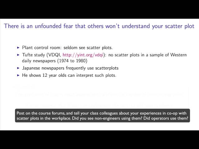
These videos are part of the FREE online book, "Process Improvement using Data", http://yint.org/pid Related is the Coursera ...
3,822 views
11y ago
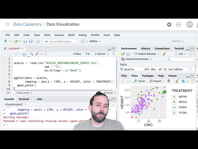
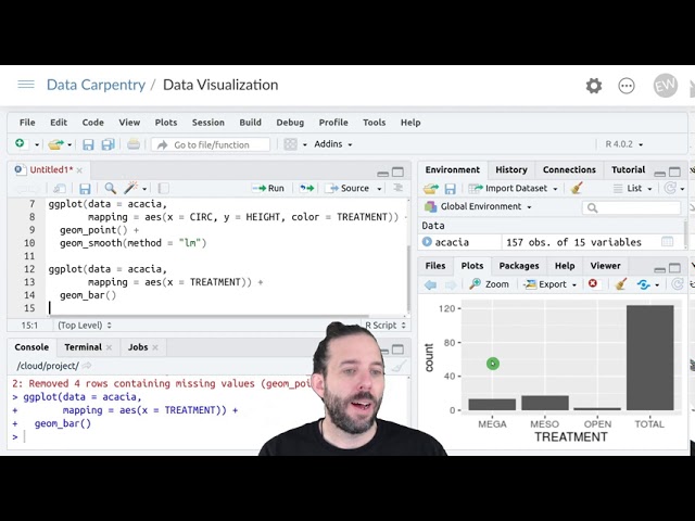
This segment covers the basics of creating ggplot objects. Course Description: This 1-hour course teaches students to create ...
1,740 views
And those were that's present in the lines that we saw that were fitted through the data those linear models. We've also seen ...
396 views
6y ago
Presented by David Christensen. This video is part of a series of lectures recorded to teach about basic data visualization ...
325 views
Let's talk about Data Visualization! We've been hearing this expression a lot lately, but do you really know how to put your data in ...
184 views
This video is part of the virtual useR! 2021 conference. Find supplementary material on our website https://user2021.r-project.org/.
764 views
5y ago
Then we looked at two different quality examples. Followed by some extra resources to help you visualize your data. So why is ...
182 views
Week 4: Tutorial 04 Part 01: Plotting In 1 D Using Python.
1,294 views
190 views
This segment covers different plot types, including boxplots, violin plots, and combined plots. Course Description: This 1-hour ...
3,959 views
Welcome to exploratory data analysis and data visualization. Before we get into the actual subject matter of the course, some ...
108 views
7y ago
This video demonstrates how to: 1 Create a dashboard with a sunburst chart. #dashboards #analytics #web #sunburst You can ...
1,217 views
python #flask #reportingtool #dataanalytics Stimulsoft Reports.PYTHON comprises a set of components for creating, viewing, ...
132 views
1y ago
154 views
This video is about how to group data when visualizing it using ggplot. And this can allow us to see if there are differences in the ...
601 views
... we want to transform or stretch them to reveal different things about the data. And we can do that in ggplot using various forms of ...
367 views
In this video, I explore a new and exciting topic: how to evaluate and compare different datasets effectively. I discuss the ...
29 views
3,759 views







![Dashboard Tools: Creating a Sunburst Chart [Shot on v2020]](/api/proxy/image?url=https%3A%2F%2Fi.ytimg.com%2Fvi%2FpSIr4KvXJjM%2Fsddefault.jpg)
![Python (Flask): Activating the report viewer in a Python application [2025]](/api/proxy/image?url=https%3A%2F%2Fi.ytimg.com%2Fvi%2F8AtmJyMJgPc%2Fsddefault.jpg)
![Python (Flask): Customizing the appearance of the Stimulsoft Viewer in a Python application [2025]](/api/proxy/image?url=https%3A%2F%2Fi.ytimg.com%2Fvi%2F5LU6JhIxF1c%2Fsddefault.jpg)