Upload date
All time
Last hour
Today
This week
This month
This year
Type
All
Video
Channel
Playlist
Movie
Duration
Short (< 4 minutes)
Medium (4-20 minutes)
Long (> 20 minutes)
Sort by
Relevance
Rating
View count
Features
HD
Subtitles/CC
Creative Commons
3D
Live
4K
360°
VR180
HDR
309 results
This video is part of the virtual useR! 2021 conference. Find supplementary material on our website https://user2021.r-project.org/.
764 views
5y ago
Demo of the PLG2 tool: http://plg.processmining.it/. The evaluation of process mining algorithms requires, as any other data ...
2,124 views
10y ago
This segment covers different plot types, including boxplots, violin plots, and combined plots. Course Description: This 1-hour ...
3,959 views
4y ago
Let's talk about Data Visualization! We've been hearing this expression a lot lately, but do you really know how to put your data in ...
184 views
A short introduction to the core concepts of network visualization. The presentation provides the minimal overview of the strategies ...
10,201 views
Presented by David Christensen. This video is part of a series of lectures recorded to teach about basic data visualization ...
325 views
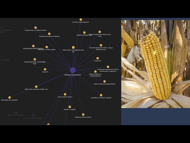
A system is converged when the residuals are close to 0 within a tolerance. How this is achieved depends on what solver you use, ...
1,409 views
XDSM diagrams are a good tool for visualizing models, understanding solver loops, and specifying interfaces between models ...
6,048 views
Variables in Python are *references*. When you assign a list variable to another list variable, you get a copy of the reference, not ...
775 views
3y ago
A brief introduction to the Arena3D web tool for 3D visualization of multilayer networks. I first explain how multilayer networks can ...
1,530 views
In this video we learn about the applications of Graph Data Science and how these approaches fit into the wider pipeline.
10,006 views
6y ago
Puhr, Harald; Müllner, Jakob Let Me Google That for You – Measuring global trends using Google Trends ...
278 views
python #flask #reportingtool #dataanalytics Stimulsoft Reports.PYTHON comprises a set of components for creating, viewing, ...
154 views
1y ago
This video demonstrates how to: 1 Create a dashboard with a waterfall chart. #dashboards #analytics #web #designer You can ...
556 views
Still staying with clustering, in this video, we look at how it works in higher dimensions. Using the same data set, we realize that ...
8,211 views
python #flask #reportingtool #businessintelligence Stimulsoft Reports.PYTHON comprises a set of components for creating, ...
99 views
Welcome to exploratory data analysis and data visualization. Before we get into the actual subject matter of the course, some ...
108 views
7y ago
Week 4: Tutorial 04 Part 01: Plotting In 1 D Using Python.
1,294 views
This video is part of the virtual useR! 2021 conference. Slides: ...
465 views
... we want to transform or stretch them to reveal different things about the data. And we can do that in ggplot using various forms of ...
368 views







![Python (Flask): Customizing the appearance of the Stimulsoft Viewer in a Python application [2025]](/api/proxy/image?url=https%3A%2F%2Fi.ytimg.com%2Fvi%2F5LU6JhIxF1c%2Fsddefault.jpg)
![Dashboard Tools: Creating a Waterfall Chart [Shot on v2020]](/api/proxy/image?url=https%3A%2F%2Fi.ytimg.com%2Fvi%2Fj06ytFZ89g4%2Fsddefault.jpg)

![Python (Flask): Changing the localization of the Stimulsoft Viewer in a Python application [2025]](/api/proxy/image?url=https%3A%2F%2Fi.ytimg.com%2Fvi%2Foqhj-ml5BD4%2Fsddefault.jpg)


