ViewTube

ViewTube
Sign inSign upSubscriptions
Filters

Upload date

Type

Duration

Sort by

Features

Reset

1,288 results

Utkarsh Minds-Data Science, analytics, AI
Data Analysis Using Boxplot | Python Data Visualization

In this practical Python Data Analysis tutorial, we'll learn how to create and understand a Boxplot to analyze the distribution, ...

6:35
Data Analysis Using Boxplot | Python Data Visualization

0 views

17h ago

Rahim Zulfiqar Ali
Pandas Data Visualization, EDA and AI-Powered Analytics Python | Excel AI Mastery 2026-2027

Pandas Data Visualization, EDA and AI-Powered Analytics | Python in Excel 365 Net Sales by Region Net Sales by Category Top ...

10:25
Pandas Data Visualization, EDA and AI-Powered Analytics Python | Excel AI Mastery 2026-2027

143 views

1d ago

Utkarsh Minds-Data Science, analytics, AI
Data Analysis Using Line Plot | Python & Pandas Data Visualization

In this practical Python Data Analysis tutorial, we'll learn how to create and understand a Line Plot to visualize data and identify ...

10:47
Data Analysis Using Line Plot | Python & Pandas Data Visualization

0 views

18h ago

Utkarsh Minds-Data Science, analytics, AI
Data Analysis Using Bar Charts | Python Data Visualization

In this practical Python Data Analysis tutorial, we'll learn how to create and understand Bar Charts to compare different categories ...

7:57
Data Analysis Using Bar Charts | Python Data Visualization

0 views

18h ago

Utkarsh Minds-Data Science, analytics, AI
Data Analysis Using Subplots | Python Data Visualization

In this practical Python Data Analysis tutorial, we'll learn how to create Subplots to display multiple charts or visualizations in a ...

5:07
Data Analysis Using Subplots | Python Data Visualization

3 views

17h ago

VPro Skills
Day-26 | Seaborn & Python Loops | Data Visualization and Iteration Fundamentals

Learn Seaborn for creating powerful statistical visualizations and understand Python loops for repeating tasks efficiently. Explore ...

1:20:19
Day-26 | Seaborn & Python Loops | Data Visualization and Iteration Fundamentals

13 views

1d ago

Utkarsh Minds-Data Science, analytics, AI
Data Analysis Using Area Plot | Python Data Visualization

In this practical Python Data Analysis tutorial, we'll learn how to create and understand an Area Plot to visualize data, compare ...

8:34
Data Analysis Using Area Plot | Python Data Visualization

1 view

18h ago

Aftab Alam
Matplotlib Lecture 1 | Data Visualization in Python | Line, Scatter, Bar & Pie Charts

Matplotlib Lecture 1 | Data Visualization in Python In today's class, I taught my students how to visualize data using Matplotlib, one ...

29:19
Matplotlib Lecture 1 | Data Visualization in Python | Line, Scatter, Bar & Pie Charts

37 views

18h ago

DEPTH OF BIOLOGY
Data Visualization with Matplotlib | Creating line plot | Labeling axes | Interpretation of plots

Data Visualization with Matplotlib | Creating line plot | Labeling axes,Legends & Interpretation In this One Shot Lecture, we cover ...

59:31
Data Visualization with Matplotlib | Creating line plot | Labeling axes | Interpretation of plots

628 views

3d ago

Utkarsh Minds-Data Science, analytics, AI
Data Correlation & Regplot in Python | Seaborn Data Visualization

How do two variables relate to each other? In this tutorial, we explore Correlation and Regplot using Python to understand ...

13:32
Data Correlation & Regplot in Python | Seaborn Data Visualization

1 view

19h ago

yitayew solomon
79. Data Analytics with Python Project | Complete End-to-End Data Analytics| Capstone Project Part 8

Welcome to the final project of our Data Analytics with Python playlist! This capstone project is designed to demonstrate how the ...

10:16
79. Data Analytics with Python Project | Complete End-to-End Data Analytics| Capstone Project Part 8

28 views

1d ago

cctmexico
🧹 Data Aggregation in Python: From 🤦🏻‍♀️ undecipherable chart to a ✨️ Professional ✨️ heatmap

💙 🤗 Thank you so much for liking this video if you found it helpful! Does your heatmap look saturated, illegible, or have ...

16:45
🧹 Data Aggregation in Python: From 🤦🏻‍♀️ undecipherable chart to a ✨️ Professional ✨️ heatmap

254 views

7d ago

codingjanta
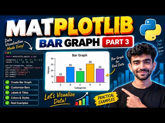
Matplotlib Bar Graph Tutorial in Python 🔥 | Part 3 | Data Visualization Made Easy 🚀

In this video, we will learn how to create Bar Graphs using Matplotlib in Python This is Part 3 of our Matplotlib series where ...

6:02
Matplotlib Bar Graph Tutorial in Python 🔥 | Part 3 | Data Visualization Made Easy 🚀

9 views

14h ago

QED Realized
Ep 21: See Your Data or Ship Wrong Answers | Plotting with Matplotlib

Plotting is not decoration. Summary statistics lie by omission: four datasets can share the same means, the same variances, and ...

15:00
Ep 21: See Your Data or Ship Wrong Answers | Plotting with Matplotlib

18 views

1d ago

Utkarsh Minds-Data Science, analytics, AI
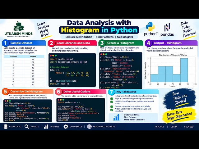
Data Analysis Using Histogram | Python Data Visualization

In this practical Python Data Analysis tutorial, we'll learn how to create and understand a Histogram to visualize the distribution of ...

9:16
Data Analysis Using Histogram | Python Data Visualization

0 views

18h ago

Digital Skills Academy
Webinar on Data Analysis with Python and Generative AI

Webinar on Data Analysis with Python and Generative AI | Digital Skills Academy & SA Consulting Discover how Python, Data ...

1:40:43
Webinar on Data Analysis with Python and Generative AI

24 views

2d ago

RR Consultancy Assignment Guidance
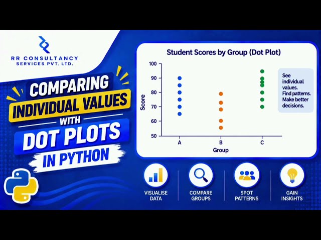
Comparing Individual Values with Dot Plots in Python - #python #matplotlib #datascience #coding

Dot plots in Python Data visualization in Python Matplotlib dot plot tutorial Seaborn data visualization Comparing individual values ...

1:45
Comparing Individual Values with Dot Plots in Python - #python #matplotlib #datascience #coding

9 views

1d ago

Analytics in 10 Minutes
How to Calculate Rolling Average in Power BI Using Variables in DAX

Learn two different ways to calculate a rolling average (moving average) in Power BI — using native DAX measures and using a ...

9:08
How to Calculate Rolling Average in Power BI Using Variables in DAX

887 views

4d ago

SK DataLabs
Data Visualization in Python using Matplotlib | Bar Plot & Pie Plot | Part 2

DATA VISUALIZATION USING MATPLOTLIB — PART 2 Welcome to SK DataLabs! In this lecture, we continue our journey into ...

31:10
Data Visualization in Python using Matplotlib | Bar Plot & Pie Plot | Part 2

41 views

6d ago

Omar Kweidy
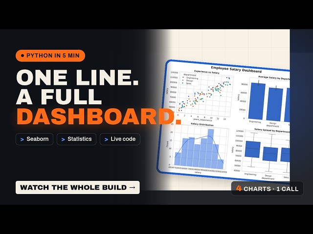
One Line, A Full Dashboard: The Complete Seaborn Guide in Python #python #pythonprogramming

Seaborn turns a DataFrame into statistical charts with a fraction of the Matplotlib code. The complete guide: what it adds, when to ...

4:53
One Line, A Full Dashboard: The Complete Seaborn Guide in Python #python #pythonprogramming

19 views

5d ago