ViewTube

ViewTube
Sign inSign upSubscriptions
Filters

Upload date

Type

Duration

Sort by

Features

Reset

113 results

The DataScience Boy
Python for Data Science #12 | Data Visualization with Matplotlib | Python

Python for Data Science — Day 12** Data visualization is an essential part of Data Science. In this session, we learn how to ...

1:04:13
Python for Data Science #12 | Data Visualization with Matplotlib | Python

4 views

8h ago

Aftab Alam
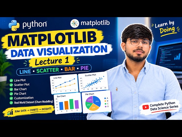
Matplotlib Lecture 1 | Data Visualization in Python | Line, Scatter, Bar & Pie Charts

Matplotlib Lecture 1 | Data Visualization in Python In today's class, I taught my students how to visualize data using Matplotlib, one ...

29:19
Matplotlib Lecture 1 | Data Visualization in Python | Line, Scatter, Bar & Pie Charts

53 views

1d ago

VPro Skills
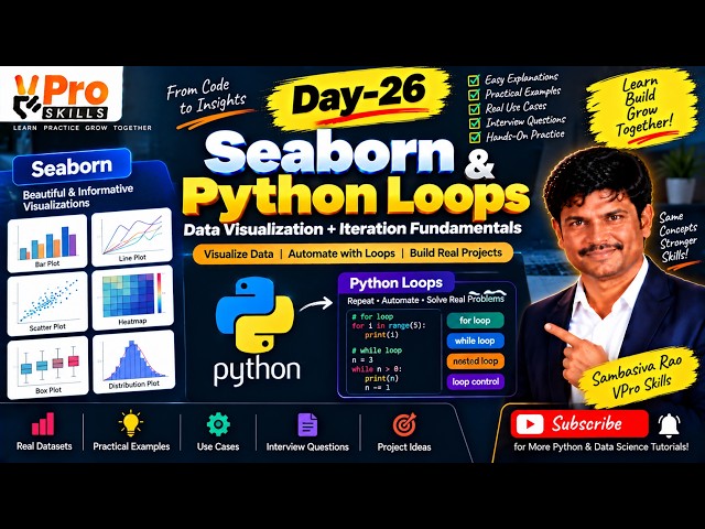
Day-26 | Seaborn & Python Loops | Data Visualization and Iteration Fundamentals

Learn Seaborn for creating powerful statistical visualizations and understand Python loops for repeating tasks efficiently. Explore ...

1:20:19
Day-26 | Seaborn & Python Loops | Data Visualization and Iteration Fundamentals

14 views

2d ago

codingjanta
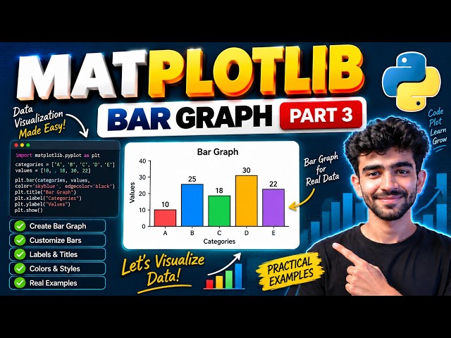
Matplotlib Bar Graph Tutorial in Python 🔥 | Part 3 | Data Visualization Made Easy 🚀

In this video, we will learn how to create Bar Graphs using Matplotlib in Python This is Part 3 of our Matplotlib series where ...

6:02
Matplotlib Bar Graph Tutorial in Python 🔥 | Part 3 | Data Visualization Made Easy 🚀

18 views

1d ago

CS AI Hub Hindi
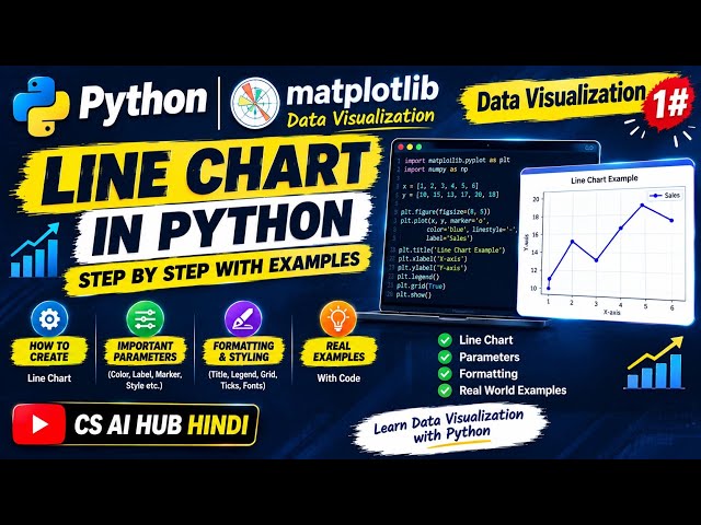
Python Line Chart using Matplotlib | Data Visualization 1# | Easy Explanation + Examples

Welcome to CS AI Hub Hindi! इस वीडियो में हम Python के Matplotlib Library की मदद से Data Visualization ...

11:36
Python Line Chart using Matplotlib | Data Visualization 1# | Easy Explanation + Examples

82 views

3d ago

VPro Skills
Day-23 | Matplotlib in Python | Line Plot, Bar Chart & Scatter Plot Explained

In Day 23, learn Matplotlib in Python and create powerful visualizations using Line Plots, Bar Charts, and Scatter Plots.

1:23:57
Day-23 | Matplotlib in Python | Line Plot, Bar Chart & Scatter Plot Explained

138 views

Streamed 6d ago

SK DataLabs
Data Visualization in Python using Matplotlib | Bar Plot & Pie Plot | Part 2

DATA VISUALIZATION USING MATPLOTLIB — PART 2 Welcome to SK DataLabs! In this lecture, we continue our journey into ...

31:10
Data Visualization in Python using Matplotlib | Bar Plot & Pie Plot | Part 2

41 views

7d ago

Code Your Future
Pandas + Matplotlib Real Dataset Visualization | Matplotlib in Tamil S5 E4

In this episode, we move from simple chart examples to real-world data visualization using Pandas and Matplotlib. Learn Python ...

20:09
Pandas + Matplotlib Real Dataset Visualization | Matplotlib in Tamil S5 E4

336 views

5d ago

DEPTH OF BIOLOGY
Data Visualization with Matplotlib | Creating line plot | Labeling axes | Interpretation of plots

Data Visualization with Matplotlib | Creating line plot | Labeling axes,Legends & Interpretation In this One Shot Lecture, we cover ...

59:31
Data Visualization with Matplotlib | Creating line plot | Labeling axes | Interpretation of plots

691 views

3d ago

Code Your Future
Customize Professional Charts with Python | Matplotlib in Tamil S5 E3

In this Matplotlib Tutorial in Tamil, we'll learn how to transform a basic chart into a clear, professional and easy-to-understand data ...

28:19
Customize Professional Charts with Python | Matplotlib in Tamil S5 E3

512 views

6d ago

Study Hard IP
Data Visualization using Pyplot & Matplotlib | Class 12 IP Complete Chapter | CBSE Board

Master Data Visualization using Matplotlib & Pyplot for CBSE Class 12 Informatics Practices (IP)! In this video, we cover the ...

19:43
Data Visualization using Pyplot & Matplotlib | Class 12 IP Complete Chapter | CBSE Board

12 views

1d ago

codingjanta
Matplotlib Histogram Graph in Python 🔥 | Part 4 | Bins Explained + Real Examples

... tutorial hindi python histogram example bins in histogram data visualization python matplotlib part 4 histogram in python tutorial ...

3:00
Matplotlib Histogram Graph in Python 🔥 | Part 4 | Bins Explained + Real Examples

6 views

1h ago

Ultralytics
How to Create Heatmaps with Ultralytics YOLO26 | Visualize Object Activity | VisionAI in Retail 🚀

See where activity happens most within a video or live stream using Ultralytics YOLO26 and heatmaps. By combining object ...

6:03
How to Create Heatmaps with Ultralytics YOLO26 | Visualize Object Activity | VisionAI in Retail 🚀

1,069 views

7d ago

CODINGFORFREEDOM
PYTHON CODING TUTORIALS

Ever wondered why Python is the absolute gold standard for data science and analytics? In our latest tutorial, we break down ...

2:39
PYTHON CODING TUTORIALS

0 views

7d ago

VPro Skills
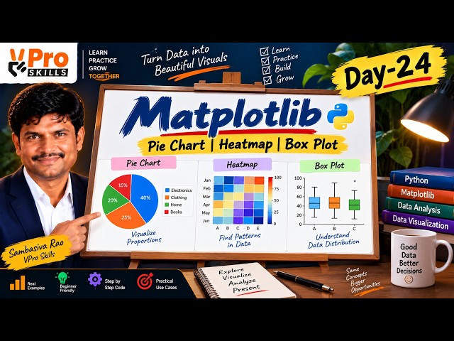
Day-24 | Matplotlib Pie Chart, Heatmap & Box Plot Explained | Python

In Day 24, learn how to create Pie Charts, Heatmaps, and Box Plots using Matplotlib with simple practical examples. Understand ...

1:14:31
Day-24 | Matplotlib Pie Chart, Heatmap & Box Plot Explained | Python

213 views

5d ago

webitya
Matplotlib Pie Charts & Histograms in Python | plt.pie(), autopct, explode, startangle & plt.hist()

Learn Matplotlib Pie Charts and Histograms in Python with this practical Data Science lesson. In this tutorial, you will learn ...

36:00
Matplotlib Pie Charts & Histograms in Python | plt.pie(), autopct, explode, startangle & plt.hist()

68 views

7d ago

Corporate King
Lecture 6: Categorical Plots in Python | Bar Plot, Box Plot, Violin Plot & Swarm Plot

If you are learning Python, Data Science, Data Analytics or Data Visualization, make sure you follow the complete course.

56:24
Lecture 6: Categorical Plots in Python | Bar Plot, Box Plot, Violin Plot & Swarm Plot

199 views

5d ago

Aftab Alam
Pandas Lecture 7 | GroupBy, Aggregation & Data Visualization | EDA with Pandas

Pandas Lecture 7 | GroupBy, Aggregation & Data Visualization In today's lecture, I taught my students how to analyze and ...

12:43
Pandas Lecture 7 | GroupBy, Aggregation & Data Visualization | EDA with Pandas

53 views

2d ago

Corporate King
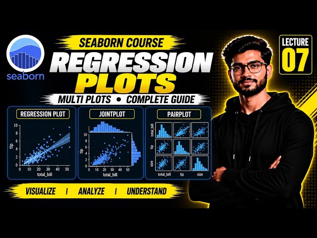
Lecture 7: Seaborn Regression Plots & Multi Plots in Python | Regplot, JointPlot & PairPlot

#Seaborn #Python #DataVisualization #PythonTutorial #DataScience #SeabornTutorial #MachineLearning #DataAnalytics ...

37:30
Lecture 7: Seaborn Regression Plots & Multi Plots in Python | Regplot, JointPlot & PairPlot

190 views

3d ago

I'am Rajinikanth Vadla
NumPy, Pandas & Seaborn Tutorial for Beginners | Python MLOps Day 34

Learn NumPy, Pandas, and Seaborn in this Day 34 MLOps class recording. Follow practical Python examples for working with ...

1:28:01
NumPy, Pandas & Seaborn Tutorial for Beginners | Python MLOps Day 34

84 views

12h ago