Upload date
All time
Last hour
Today
This week
This month
This year
Type
All
Video
Channel
Playlist
Movie
Duration
Short (< 4 minutes)
Medium (4-20 minutes)
Long (> 20 minutes)
Sort by
Relevance
Rating
View count
Features
HD
Subtitles/CC
Creative Commons
3D
Live
4K
360°
VR180
HDR
2,833 results
Te imaginas crear un dashboard profesional, interactivo y desde cero usando solo Python? ¡En este video lo vas a lograr!
8,608 views
8 months ago
In this chapter, you'll understand what Plotly is, why it's widely used for interactive data visualization, and how to install and set it ...
75 views
3 months ago
YouTube Video Description Welcome to another exciting data visualization tutorial on DataViz! In this video, we dive into ...
592 views
9 months ago
Hello Everyone! Today, in this video, I am going to step-by-step guide you on How to install Plotly with the latest Python on ...
263 views
2 months ago
DataVisualization #Python #Plotly #LinePlot #PythonTutorial #Coding #DataScience Ready to create stunning interactive ...
327 views
In this video, I cover the top 2 Python libraries for data visualisation: Matplotlib and Plotly. Matplotlib is the most well-known and ...
837 views
Get started with DataCamp and their Finance with Python track today! https://datacamp.pxf.io/RGZMVb In this video, I'll show you ...
117,683 views
In this new walkthrough, we take maritime data from Excel and transform it into a Dash app featuring: - Interactive maps (latitude, ...
306 views
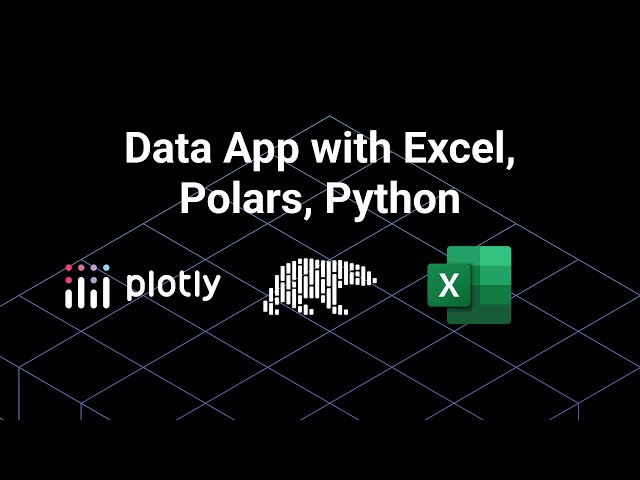
In this new walkthrough, we explore how to use the blazing-fast Polars dataframe library in a Dash app, featuring a dynamic Excel ...
354 views
Mastering Interactive Data Visualization with Plotly in Python | Build Stunning Charts for Business Dashboards Want to turn ...
244 views
6 months ago
Plotly #TreeMap #DataVisualization #Python #Tutorial Welcome to our Data Visualization with Plotly series! In this tutorial, we'll ...
103 views
7 months ago
Please watch: "ChatGPT's SECRET Mini Games for Kids! | Super Fun, Super Easy!
9 views
In this video, you'll learn how to visualize machine learning models in 3D using Python and Plotly — a powerful combination for ...
549 views
Overview: Want to turn your data into dynamic, interactive visuals with just a few lines of Python? In this beginner-friendly episode, ...
415 views
Visually explained breakdown of Python vs Power BI for data visualization, showing when to use code and when to use tools.
18,360 views
Watch me build a complete financial analysis dashboard from scratch with AI assistance! In this live coding session, I work with ...
1,286 views
Descubre cómo crear impresionantes diagramas de Sankey interactivos para analizar tus datos de ventas usando Python!
719 views
Learn how to create an interactive Annotated Timeline using Python! In this tutorial, we will explore Matplotlib, Plotly, and Pandas ...
172 views
10 months ago
Want to build **interactive dashboards** right inside your **Jupyter Notebook**? In this video, you'll learn how to create powerful, ...
5,256 views
Streamlit vs Dash – Which Python Dashboard Framework Is Better? In this video, we compare two of the most popular Python ...
2,291 views


![How to Install Plotly with latest Python on Windows 10/11 [ 2025 Update ] Plotly Tutorial](/api/proxy/image?url=https%3A%2F%2Fi.ytimg.com%2Fvi%2FSmoaSXEZgYA%2Fsddefault.jpg)