Upload date
All time
Last hour
Today
This week
This month
This year
Type
All
Video
Channel
Playlist
Movie
Duration
Short (< 4 minutes)
Medium (4-20 minutes)
Long (> 20 minutes)
Sort by
Relevance
Rating
View count
Features
HD
Subtitles/CC
Creative Commons
3D
Live
4K
360°
VR180
HDR
1,914 results
Pandas Data Visualization, EDA and AI-Powered Analytics | Python in Excel 365 Net Sales by Region Net Sales by Category Top ...
61 views
6 hours ago
Stop looking at ugly spreadsheets and start building beautiful, visual stories with Python. Welcome back to ABAYSA with AI, your ...
194 views
6 days ago
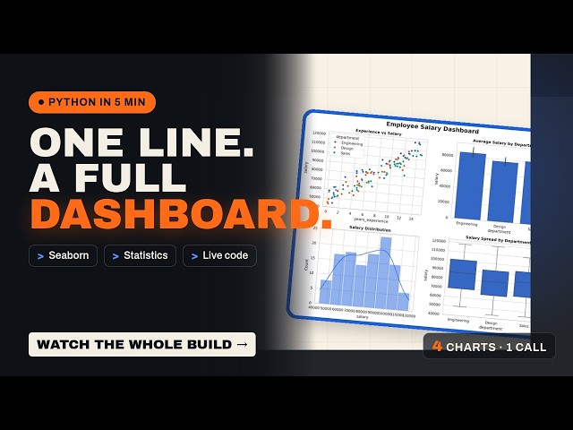
Learn Seaborn for creating powerful statistical visualizations and understand Python loops for repeating tasks efficiently. Explore ...
5 views
7 hours ago
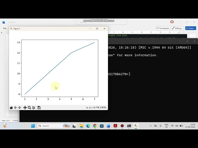
Data Visualization with Matplotlib | Creating line plot | Labeling axes,Legends & Interpretation In this One Shot Lecture, we cover ...
521 views
1 day ago
Six free data visualization courses, checked by hand — and the one thing most "free courses" lists leave out: whether the ...
549 views
Welcome to Part 3 of the Data Visualization with Python course! In this video, we build on the fundamentals to explore advanced ...
132 views
IIT Kanpur - Professional Certificate Course in AI-Powered Data Analytics ...
15,616 views
Streamed 6 days ago
Welcome to Day 184 of The Complete Python Bootcamp. In this session, you will explore an introduction to creating interactive ...
31 views
Welcome to the final project of our Data Analytics with Python playlist! This capstone project is designed to demonstrate how the ...
17 views
14 hours ago
... line plot python matplotlib tutorial python matplotlib tutorial line graph python matplotlib part 2 data visualization python python ...
9 hours ago
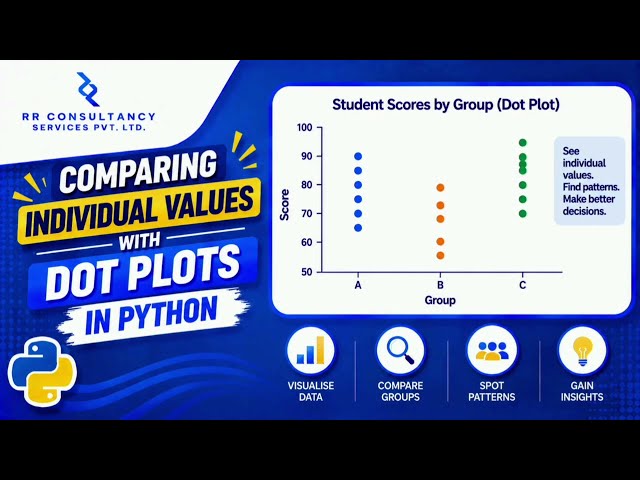
Dot plots in Python Data visualization in Python Matplotlib dot plot tutorial Seaborn data visualization Comparing individual values ...
4 views
13 hours ago
Webinar on Data Analysis with Python and Generative AI | Digital Skills Academy & SA Consulting Discover how Python, Data ...
19 views
18 hours ago
DATA VISUALIZATION USING MATPLOTLIB — PART 2 Welcome to SK DataLabs! In this lecture, we continue our journey into ...
39 views
5 days ago
Seaborn turns a DataFrame into statistical charts with a fraction of the Matplotlib code. The complete guide: what it adds, when to ...
16 views
4 days ago
Want to get started with NumPy, Pandas, and Matplotlib? This video is a beginner-friendly introduction to three of the most widely ...
55 views
Learn two different ways to calculate a rolling average (moving average) in Power BI — using native DAX measures and using a ...
811 views
3 days ago
In Day 23, learn Matplotlib in Python and create powerful visualizations using Line Plots, Bar Charts, and Scatter Plots.
125 views
Streamed 4 days ago
Welcome to this tutorial on Comparing Average Values Across Categories with Mean Plots in Python! When analyzing data ...
1 view
... we will again customize and finalize the visualization data So in this way for example we have to draw a line plot in the python ...
3 views
In this video, we will start our Matplotlib Full Course and learn the basics of Data Visualization in Python. Agar aap beginner ho ya ...
92 views