Upload date
All time
Last hour
Today
This week
This month
This year
Type
All
Video
Channel
Playlist
Movie
Duration
Short (< 4 minutes)
Medium (4-20 minutes)
Long (> 20 minutes)
Sort by
Relevance
Rating
View count
Features
HD
Subtitles/CC
Creative Commons
3D
Live
4K
360°
VR180
HDR
42 results
In this short, you'll get a clear Python for Data Science roadmap to help you stay ahead in 2026. We walk through the complete ...
1,932 views
4 hours ago
In this tutorial, we walk you step by step through data cleaning and analysis of an e-commerce sales dataset using Python.
0 views
11 hours ago
Data visualization is one of the most important skills in Data Science, Machine Learning, and Analytics. In this video, you will ...
8 hours ago
Want to create stunning charts, graphs, and dashboards using Python? In this YouTube Shorts video, you'll discover the top ...
103 views
17 hours ago
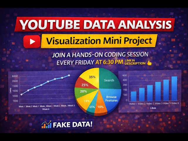
Welcome to this Data Visualization Mini Project using Python & Matplotlib! In this video, we analyze YouTube channel fake data ...
Welcome to Day 9 of the Python Programming Bootcamp! In this video, you'll learn how to work with some of the most powerful ...
13 views
14 hours ago
Welcome to AI ML Explainer! We simplify AI, ML, deep learning, and agent-based systems through clear explanations.
18 views
19 hours ago
Built using: Python Matplotlib animation Mathematical wave functions This type of visualization is used in: ✓ AI learning concepts ...
5 hours ago
Free Data Analyst KickStarter Pack - https://datacoaching4628.graphy.com/courses/dataanalyst-freecourse Check Data Analytics ...
1,478 views
16 hours ago
Bubble sort algorithm animation. Ever wondered how computers sort data? This is Bubble Sort visualized! It compares two ...
8 views
13 hours ago
Grab your popcorn. It's showtime. Forget boring 10-hour tutorials that put you to sleep. This isn't just a coding course; it's a journey.
20 views
9 hours ago
Python for Data Science – DAY 1 | Learn Python From Scratch (Beginner Friendly) **Welcome to Day 1 of Python for Data ...
32 views
Learn how to visualize survival rates by passenger class using pandas and matplotlib. This lesson covers grouping Titanic data by ...
0
Start Your AI & ML Journey with Techmindshub! 6-Month Professional Course in Artificial Intelligence & Machine Learning ...
5 views
10 hours ago
I always adored visualizations comparing various projections vs the true size of the countries, and I have been planning to create ...
Alguna vez te has preguntado cómo distingue Instagram una cuenta real de un bot de spam? En este vídeo vamos a construir ...
4 views
1 hour ago
Sudoku is a common number puzzle, that can be seen in newspapers, and online portals. It is a 9 x 9 grid, and the idea is to fill ...
2 hours ago
How to Choose the Right Chart for Your Data | Data Visualization Guide | In Hindi Stop Using Wrong Charts! How to Choose the ...
In diesem Blogbeitrag erfahren Sie, wie Sie den Fehler `UnboundLocalError: local variable 'x_min' referenced before assignment` ...
12 hours ago