Upload date
All time
Last hour
Today
This week
This month
This year
Type
All
Video
Channel
Playlist
Movie
Duration
Short (< 4 minutes)
Medium (4-20 minutes)
Long (> 20 minutes)
Sort by
Relevance
Rating
View count
Features
HD
Subtitles/CC
Creative Commons
3D
Live
4K
360°
VR180
HDR
2,658 results
Need some help with a project or some consulting? Contact me here: https://www.neuralnine.com/services Code: ...
2,960 views
11 days ago
Learn Matplotlib from scratch in this complete beginner-friendly Python tutorial covering everything from basic plots to professional ...
120 views
4 weeks ago
This video shows how to install matplotlib on Python 3.14.6 It will walk you through, step-by-step, how to install matplotlib on ...
42 views
2 weeks ago
How to Add Error Bars in Matplotlib Python [2026 Guide] In today's video we cover: Matplotlib, Python, add error bars matplotlib, ...
7 views
Are you still creating basic, lifeless charts in Python? In this comprehensive tutorial, you'll learn to master Matplotlib ...
51 views
Welcome to It's Probably Coding! The free Python programming series built specifically for beginners. How to watch this video: ...
5 views
Matplotlib is Python's most powerful data visualization library — and most tutorials only scratch the surface. This crash course ...
34 views
11 views
3 weeks ago
Create Stunning Pie Charts in Python | Matplotlib Step-by-Step Tutorial In this video, you will learn how to create a beautiful pie ...
4 views
2D Histogram Plot in Python | Easy Matplotlib Tutorial for Beginners Learn how to create a 2D Histogram Plot in Python using ...
10 views
10 days ago
Namaste dosto! Is video mein maine Matplotlib ko bahut hi simple language mein explain kiya hai. Agar aap Python seekh ...
In this session, we continued our Data Visualization with Matplotlib series — picking up from where we left off and diving into more ...
3 views
Welcome to Lesson 5 (Part 2)! Now that we've mastered backend data analytics, it's time to bring your app to life with stunning, ...
200 views
Welcome to the Complete Data Science with Python series. This course takes you through the complete Data Science ...
2 views
4 days ago
Sigmoid Activation Function in Python | Easy Matplotlib Tutorial for Beginners Learn how to plot the Sigmoid Activation Function ...
How to Create a Boxplot in Matplotlib Pyhton [2026 Guide] In today's video we cover: Matplotlib, Python, matplotlib boxplot, python ...
6 views
Learn how to create powerful and professional data visualizations using Matplotlib, one of the most popular Python libraries for ...
Want to transform boring data into spectacular graphics like a pro? This is the place for you. Here you'll learn to master ...
45 views
Welcome to Day 116 of the NetGuardians Certified Basic of Python Programming. 6 Month journey to become confident in Python ...
8 days ago
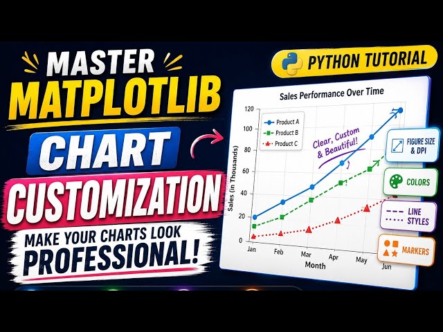
Want to make your Matplotlib charts look professional? In this beginner-friendly Python tutorial, you'll learn how to customize your ...
22 views


![How to Add Error Bars in Matplotlib Python [2026 Guide]](/api/proxy/image?url=https%3A%2F%2Fi.ytimg.com%2Fvi%2FbeBw0RGe4Ec%2Fsddefault.jpg)


![How to Create a Boxplot in Matplotlib Pyhton [2026 Guide]](/api/proxy/image?url=https%3A%2F%2Fi.ytimg.com%2Fvi%2Fna7LegmbvSs%2Fsddefault.jpg)