Upload date
All time
Last hour
Today
This week
This month
This year
Type
All
Video
Channel
Playlist
Movie
Duration
Short (< 4 minutes)
Medium (4-20 minutes)
Long (> 20 minutes)
Sort by
Relevance
Rating
View count
Features
HD
Subtitles/CC
Creative Commons
3D
Live
4K
360°
VR180
HDR
64 results
For more information on Nick Eagles, check https://bsky.app/profile/nick-eagles.bsky.social. For more information about the ...
40 views
4 months ago
In this video, we'll explore the essential techniques for saving your Seaborn plots in Python, ensuring that your visualizations are ...
0 views
1 month ago
In this video, we dive into the powerful data visualization library Seaborn, focusing on how to effectively plot frequency ...
4 views
3 months ago
In this video, we dive into the world of data visualization using Seaborn, a powerful Python library. Specifically, we'll explore how ...
1 view
Ever wondered who spends the MOST time on social media? In this video, we analyze a dataset of 62 users to uncover trends in ...
69 views
10 months ago
In this video, we'll explore the essential techniques for adjusting tick settings on Seaborn heatmaps to enhance your data ...
18 views
5 months ago
In this video, we delve into the intricacies of visualizing data with Seaborn's violin plots, specifically focusing on how to handle ...
2 months ago
In this video, we'll explore the powerful data visualization library Seaborn and learn how to create multiple boxplots to effectively ...
9 months ago
Bars not fitting to X-axis ticks in a Seaborn distplot I hope you found a solution that worked for you :) The Content is licensed under ...
8 months ago
In this video, we'll explore the powerful data visualization library Seaborn and learn how to create barplots that effectively ...
5 views
7 months ago
Seaborn Class Overview – Xellux Technologies Training in Nigeria! Join us for an exclusive overview of Xellux Technologies' ...
24 views
11 months ago
In this video, we'll explore a common challenge faced by data visualizers using Seaborn: inverting the Y-axis of a BarPlot while ...
13 views
Only the first row of annotations displayed on seaborn heatmap Hey guys! Hopefully you found a solution that helped you!
In this video, we'll explore how to enhance your data visualizations by overlaying box plots on swarm plots using Seaborn, ...
In this video, we tackle a common issue encountered by Python developers when working with Seaborn: the dreaded ...
34 views
In this video, we'll explore the powerful data visualization library Seaborn and learn how to customize your plots by changing ...
2 views
... Python Seaborn and Matplotlib for Improving Decision Making Process #seaborn #kaggle #datavisualisation Kaggle Dataset: ...
36 views
In this video, we'll explore the process of exporting Seaborn heatmaps to full PGF format, ensuring you achieve high-quality ...
In this video, we tackle a common issue faced by data visualization enthusiasts using Seaborn: the legend not appearing in your ...
6 months ago
Python: Change/customise colour maps in Seaborn Helpful? Please use the *Thanks* button above! Or, thank me via Patreon: ...
17 views
2 weeks ago
Visualize your SUMO simulation data! Learn how to create charts and plots to easily understand your traffic results. #SUMO ...
147 views
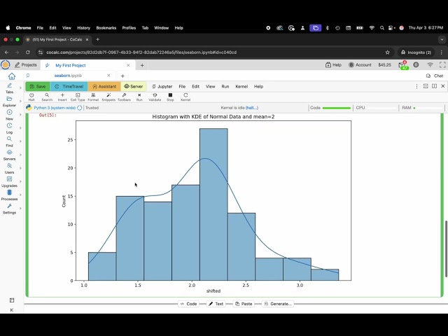
What You'll Learn: Learn how to create stunning data visualizations using Seaborn within CoCalc. Master the creation of ...
54 views
In this video, we'll explore the quickest and most efficient methods to plot coordinates directly on a map within a Jupyter Notebook.
In this video, we'll explore the importance of clear data visualization, specifically focusing on how to enhance your Seaborn ...
![[2025-07-18] Plots in Python with seaborn and plotnine](/api/proxy/image?url=https%3A%2F%2Fi.ytimg.com%2Fvi%2FxK9UNcOfjnI%2Fsddefault.jpg)