ViewTube

ViewTube
Sign inSign upSubscriptions
Filters

Upload date

Type

Duration

Sort by

Features

Reset

901 results

UAI
Data Visualisation in Python:  Line Plot

Learn Line Plot in Python (Matplotlib) | Complete Beginner to Advanced Guide In this video, you will learn how to create and ...

10:16
Data Visualisation in Python: Line Plot

27 views

4 months ago

DeepWing
Matplotlib Crash Course: Python Data Visualization from Zero to Live Charts

Matplotlib is Python's most powerful data visualization library — and most tutorials only scratch the surface. This crash course ...

27:49
Matplotlib Crash Course: Python Data Visualization from Zero to Live Charts

41 views

3 months ago

FOSS4G SotM Oceania
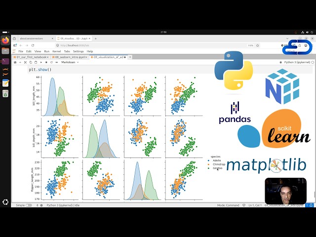
FOSS4G 2025 | Lonboard: Fast, interactive geospatial vector data visualization in Python

Presented by Kyle Barron on 21 November 2025 09:00, at FOSS4G 2025 Auckland. Track: Tools, Libraries & Visualisation Full ...

25:23
FOSS4G 2025 | Lonboard: Fast, interactive geospatial vector data visualization in Python

79 views

9 months ago

App Genesis
Data Visualization in Python | Line Chart, Bar Chart, Pie Chart, Histogram & Scatter Plot

Learn Data Visualization in Python and transform raw data into meaningful insights using powerful charts and graphs! Data ...

5:48
Data Visualization in Python | Line Chart, Bar Chart, Pie Chart, Histogram & Scatter Plot

202 views

2 months ago

RADHIKA'S CODE HUB
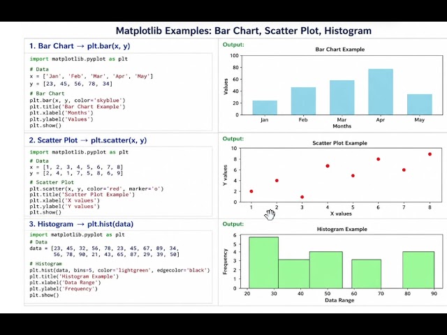
Visualizing Data Made Simple: Bar, Scatter & Histogram in matplotlib #coding #python

... इन Python के अंदर यहां पर हमारा प्रोग्राम है और यहां हमारा इसका आउटपुट ...

2:34
Visualizing Data Made Simple: Bar, Scatter & Histogram in matplotlib #coding #python

12 views

3 months ago

DEEPTI SHARMA: Let's Learn Programming
Data Visualization in Python | Scatter Plot, Box Plot, Pie Chart & Frequency Polygon | Class 12 IP

Data Visualization in Python | Scatter Plot, Box Plot, Pie Chart & Frequency Polygon | Class 12 IP #pandas #exam ...

1:02:15
Data Visualization in Python | Scatter Plot, Box Plot, Pie Chart & Frequency Polygon | Class 12 IP

19 views

1 month ago

BioniChaos
AI-Assisted BFRB Sensor Dashboard: Python, ML & Data Visualization

Welcome to an engaging session of biomedical data science and web development! In this video, we explore machine learning, ...

40:18
AI-Assisted BFRB Sensor Dashboard: Python, ML & Data Visualization

27 views

9 months ago

Don't Use This Code • James Powell
Master Data Viz in (Under) One Hour! | Open Science Skills Part 4

Ready to level up your open science skills? This training is what you need! DOI: https://zenodo.org/records/19700183 Learn more ...

54:20
Master Data Viz in (Under) One Hour! | Open Science Skills Part 4

91 views

11 months ago

Python Tyro
Plotting With PyPlot class XII IP Tamil | Data Visualization | Line Chart | matplotlib |Class 12  IP

Online CBSE Tuition & Doubt Clarification Sessions for Class 11 & 12 – Computer Science & Informatics Practices Contact: ...

4:50
Plotting With PyPlot class XII IP Tamil | Data Visualization | Line Chart | matplotlib |Class 12 IP

156 views

11 months ago

Alex The Analyst
2026 FREE Data Analyst Bootcamp [24 Hours+] for FREE | SQL, Excel, Python, Power BI, GitHub, AWS

Check out all my Full Courses on Analyst Builder: https://www.analystbuilder.com/ 25% Off Analyst Builder Code: BOOTCAMP In ...

28:41:08
2026 FREE Data Analyst Bootcamp [24 Hours+] for FREE | SQL, Excel, Python, Power BI, GitHub, AWS

876,319 views

4 months ago

بالعربي Big Data
Exploratory Data Analysis using Python | تحليلات سوعبانية

Ahmed_Sami #Arabic_Big_Data Exploratory Data Analysis using Python To support via PayPal ...

11:43:06
Exploratory Data Analysis using Python | تحليلات سوعبانية

33,531 views

2 months ago

Training – SIB Swiss Institute of Bioinformatics
Plotly basics - November 2025 (1 of 6)

This video provides an introduction to interactive visualizations with the plotly library. The video was recorded live during the ...

1:04:32
Plotly basics - November 2025 (1 of 6)

100 views

7 months ago

DEEPTI SHARMA: Let's Learn Programming
Data Visualization with Matplotlib (Complete Chapter) | Line Plot, Bar Graph & Histogram #pandas

Data Visualization with Matplotlib (Complete Chapter) | Line Plot, Bar Graph & Histogram #pandas #exam #informaticspractices ...

1:21:00
Data Visualization with Matplotlib (Complete Chapter) | Line Plot, Bar Graph & Histogram #pandas

8 views

1 month ago

BioniChaos
Kaggle Sensor Data Visualization: Building a BFRB Dashboard with AI

Welcome to an engaging session of biomedical data science and web development on bionichaos.com. In this video, we tackle ...

55:47
Kaggle Sensor Data Visualization: Building a BFRB Dashboard with AI

20 views

9 months ago

Learn with Champak | Champak Roy
Square Root in Python Using Approximation | Logic Building with Matplotlib Graph

Learn how to find the square root of a number in Python without directly using sqrt(). In this video, we build the logic step ...

33:07
Square Root in Python Using Approximation | Logic Building with Matplotlib Graph

69 views

3 months ago

Python Tyro
Plotting Data Using matplotlib Class 12 | Data Visualization | Plotting With pyplot Class 12 | Tamil

Online CBSE Tuition & Doubt Clarification Sessions for Class 11 & 12 – Computer Science & Informatics Practices Contact: ...

12:36
Plotting Data Using matplotlib Class 12 | Data Visualization | Plotting With pyplot Class 12 | Tamil

190 views

11 months ago

ojamboshop
Build 3D Web Charts with Blender Python and CSV for Beginners

In this video you will learn how to turn simple CSV data into a professional 3D bar chart using Blender and Python. We walk ...

35:37
Build 3D Web Charts with Blender Python and CSV for Beginners

31 views

Streamed 7 months ago

Python Tyro
Plotting With PyPlot Class 12 IP | Class 12 IP Chapter|Plotting Data Using matplotlib Class 12|Tamil

Online CBSE Tuition & Doubt Clarification Sessions Class 11 & 12 – Computer Science (083) & Informatics Practices (065) ...

15:08
Plotting With PyPlot Class 12 IP | Class 12 IP Chapter|Plotting Data Using matplotlib Class 12|Tamil

1,705 views

9 months ago

AnalytiCode
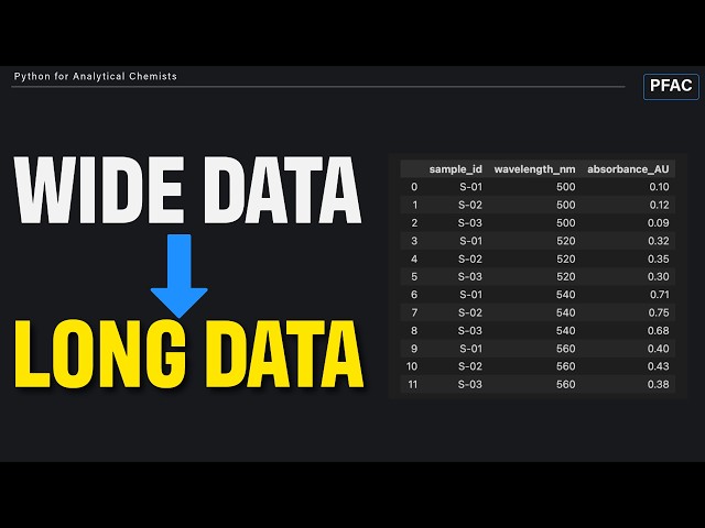
Why Your PCA Looks Wrong (Long vs Wide Data in Python)

Your data might be perfectly measured... ...and still fail once you start building machine learning models. One of the biggest ...

6:00
Why Your PCA Looks Wrong (Long vs Wide Data in Python)

107 views

2 months ago

Alex The Analyst
Learn Databricks in Under 2 Hours

Take my Full Databricks Course Here: https://www.analystbuilder.com/courses/modern-data-workflows-in-databricks In this video ...

1:40:15
Learn Databricks in Under 2 Hours

277,692 views

9 months ago