Upload date
All time
Last hour
Today
This week
This month
This year
Type
All
Video
Channel
Playlist
Movie
Duration
Short (< 4 minutes)
Medium (4-20 minutes)
Long (> 20 minutes)
Sort by
Relevance
Rating
View count
Features
HD
Subtitles/CC
Creative Commons
3D
Live
4K
360°
VR180
HDR
1,503 results
To learn for free on Brilliant, go to https://brilliant.org/techwithtim . Brilliant's also given our viewers 20% off an annual Premium ...
7,354 views
10 days ago
Matplotlib Python Tutorial for Beginners | Data Visualization in Python Matplotlib is a python library used for data ...
5,742 views
6 days ago
This video today is a crash course on Seaborn, a data visualization library for Python built on top of Matplotlib. It makes it super ...
5,951 views
3 weeks ago
Python Data Associate Certification: https://datacamp.pxf.io/LKePnL Data Analyst in Python: https://datacamp.pxf.io/xLA9yd Get ...
2,019 views
8 days ago
CSV Data can be found here: https://catalog.data.gov/dataset/electric-vehicle-population-data.
16 views
7 days ago
39 views
5 days ago
Learn Python NumPy and Matplotlib libraries from scratch in this complete beginner-friendly tutorial. In this video, we explain how ...
23 views
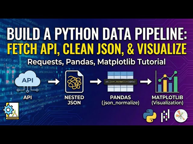
In this video, we build a complete end-to-end data pipeline using Python. You will learn how to fetch real data from an API, handle ...
21 views
4 weeks ago
... the example how to plot plot a scatter plot and we will see the next example too uh import mplot lib dotpip plot as plt as plot okay ...
2 views
So uh this is the code I have written for uh how like how to plot in the mattplot lib Mattplot lib is one of the python library So uh let ...
4 views
What is a stacked area plot and how can you create one using Python? In this video, you'll learn how to visualize multiple ...
0 views
Learn the 3 most essential Python libraries for data science and programming in 2026! This complete tutorial covers NumPy, ...
28 views
In this video, you'll learn how to create a polar plot in Python using Matplotlib and NumPy. Polar plots are useful for visualizing ...
3 views
Let us see out this example in the next video okay I will create a next video for this and we will discuss the same example.
1 view
In this video, you will learn how to create different types of data visualization graphs using Python. We will cover popular graph ...
9 days ago
Now let us see the example of histogram so first of all understand what is histogram histogram is the visual representation of data ...
What happens when circular waves overlap? In this video, you'll see how to visualize circular wave superposition using Python ...
2 weeks ago
What if you could draw the Google logo using Python? In this video, you'll learn how to create a colorful Google-style text ...
In this video, you'll get a complete introduction to data analytics, starting from the basics and gradually moving toward practical, ...
11,484 views
Streamed 18 hours ago
In this video learn the basics of how to make a pie chart in Matplotlib. And see how I used it to analyze some of my chess game ...
19 views