Upload date
All time
Last hour
Today
This week
This month
This year
Type
All
Video
Channel
Playlist
Movie
Duration
Short (< 4 minutes)
Medium (4-20 minutes)
Long (> 20 minutes)
Sort by
Relevance
Rating
View count
Features
HD
Subtitles/CC
Creative Commons
3D
Live
4K
360°
VR180
HDR
766 results
In Part 2 of this Data Visualization with Python Course 2026, you will learn how to visualize data distributions, relationships, and ...
96 views
7 days ago
Data Analyst Masters Program (Discount - YTBE15) ...
1,890 views
2 days ago
Subscribe and Support the channel for more Free content https://www.youtube.com/ @DataWithBaraa ━━━━━ *MY ...
4,109 views
1 day ago
In Part 3 of this Data Visualization with Python Course 2026, you will create categorical, advanced statistical, and geospatial ...
50 views
Learn how to analyze 3D organoid imaging data using Python and machine learning with real published datasets from Nature ...
1,084 views
0 views
In Ep 11 of our Python Data Analysis series, we learn how to visualize data using Matplotlib. After cleaning and exploring data ...
5 days ago
The KAUST Visualization Lab is hosting an Introduction to Data Science Workshop This hands-on lesson is part of the Introduction ...
98 views
Streamed 3 days ago
Video data visualization of stars around Earth using Python, Claude.ai, Matplotlib, PyVista and Mayavi. Matplotlib and PyVista ...
18 views
Want to turn raw CSV data into clean, professional charts using Python? In this video, you'll learn how to read a CSV file and plot ...
33 views
Ready to start your Data Science journey with Python? This video is the perfect starting point for beginners, students, and aspiring ...
13 views
... and Series for efficient data handling - Basic data visualization techniques with Pandas - Exporting and reporting analyzed data ...
4 days ago
In this video, you will learn the Python Seaborn library for data visualization. Seaborn is a powerful Python library built on top of ...
5 views
6 days ago
What is Matplotlib and why is it important for data visualization in Python? In this 60 second introduction, you will understand what ...
Histogram Boxplot Scatterplot Bar chart Pairplots In Python.
Learn how to structure and execute a market research workflow using Python. This training covers practical techniques for ...
19 views
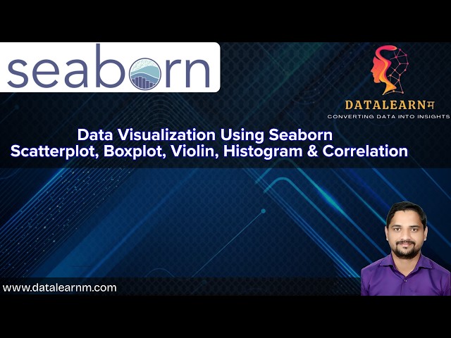
In this complete tutorial on Data Visualization using Seaborn in Python, you will learn how to create beautiful and informative ...
60 views
... Engineering ✓ Data Analysis with Python ✓ Data Analytics using R ✓ Data Visualization with Tableau ✓ Data Storytelling with ...
1,633 views
TimSort is a hybrid stable sorting algorithm, derived from merge sort and insertion sort, designed to perform efficiently on many ...
6 hours ago
![Data Visualization with Python Course [2026] - Part 2: Distribution & Time Series Charts](/api/proxy/image?url=https%3A%2F%2Fi.ytimg.com%2Fvi%2Ftaa64u_CcYk%2Fsddefault.jpg)
![Data Analytics With Python Full Course 2026 [FREE] | Python Data Analytics Tutorial | Simplilearn](/api/proxy/image?url=https%3A%2F%2Fi.ytimg.com%2Fvi%2FT9Jh_X134l4%2Fsddefault.jpg)

![Data Visualization with Python Course [2026] - Part 3: Categorical, Statistical & Geospatial Charts](/api/proxy/image?url=https%3A%2F%2Fi.ytimg.com%2Fvi%2FR4mnsA5dctU%2Fsddefault.jpg)


![Generative AI in Data Analytics Full Course 2026 [FREE] | Gen AI For Data Analytics | Simplilearn](/api/proxy/image?url=https%3A%2F%2Fi.ytimg.com%2Fvi%2FrMs7_JmfHRs%2Fsddefault.jpg)
