Upload date
All time
Last hour
Today
This week
This month
This year
Type
All
Video
Channel
Playlist
Movie
Duration
Short (< 4 minutes)
Medium (4-20 minutes)
Long (> 20 minutes)
Sort by
Relevance
Rating
View count
Features
HD
Subtitles/CC
Creative Commons
3D
Live
4K
360°
VR180
HDR
103 results
Python for Data Science — Day 12** Data visualization is an essential part of Data Science. In this session, we learn how to ...
0 views
51 minutes ago
Matplotlib Lecture 1 | Data Visualization in Python In today's class, I taught my students how to visualize data using Matplotlib, one ...
45 views
1 day ago
Learn Seaborn for creating powerful statistical visualizations and understand Python loops for repeating tasks efficiently. Explore ...
13 views
Welcome to CS AI Hub Hindi! इस वीडियो में हम Python के Matplotlib Library की मदद से Data Visualization ...
73 views
2 days ago
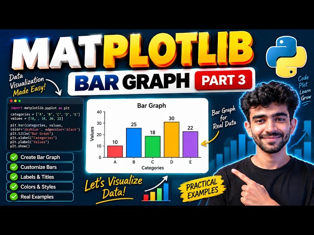
In this video, we will learn how to create Bar Graphs using Matplotlib in Python This is Part 3 of our Matplotlib series where ...
14 views
20 hours ago
In Day 23, learn Matplotlib in Python and create powerful visualizations using Line Plots, Bar Charts, and Scatter Plots.
137 views
Streamed 6 days ago
DATA VISUALIZATION USING MATPLOTLIB — PART 2 Welcome to SK DataLabs! In this lecture, we continue our journey into ...
41 views
6 days ago
In this episode, we move from simple chart examples to real-world data visualization using Pandas and Matplotlib. Learn Python ...
325 views
4 days ago
Data Visualization with Matplotlib | Creating line plot | Labeling axes,Legends & Interpretation In this One Shot Lecture, we cover ...
652 views
3 days ago
In this Matplotlib Tutorial in Tamil, we'll learn how to transform a basic chart into a clear, professional and easy-to-understand data ...
501 views
5 days ago
Master Data Visualization using Matplotlib & Pyplot for CBSE Class 12 Informatics Practices (IP)! In this video, we cover the ...
8 views
Ever wondered why Python is the absolute gold standard for data science and analytics? In our latest tutorial, we break down ...
See where activity happens most within a video or live stream using Ultralytics YOLO26 and heatmaps. By combining object ...
1,051 views
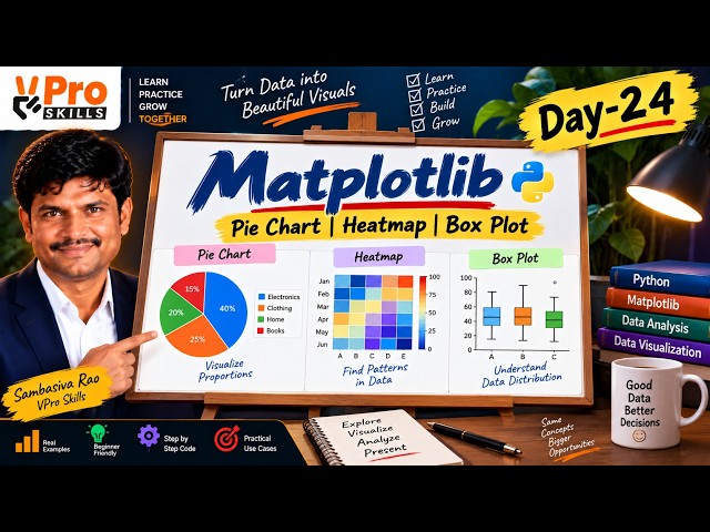
In Day 24, learn how to create Pie Charts, Heatmaps, and Box Plots using Matplotlib with simple practical examples. Understand ...
198 views
Learn Matplotlib Pie Charts and Histograms in Python with this practical Data Science lesson. In this tutorial, you will learn ...
67 views
If you are learning Python, Data Science, Data Analytics or Data Visualization, make sure you follow the complete course.
145 views
Pandas Lecture 7 | GroupBy, Aggregation & Data Visualization In today's lecture, I taught my students how to analyze and ...
42 views
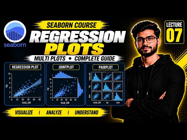
#Seaborn #Python #DataVisualization #PythonTutorial #DataScience #SeabornTutorial #MachineLearning #DataAnalytics ...
178 views
Learn NumPy, Pandas, and Seaborn in this Day 34 MLOps class recording. Follow practical Python examples for working with ...
12 views
4 hours ago
Learn how Python compares strings character by character using lexicographical ordering. This video explains string comparison ...
33 views