Upload date
All time
Last hour
Today
This week
This month
This year
Type
All
Video
Channel
Playlist
Movie
Duration
Short (< 4 minutes)
Medium (4-20 minutes)
Long (> 20 minutes)
Sort by
Relevance
Rating
View count
Features
HD
Subtitles/CC
Creative Commons
3D
Live
4K
360°
VR180
HDR
0 results
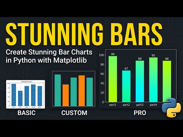
Learn how to create a colorful Bar Chart in Python using Matplotlib. This beginner-friendly tutorial covers: Importing Matplotlib ...
17 views
3 weeks ago
When building technical reports or educational materials, static plots often fall short. They force the reader to mentally visualize ...
44 views
4 weeks ago
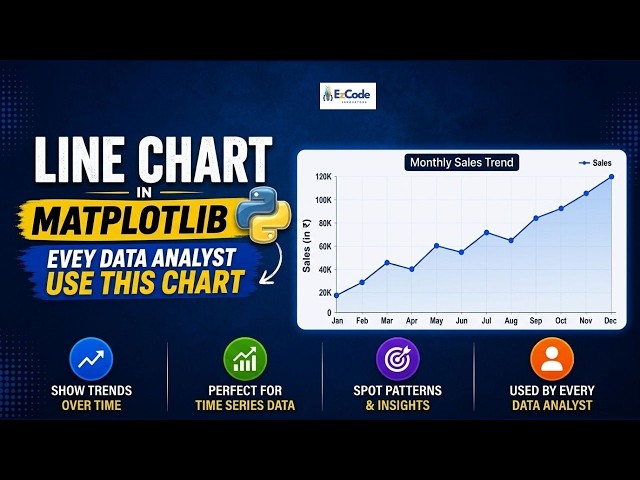
If you're learning Python for data analysis, this is the first chart you NEED to master the Line Chart in Matplotlib. In this video, we're ...
11 views
Learn how to build a professional AI Financial Assistant using Python, CustomTkinter, SQLite, Matplotlib, and OpenAI.
29 views
2 weeks ago
How can I boxplot values that wrap around using matplotlib? ✧ I really hope you found a helpful solution! ♡ The Content is ...
0 views
This video shows how to install matplotlib on Python 3.14.7 It will walk you through, step-by-step, how to install matplotlib on ...
25 views
5 days ago
A comprehensive guide to using scatter plots in data visualization and machine learning. Unlock the power of scatter plots in ...
5 views
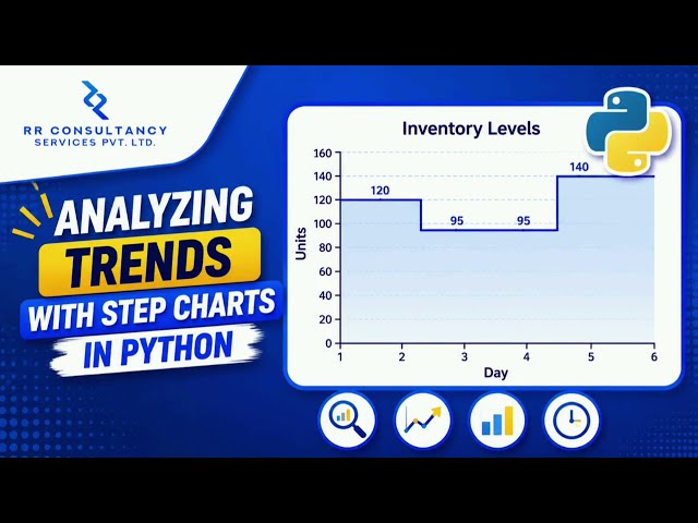
Hello and Welcome Back to RR Consultancy Services! In this video, we'll learn how to *analyze trends using Step Charts in ...
4 views
6 days ago
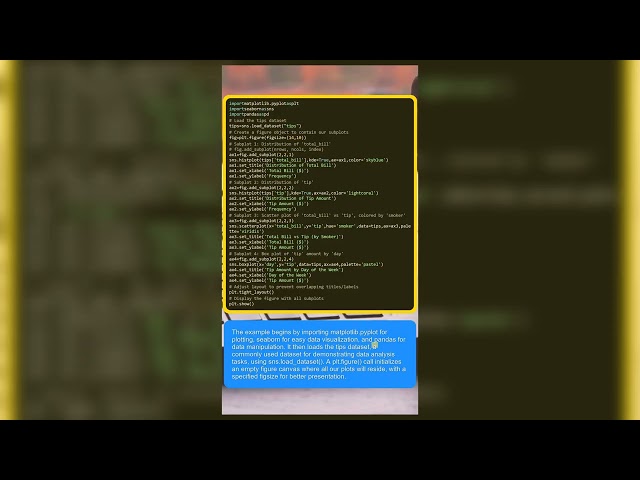
Ever struggled to fit multiple charts into a single, clean dashboard? In this tutorial, we unlock Python's powerful subplot method to ...
1 day ago
A scatter plot shows the cloud; the fit line shows the trend. This lesson plots paired data in Matplotlib, adds a numpy polyfit line, ...
1 view
14 hours ago
Source: https://stackoverflow.com/questions/79732064 Question Author: - BernhardWebstudio ...
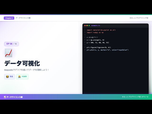
MatplotlibとSeabornを使った折れ線・棒・散布図・ヒストグラムの描き方と、AI開発に役立つデータ可視化技術を解説します。
2 views
8 days ago
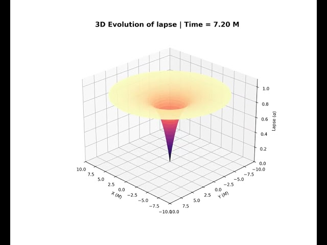
This is a animation of 3D Evoluiton of Lapse Function in Schwarzschild black hole, this video show the transition of geometry of ...
6 views
How To Use Cursor For Data Visualization In Python And JS Learn how to leverage Cursor's AI capabilities to create professional ...
3 views
7 days ago
Learn how to add real illustrative images to AI-generated reports in Python — with zero API keys, zero GPU, and zero network ...
3 days ago
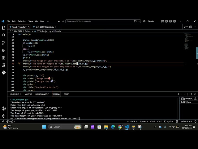
A Python-based Projectile Motion Simulator developed as my CS50P Final Project. The program calculates the projectile's range, ...
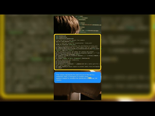
A great data visualization does more than just look pretty—it communicates insights instantly and accurately. In this quick tutorial, ...
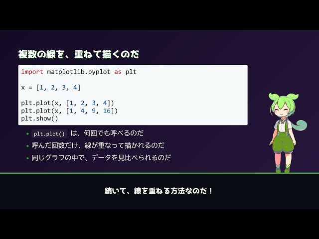
Python入門シリーズ データをグラフとして可視化するライブラリ、matplotlibの基本をずんだもんが解説するのだ! ✓ この動画で ...
9 days ago
How To Plot Graph In Jupyter Notebook In today's video, we cover plot graph in Jupyter Notebook, create graph in Jupyter ...







![How To Plot Graph In Jupyter Notebook [2026 Guide]](/api/proxy/image?url=https%3A%2F%2Fi.ytimg.com%2Fvi%2FgyfJjYRAebY%2Fsddefault.jpg)