Upload date
All time
Last hour
Today
This week
This month
This year
Type
All
Video
Channel
Playlist
Movie
Duration
Short (< 4 minutes)
Medium (4-20 minutes)
Long (> 20 minutes)
Sort by
Relevance
Rating
View count
Features
HD
Subtitles/CC
Creative Commons
3D
Live
4K
360°
VR180
HDR
533 results
🍩 Learn how to create a Donut Chart using Python Matplotlib with a real-world sales dataset! In this Python Data ...
149 views
3d ago
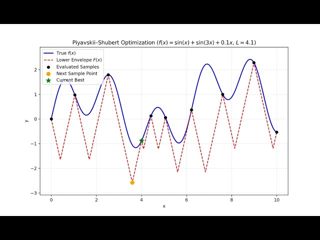
A step-by-step visual introduction and Python demo of the Piyavskii–Shubert algorithm (also known as Shubert's algorithm) for 1D ...
50 views
10d ago
Welcome to this tutorial on Comparing Average Values Across Categories with Mean Plots in Python! When analyzing data ...
6 views
9d ago
Learn how to efficiently manage and update colored overlays on grayscale images in Matplotlib by removing previous overlays ...
0 views
5d ago
Data visualization has become a cornerstone of Artificial Intelligence, converting massive datasets into clear graphical formats that ...
38 views
2w ago
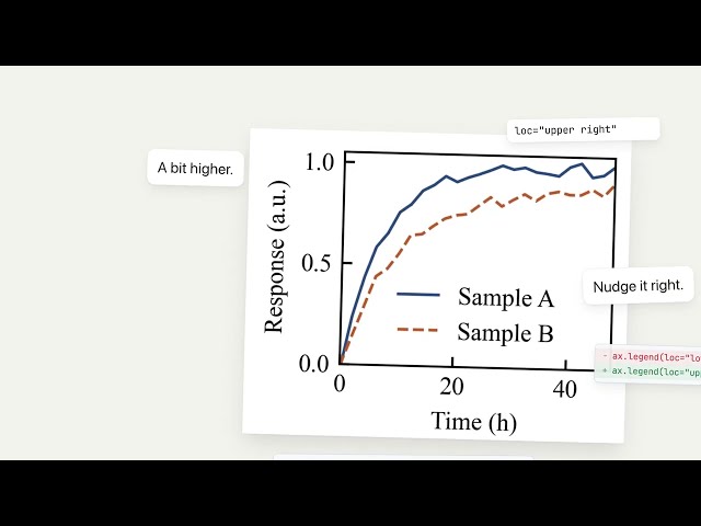
AI does an impressive job generating scientific figures with Python, but getting them publication-ready is always a nightmare.
9 views
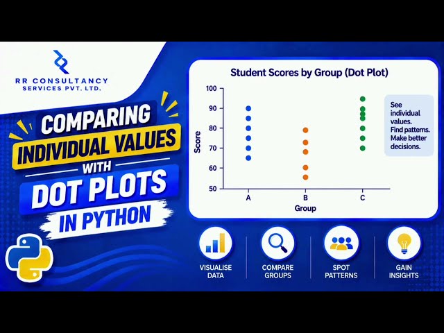
Welcome to this comprehensive tutorial on Comparing Individual Values with Dot Plots in Python! If you want to elevate your data ...
In this video, you'll learn how to create a Histogram Graph using Matplotlib in Python step by step This is Part 4 of our Matplotlib ...
277 views
7d ago
Stop Making UGLY Excel Charts! Do THIS with ChatGPT & Python Stop making boring 2D Excel charts! In this 60-second tutorial, ...
5 views
1d ago