Upload date
All time
Last hour
Today
This week
This month
This year
Type
All
Video
Channel
Playlist
Movie
Duration
Short (< 4 minutes)
Medium (4-20 minutes)
Long (> 20 minutes)
Sort by
Relevance
Rating
View count
Features
HD
Subtitles/CC
Creative Commons
3D
Live
4K
360°
VR180
HDR
149 results
Explore All My Excel Solutions: https://pythonandvba.com/solutions DESCRIPTION ...
8,948 views
2 years ago
How to Install Plotly on PyCharm ✓ Subscribe To My YouTube Channel: ...
2,898 views
4 years ago
Introduction: A sunburst chart is suitable when there is hierarchical data to be presented visually. The data for the sunburst chart ...
216 views
This video demonstrates how to: 1 Create Date picker; 2 Use Date Picker. https://stimulsoft.com.
369 views
7 years ago
When you create a new Python notebook file, it will be recorded in the IPython Notebook format, dot ipynb for brief. Don't fear this ...
408 views
In this video, we will look at Plotly 'choropleth' map. Plotly 'choropleth' map is an outline based map. All metadata associated with ...
111 views
I am happy to announce the release of streamlit-echarts version 0.4.0 In this video, I will very quickly present you its newest ...
5,747 views
5 minute tutorial: https://anvil.works/learn/tutorials/feedback-form Open-source app server: ...
1,930,624 views
3 years ago
Semantic searching and text analysis based on Python Sentence Transformer and NLTK packages. Web page design by Plotly ...
32 views
The hvplot library has a new .inspect() method that lets you interactively plot million- and billion-point datasets. Credit to Jean-Luc ...
1,233 views
powerbi #dashboard #rh #python Nessa primeira parte do vídeo são exemplos de gráficos para RH como violin plot, gráfico de ...
152 views
Tutorial on How to plot Stock Candlestick Chart with 2 lines of Code in Python. In this video we will use plotly module (package) in ...
1,086 views
The “Streamlit for Data Science” book by Tyler Richards just released an updated version 2. It provides the perfect project-based ...
3,221 views
This video is part of an online course, Data Visualization and D3.js. Check out the course here: ...
7,004 views
10 years ago
4,608 views
It's simple and straightforward to implement outbound fax sending into your application using Python with Telecoms Cloud.
977 views
8 years ago
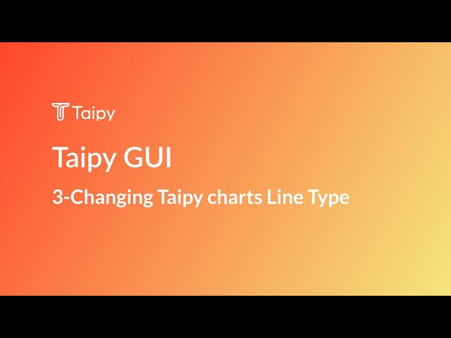
Description In this video, we'll focus on creating and customizing a line chart using the visual chart element in Taipy.
2,133 views
It'll show streaming of data from API data and creating graph using matplotlib library. It's simple demo to understand way of ...
641 views
In this video, we explore the powerful capabilities of the Select Slider component in Streamlit. Streamlit is a Python library used for ...
747 views
VegaFusion provides server-side scaling for Vega and Altair visualizations VegaFusion 1.1 introduces support for Polars ...
567 views
Nesse vídeo, eu te ensino a fazer um histograma no Python utilizando a biblioteca Plotly. Pro vídeo ficar mais divertido, eu vou ...
688 views
In this video we talk about How To Install PIP In Python On Mac. Well as PIP is a part of the standard python library (meaning it ...
84,639 views
runningpython #code #cloudide #ide #ideas At the end of this course, you'll be a professional Python developer and you'll learn ...
197 views
The next tip I want to cover is how to make your plots that pandas provides to be an interactive plot. There is a specific package for ...
1,118 views
Dash apps In this video we will learn, which apps are available for Dash and how to get them into your tablet. In the previous ...
77 views


![Winforms Dashboard: Dashboard with Using Date Picker [Shot on v2018]](/api/proxy/image?url=https%3A%2F%2Fi.ytimg.com%2Fvi%2FF1M5xEuiNRc%2Fsddefault.jpg)


![[Power BI + Python] Dashboard para Recursos Humanos[RH],com Matplotlib e Seaborn Parte l](/api/proxy/image?url=https%3A%2F%2Fi.ytimg.com%2Fvi%2FOAkmJdPLcu4%2Fsddefault.jpg)


![How to Send Faxes with Python in less than 60 seconds [Telecoms Cloud]](/api/proxy/image?url=https%3A%2F%2Fi.ytimg.com%2Fvi%2F9xQqk0hta90%2Fsddefault.jpg)