Upload date
All time
Last hour
Today
This week
This month
This year
Type
All
Video
Channel
Playlist
Movie
Duration
Short (< 4 minutes)
Medium (4-20 minutes)
Long (> 20 minutes)
Sort by
Relevance
Rating
View count
Features
HD
Subtitles/CC
Creative Commons
3D
Live
4K
360°
VR180
HDR
223,200 results
Aprende a crear un diseño responsive con CSS y sin usar Media Queries! Y todo gracias a la potencia de CSS Grid. La clave está ...
156,324 views
2 years ago
Build a responsive CSS layout without using any media queries. The most powerful CSS trick you're not using. No More Media ...
16,337 views
6 months ago
🤯 I'll show you how to create a responsive grid in CSS without media queries! 💾 Save the video so you always have it handy ...
93,478 views
3 years ago
Outlines are important for keyboard navigation, but maybe you've come up with a replacement and decide to do an outline: none; ...
314,599 views
Critical Responsive Layout Tips.
80,824 views
213,937 views
1 year ago
Responsive Grid Layout... Free Source Code (Link - https://t.me/codewith_muhilan/282 ) Telegram and GitHub link in Bio ...
726,420 views
Learn how to create responsive web designs using CSS media queries! In this tutorial, I'll guide you through the basics of media ...
3,191 views
572,538 views
Responsive CSS grid - Flexbox using HTML & CSS JavaScript ReactJS HTML CSS SQL Azure Like, follow & share ...
154,973 views
Learn how to use the flex shorthand in CSS Flexbox to create responsive layouts faster with CSS Flexbox. This one line of code ...
97,808 views
CSS Flexbox is a powerful tool for creating flexible and responsive layouts, but what happens when there are too many items to fit ...
373,395 views
Learn about css positioning. From position relative to absolute, fixed and sticky.
264,877 views
Responsive Screen Size Breakpoints | Mastering CSS Media Queries for Responsive Web Design | CSS Learn how to create ...
200,775 views
Learn how to use the clamp() method to make resonsive font-sizes in css only Full video: https://youtu.be/2IV08sP9m3U #csstricks ...
37,712 views
4 months ago
Responsive design is super simple let's say you want to have these cards on desktop one next to each other and one below each ...
67,422 views
CSS Responsive Layout With Flex-wrap & Flex-basis #responsive #css `flex-wrap` in CSS is used in Flexbox layouts to ...
23,006 views
10,681 views
How to Make Responsive Websites Without Media Queries! | Stop Using Media Queries! Try This Instead ...
33,032 views
10 months ago
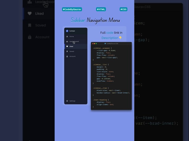
Responsive Sidebar with Slide Animation | HTML CSS JS In this video, I'll show you how to build a **Responsive Sidebar ...
171,261 views
8 months ago