Upload date
All time
Last hour
Today
This week
This month
This year
Type
All
Video
Channel
Playlist
Movie
Duration
Short (< 4 minutes)
Medium (4-20 minutes)
Long (> 20 minutes)
Sort by
Relevance
Rating
View count
Features
HD
Subtitles/CC
Creative Commons
3D
Live
4K
360°
VR180
HDR
162 results
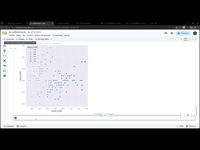
En este video se presenta el trabajo práctico “Seaborn 2”, realizado en Python mediante Google Colab. Se utiliza la librería ...
11 views
4w ago
En este video aplicamos el Modelo de Aprendizaje Experiencial de Kolb para llevar la visualización de datos en Python al ...
12 views
YouTube Description Welcome to Part 4 of my Seaborn data visualization series! So far in this series, we've explored: Part 1: ...
24 views
1mo ago
Seaborn gives you better-looking, more statistical charts in far less code than Matplotlib. What you'll learn: - How Seaborn builds ...
47 views
How do two variables relate to each other? In this tutorial, we explore Correlation and Regplot using Python to understand ...
1 view
5d ago
Stop looking at ugly spreadsheets and start building beautiful, visual stories with Python. Welcome back to ABAYSA with AI, your ...
195 views
12d ago
This learning video will help you to learn about python Seaborn library Defined in simple English language to understand better ...
88 views
Learn Data Visualization in Python using Matplotlib and Seaborn and understand how to turn raw data into clear, meaningful ...
35 views
2w ago
Hola a todos! En este video aprenderemos a dominar la librería Seaborn en Python para crear visualizaciones de datos ...
52 views
Learn how to create and interpret a box plot in Python using Seaborn and Matplotlib. In this beginner-friendly Python data ...
234 views
3d ago
Seaborn turns a DataFrame into statistical charts with a fraction of the Matplotlib code. The complete guide: what it adds, when to ...
27 views
10d ago
Data Visualization with Python (Part 1): Beginner to Pro Guide! Welcome to Part 1 of our Data Visualization with Python ...
214 views
3w ago
Data cleaning with Python, a preliminary stage before performing subsequent data transformation and analysis processes
40 views
2d ago
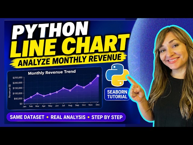
Learn how to create a colorful line chart in Python using Seaborn and Matplotlib while analyzing monthly revenue trends.
311 views
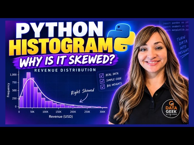
Learn how to create and interpret a histogram in Python using Seaborn and Matplotlib. In this beginner-friendly data visualization ...
346 views
We've reached the final video in my Simple Visualizations with Seaborn series! For this bonus episode, we're looking at the pie ...
10 views
13 views
Data Visualization with Python (Part 2): Advanced Charts & Analytics! Welcome back to Part 2 of our Data Visualization with ...
61 views
Welcome to Topic #077 of the Artificial Intelligence using Python course on Skills Cone! In this kickoff tutorial to statistical ...
I'm excited to share another video from my Python for Data Analysis learning series. In this video, I explain how to create a ...
36 views