Upload date
All time
Last hour
Today
This week
This month
This year
Type
All
Video
Channel
Playlist
Movie
Duration
Short (< 4 minutes)
Medium (4-20 minutes)
Long (> 20 minutes)
Sort by
Relevance
Rating
View count
Features
HD
Subtitles/CC
Creative Commons
3D
Live
4K
360°
VR180
HDR
214,364 results
In this one, I look at two simple ways to make maintaining your site's typography much simpler! Links ✓ The codepen: ...
199,834 views
4 years ago
Struggling to make your website's headings and text responsive? In this video, I'll show you a simple yet powerful solution: one ...
5,303 views
1 year ago
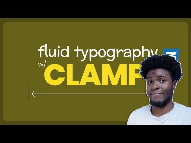
Today we're going to learn how we can use the CSS clamp function to create responsive, fluid typography! Project Links code: ...
73,954 views
3 years ago
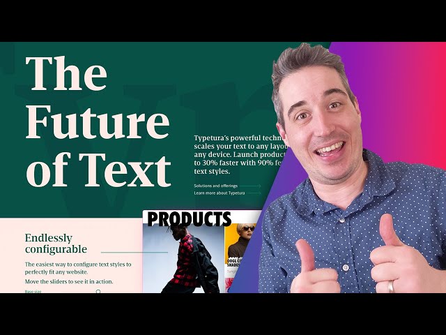
... https://www.oddbird.net/courses/poetic-css/ | There are great tools we can use for generating responsive typography in CSS, but ...
841 views
11 months ago
Start writing CSS with confidence with my course CSS Demystified: https://cssdemystified.com When people find out about ...
35,937 views
In this video, you'll learn how to use the three most powerful CSS functions for modern responsive design: min(), max() and ...
144,047 views
7 months ago
In this video, I'll show you how to set up a fluid responsive typography scale with the CSS clamp property. Key Links ...
14,432 views
Sponsor: Pie Calendar is the easiest, most flexible event calendar plugin for WordPress. Turn any post into an event in minutes ...
7,401 views
6 months ago
If you're building your own SaaS, I built a production-ready AI SaaS foundation https://www.saasbymonday.io/ Learn how to ...
23,365 views
5 MINDBLOWING CSS Tips and Tricks for better responsiveness and modern css solutions for typical problems with CSS ONLY.
530,111 views
How to set up your web design responsive typography – our most requested video! And we got a new mic so hoping the sound ...
8,822 views
2 years ago
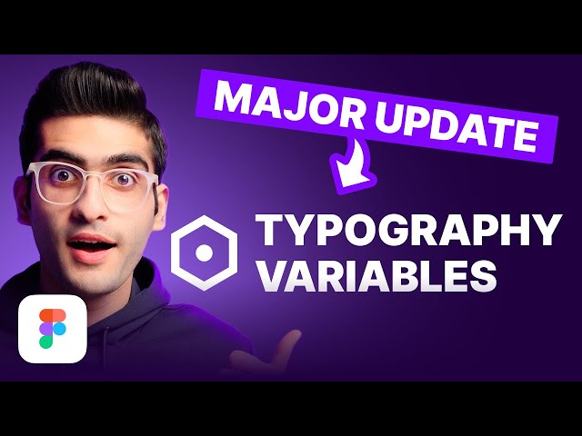
In this video, I'm going to show you how to make your typography responsive using Figma variables. Become a Pro UI ...
83,720 views
Learn the most important concepts of Responsive CSS Media Queries in simple and easy manner. ✉️ Reach out to us at: ...
161,130 views
Conoce nuestras vacantes actuales de tecnología en https://bit.ly/talento-tech-GDI En este vídeo vemos cómo resolver los ...
9,096 views
Learn how the best design systems build their typography and apply the common patterns and insights for yourself. Chapters Intro ...
78,085 views
Get access to my free course here: https://bradhussey.hopp.to/wix-studio-course Looking for perfectly responsive typography?
19,034 views
Responsive typography is tricky, and while solutions with clamp() can be really handy, we can't have that look at the context of an ...
52,648 views
https://bit.ly/2IPcPgA - Become a frontend developer (50% off limited time!) -- Want to learn UI/UX? https://designcourse.com ...
54,191 views
5 years ago
Overflowing text is actually a feature of CSS, but it can feel like a pretty annoying one . Depending on the situation, there are ...
90,781 views
To create Responsive Typography in your websites, you might immediately want to reach for Media Queries. Well, the clamp ...
10,180 views