Upload date
All time
Last hour
Today
This week
This month
This year
Type
All
Video
Channel
Playlist
Movie
Duration
Short (< 4 minutes)
Medium (4-20 minutes)
Long (> 20 minutes)
Sort by
Relevance
Rating
View count
Features
HD
Subtitles/CC
Creative Commons
3D
Live
4K
360°
VR180
HDR
1,063,059 results
By the end of this video, you'll be able to design and build responsive websites that work on a 4K monitor, a tiny smartphone and ...
199,042 views
9 months ago
5 MINDBLOWING CSS Tips and Tricks for better responsiveness and modern css solutions for typical problems with CSS ONLY.
475,590 views
1 year ago
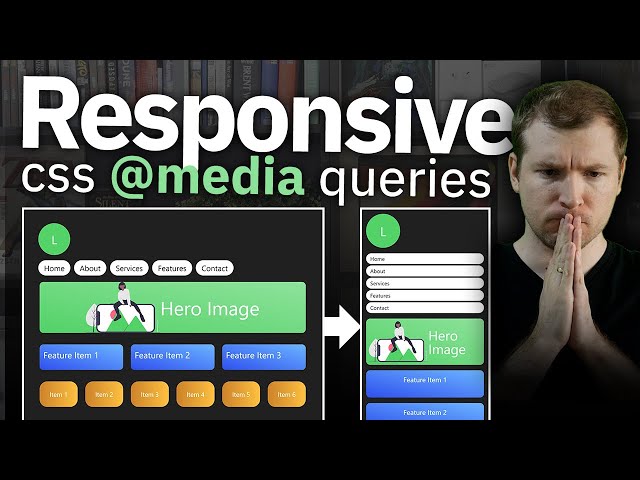
Learn the most important concepts of Responsive CSS Media Queries in simple and easy manner. ✉️ Reach out to us at: ...
136,353 views
Learn what media queries are and how to use them to create responsive design for mobile devices. 📣 Need hosting and a domain ...
97,731 views
4 years ago
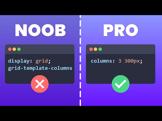
New to CSS Grid? Watch the full Crash Course here: https://www.youtube.com/watch?v=yOPCQ5nD1Vs Add Google Fonts to ...
880,850 views
5 years ago
Become a Member to Support our Channel: https://www.youtube.com/channel/UCGpoeEhUBQBaaKZ_a8HB67Q/join Get our ...
279,590 views
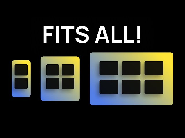
COURSES - https://slayingthedragon.io Join the discord - https://discord.gg/Ccz9nQSfQB You might be wondering why ...
488,120 views
2 years ago
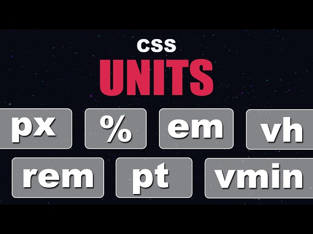
In this video, we're diving deep into one of the most fundamental topics in web development — CSS Units. Whether you're just ...
15,637 views
6 months ago
FREE COURSE: Conquering Responsive Layouts https://courses.kevinpowell.co/conquering-responsive-layouts Links ✓ min() ...
816,171 views
IMPORTANT: Learn CSS Today Course: ...
885,585 views
6 years ago
In this video, we'll be creating a responsive navigation bar with a submenu using HTML and CSS, perfect for modern website ...
11,056 views
7 months ago
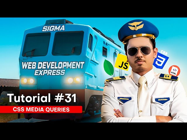
Latest Udemy Web dev Course With Certificate: https://goharry.in/webdev Access the Sigma web development course playlist: ...
481,387 views
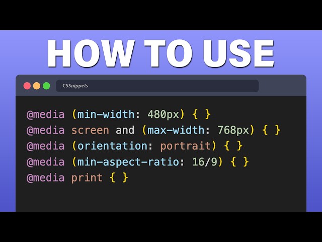
Learn how to do CSS Media Queries with the latest techniques of calling @media, max-width, min-width to allow your HTML code ...
198,783 views
My free course, Conquering Responsive Layouts: https://courses.kevinpowell.co/conquering-responsive-layouts A look at how we ...
220,235 views
In this video, you will finally understand when Flexbox is the right tool and when CSS Grid is a better choice. Most developers use ...
155,702 views
3 months ago
Want to learn how to build a responsive website that looks perfect on all screen sizes — mobile, tablet, laptop, or desktop? In this ...
11,512 views
8 months ago
Learn how to create responsive websites using CSS! This video will cover essential CSS techniques like media queries to make ...
3,960 views
10 months ago
Responsive Sidebar, Navbar, Main, Footer Layout, How to use CSS Grid Layouts for beginners | Responsive CSS Grids with ...
211,277 views
Conquering responsive layouts: https://courses.kevinpowell.co/conquering-responsive-layouts Here's 5 quick responsive layouts ...
199,408 views
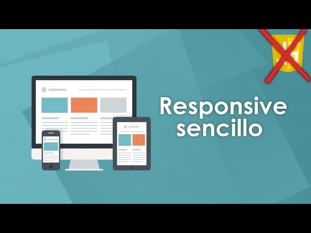
En este video veremos como hacer una página web con diseño responsive solo con HTML y CSS sin usar javascript ni media ...
292,689 views
7 years ago