Upload date
All time
Last hour
Today
This week
This month
This year
Type
All
Video
Channel
Playlist
Movie
Duration
Short (< 4 minutes)
Medium (4-20 minutes)
Long (> 20 minutes)
Sort by
Relevance
Rating
View count
Features
HD
Subtitles/CC
Creative Commons
3D
Live
4K
360°
VR180
HDR
4,117 results
If you work with data in Python, at some point you'll need to visualize it. In this video, I'll show you the differences ...
1,624 views
9 months ago
In my last video, I showed how elegant and simple plotnine makes the Grammar of Graphics in Python. This time, I put Seaborn's ...
361 views
4 months ago
SuperStore Sales analysis ds/Data analytics Project using python(Pandas, seaborn, matplotlib), MySQL GitHub Link: ...
44 views
6 months ago
Learn how to create stunning data visualizations in Python using Matplotlib and Seaborn! In this tutorial, we cover: ✓ Line Plots ...
192 views
11 months ago
Do you want to learn how to turn real-world data into beautiful charts in just a few lines of Python? In this beginner-friendly video, ...
31 views
The Python script used in this tutorial was imported into NotebookLM as .txt. A Google Slide slideshow with screenshots of the ...
130 views
5 months ago
Welcome today we're diving into Seabour a powerful Python library designed for creating beautiful and informative statistical plots ...
39 views
2 months ago
Seaborn #DataVisualization #PythonTutorial #SeabornTutorial #DataScience #PythonDataScience #LearnSeaborn #DataViz ...
89 views
Stay tuned: https://www.youtube.com/@CodeAiFlow?sub_confirmation=1 ☕️ I'm glad I can share all this for free! If it helped you ...
52 views
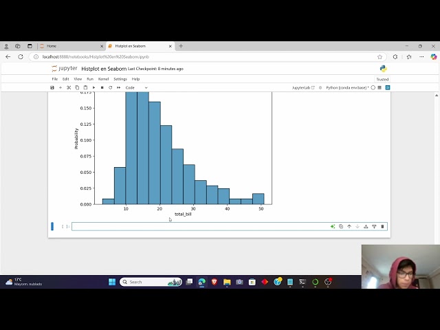
En este video veremos las ventajas y algunos parámetros de Displot en Seaborn. Espero que te haya servido mi video y gracias ...
27 views
8 months ago
In this project, you will learn how to analyze supermarket sales data using Python, Pandas, and Seaborn. #python #pandas ...
71 views
10 months ago
Unlock the power of Histograms in Python using Matplotlib and Seaborn! Learn to create, customize, and interpret histograms ...
60 views
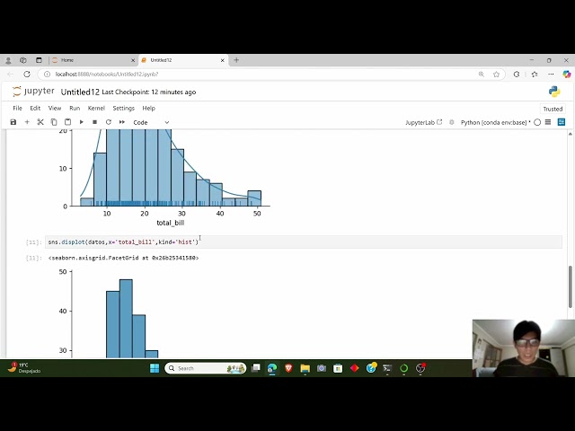
Un histograma sirve para describir una variable y como esta dispersa. Espero que te haya servido mi video y gracias por ver!
26 views
Learn How to Create Scatter Plot and Basic Visualizations in Python using Matplotlib & Seaborn!** In this beginner-friendly tutorial ...
49 views
Learn how to create Seaborn scatter plots in this easy-to-follow Seaborn tutorial using Python. Discover how to visualize ...
65 views
3 months ago
Learn how to perform a complete Weather Data Analysis project in Python using Pandas, Matplotlib, and Seaborn. In this tutorial ...
254 views
1 month ago
Description: In this video, you'll learn how to create an interactive Seaborn PairPlot directly in Excel using Python, all without ...
1,389 views
Visualize relationships between two variables using scatter plots. Learn to add color, size, and style to uncover hidden data ...
In this video, explore the complete basics of Seaborn, one of Python's most powerful and easy-to-use data visualization libraries!
5 views
Welcome to Module 4 of my Data Science with Python series! In this video, we dive into Exploratory Data Analysis (EDA) using ...
66 views


![Learn Seaborn - Python Data Visualization made easy | Data Science with Python [Part 1]](/api/proxy/image?url=https%3A%2F%2Fi.ytimg.com%2Fvi%2FY-1C6zxBLfs%2Fsddefault.jpg)