ViewTube

ViewTube
Sign inSign upSubscriptions
Filters

Upload date

Type

Duration

Sort by

Features

Reset

51 results

Micah
Blender + SciGraphs + Claude = Crazy data visualizations

Get the skill that teaches your agent to do this here - https://datawithmicah.gumroad.com/l/Graphcam SciGraphs, the free Blender ...

4:48
Blender + SciGraphs + Claude = Crazy data visualizations

1,847 views

6d ago

Nathan Favero
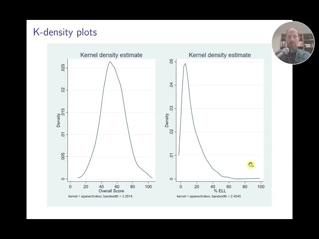
How do you interpret simple statistical graphs?
6:34
How do you interpret simple statistical graphs?

2 views

5d ago

Himanshu Mohanty
I Mapped the Hidden Network of the 4 Vedas

... Source AI, Himanshu Mohanty, AI Hallucinations, Computational Humanities, Graph Database, Data Visualization, 3D WebGL, ...

5:11
I Mapped the Hidden Network of the 4 Vedas

692 views

4d ago

Digital Life With Joel and 8K RECAP BLEEDS
How to insert Excel Graphs & Charts | LESSON 18

Excel Charts & Graphs for Beginners | Column, Bar & Line Charts Tutorial | Excel Lesson 18 Never miss anything! Subscribe ...

11:16
How to insert Excel Graphs & Charts | LESSON 18

302 views

5d ago

DataTech
My Data Science Journey | What’s Next: Classification, Time Series or Audio Analysis?

What comes next after exploring dimensionality reduction, clustering, and regression? In this video, I reflect on my data science ...

17:59
My Data Science Journey | What’s Next: Classification, Time Series or Audio Analysis?

17 views

5d ago

HaiderWithCode
How to Highlight Data Points in Matplotlib (plt.annotate)

Learn how to highlight and annotate specific data points in your charts using Matplotlib's plt.annotate() function in Python! In this ...

13:18
How to Highlight Data Points in Matplotlib (plt.annotate)

30 views

6d ago

AI Growth Library
Install NumPy, Pandas & Matplotlib | Python for Beginners

Want to get started with NumPy, Pandas, and Matplotlib? This video is a beginner-friendly introduction to three of the most widely ...

7:28
Install NumPy, Pandas & Matplotlib | Python for Beginners

155 views

4d ago

Center for Applied Artificial Intelligence
MHGB demo AAAI 2027

A live explorer for MHGB, the first benchmark of multi-hop legal reasoning over Russian statutory law: a typed graph of 5519 ...

4:44
MHGB demo AAAI 2027

14 views

6d ago

DnaOS
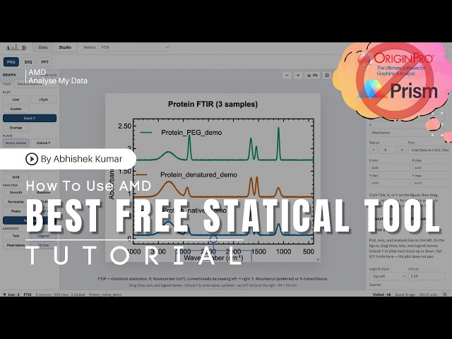
Best alternative  for Origin and Graph Pad prism. solution for MacBook users for plotting graph AMD

Every time I finished an FTIR, UV-Vis or XRD run, the real work began: cleaning raw files, stacking spectra, labelling peaks, and ...

19:06
Best alternative for Origin and Graph Pad prism. solution for MacBook users for plotting graph AMD

12 views

5d ago

Vertex Academy
Choosing a graph, and the line of best fit | Year 9 Maths (NZ Curriculum)

Which graph to draw is decided by the data, not by which one you like. What a distribution actually is, the graph that fits each kind ...

7:22
Choosing a graph, and the line of best fit | Year 9 Maths (NZ Curriculum)

2 views

5d ago

GK AI Elsa
Day67: Add Prometheus as a Grafana Data Source| 100Days of MLOps| KodeKloud

Education and IT #GeekAIKTDN #MyanmarIT #Cloud and AI.

14:06
Day67: Add Prometheus as a Grafana Data Source| 100Days of MLOps| KodeKloud

4 views

4d ago

GK AI Elsa
Day68 : Build a Grafana Time-Series Panel for Prediction Accuracy | 100Days of MLOps| KodeKloud

Education and IT #GeekAIKTDN #MyanmarIT #Cloud and AI.

11:25
Day68 : Build a Grafana Time-Series Panel for Prediction Accuracy | 100Days of MLOps| KodeKloud

10 views

4d ago

HELL- UM Tragedy and Grace under fire
The Voynich folio f115v as a simulation process map

The Voynich folio f115v as a simulation process map. The provided EVA transcription of f115v (and the following f116r) together ...

4:14
The Voynich folio f115v as a simulation process map

12 views

6d ago

Abrar Knowledge
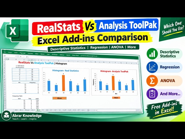
Real Statistics vs Excel Analysis ToolPak | Histogram in 12 Minutes | FREE Excel Statistics Training

... your data & create a bin Step 2: Data → Data Analysis → Histogram Step 3: Complete the dialog box and click OK Chart Output ...

12:55
Real Statistics vs Excel Analysis ToolPak | Histogram in 12 Minutes | FREE Excel Statistics Training

75 views

4d ago

GK AI Elsa
Day69: Build a Grafana Table Panel for Per-Feature Data Drift | 100Days of MLOps| KodeKloud

Education and IT #GeekAIKTDN #MyanmarIT #Cloud and AI.

13:34
Day69: Build a Grafana Table Panel for Per-Feature Data Drift | 100Days of MLOps| KodeKloud

6 views

4d ago

IT Practice
Suspicious Packet Detection with Python | Scatter Plot in Google Colab | Cybersecurity Practical

Suspicious Packet Detection with Python | Packet Size Analysis | Scatter Plot in Google Colab In this cybersecurity practical, we ...

5:36
Suspicious Packet Detection with Python | Scatter Plot in Google Colab | Cybersecurity Practical

3 views

3d ago

FuninAIofficial
GuideLLM v0.7.0: Benchmarking Reasoning, Tool Calling, and Agentic Traces

Based on your video GuideLLM v0.7.0: Benchmarking Reasoning, Tool Calling, and Agentic Traces, your title, and your channel ...

7:42
GuideLLM v0.7.0: Benchmarking Reasoning, Tool Calling, and Agentic Traces

85 views

6d ago

Tapas Digital
How to Change the Layout of a Pivot Chart? | #Excel #PivotChart #ExcelTips #DataAnalysis

Welcome to my YouTube channel, your ultimate destination for mastering Microsoft Excel! Whether you are a beginner taking your ...

5:33
How to Change the Layout of a Pivot Chart? | #Excel #PivotChart #ExcelTips #DataAnalysis

7 views

6d ago

codingjanta
Matplotlib Full Course Part 1 | Introduction to Data Visualization in Python (Hindi)

In this video, we will start our Matplotlib Full Course and learn the basics of Data Visualization in Python. Agar aap beginner ho ya ...

4:53
Matplotlib Full Course Part 1 | Introduction to Data Visualization in Python (Hindi)

295 views

4d ago

The Mr. Ozz
Build Self-Hosted Developer Portal with Ruflo, Grafana, Payload, Memos

This video demonstrates creating a self-hosted internal developer portal using Ruflo for UI, Grafana for metrics, Payload for API ...

10:37
Build Self-Hosted Developer Portal with Ruflo, Grafana, Payload, Memos

2 views

7h ago