Upload date
All time
Last hour
Today
This week
This month
This year
Type
All
Video
Channel
Playlist
Movie
Duration
Short (< 4 minutes)
Medium (4-20 minutes)
Long (> 20 minutes)
Sort by
Relevance
Rating
View count
Features
HD
Subtitles/CC
Creative Commons
3D
Live
4K
360°
VR180
HDR
3,557 results
If you're building your own SaaS, I built a production-ready AI SaaS foundation https://www.saasbymonday.io/ Learn how to ...
23,877 views
1 year ago
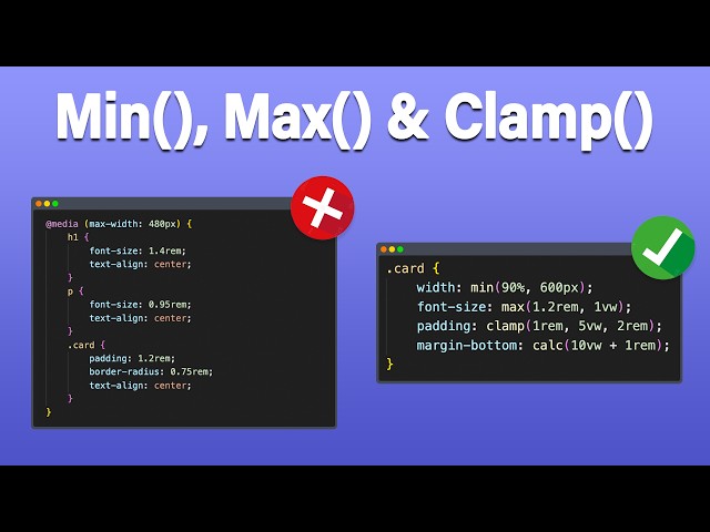
In this video, you'll learn how to use the three most powerful CSS functions for modern responsive design: min(), max() and ...
151,540 views
8 months ago
I'll teach you how to use min(), max(), and clamp() in a super easy way. 🤓 🎥 Check out my course: Minimal JS for React ...
3,456 views
3 years ago
Conoce nuestras vacantes actuales de tecnología en https://bit.ly/talento-tech-GDI En este vídeo vemos cómo resolver los ...
9,164 views
2 years ago
CSS has come a long way, but min(), max(), and clamp() make a lot of things a lot easier than they used to be, and really open up ...
318,705 views
6 years ago
⚠️ UPDATED and EASIER METHOD https://youtu.be/2gWLVS7l9uU =============================== 👇 Earn a good salary and create a ...
1,771 views
Today we're going to learn how we can use the CSS clamp function to create responsive, fluid typography! Project Links code: ...
74,191 views
Welcome to this in-depth tutorial on Responsive Web Design using CSS functions — specifically min(), max(), clamp(), and calc()!
11,087 views
Between December 2019 and April 2020 the browsers all added support for a new method in CSS called clamp( ). This method ...
20,510 views
To create Responsive Typography in your websites, you might immediately want to reach for Media Queries. Well, the clamp ...
10,204 views
В арсенале технологий CSS есть набор функций, благодаря которым можно экономить десятки строк кода, зачастую ...
17,025 views
https://bit.ly/2IPcPgA - Become a frontend developer (50% off limited time!) -- Want to learn UI/UX? https://designcourse.com ...
54,198 views
5 years ago
Curso gratuito de programação WEB ↪https://discover.maykbrito.dev O clamp() é uma feature do CSS proporciona um um valor ...
7,241 views
Full tutorial, code, and links below: Grab your free container clamp template here (no strings attached ...
31,735 views
Start writing CSS with confidence with my course CSS Demystified: https://cssdemystified.com When people find out about ...
36,067 views
Learn how to limit the number of lines with line-clamp CSS-only property. Want to learn more? Try my Udemy course on HTML, ...
542 views
10 MINDBLOWING CSS Tips and Tricks that solve typical JavaScript problems with CSS ONLY. You will learn elegant solutions ...
762,317 views
In this video, I explain the basics behind the CSS clamp that was introduced in Kadence Blocks 3.0 Plugins used: ➜ Kadence ...
2,090 views
The CSS functions min, max, and clamp can be used anywhere numeric values are specified in CSS. This includes dimensions ...
12,635 views
responsive #webdesign #webdev #css Atualmente podemos ter fontes de tamanhos flexíveis a depender do tamanho da tela do ...
3,875 views
4 years ago