ViewTube

ViewTube
Sign inSign upSubscriptions
Filters

Upload date

Type

Duration

Sort by

Features

Reset

264 results

Discover Talent™
Excel Sparklines Tutorial Create Mini Charts for Data Visualization

Excel Sparklines Tutorial Create Mini Charts for Data Visualization Learn how to use **Excel Sparklines** to turn your sales data ...

6:33
Excel Sparklines Tutorial Create Mini Charts for Data Visualization

104 views

Streamed 22 hours ago

Maven Analytics
4 Common Data Visualization Mistakes and How to Fix Them | Data Visualization 101

Even though the goal of data visualization is to communicate clearly, there are some common mistakes you might be making that ...

6:02
4 Common Data Visualization Mistakes and How to Fix Them | Data Visualization 101

3,205 views

1 day ago

BPO Interview Tutorials
Top interview questions & answers on Data Visualization in MS Excel

Must Watch some MS Excel videos: How to calculate count if in excel: https://youtu.be/ve1KM2wzfTQ How to do VlookUP in Excel ...

10:00
Top interview questions & answers on Data Visualization in MS Excel

26 views

3 days ago

BICT
Excel Line Chart Tutorial  Continuous Data Visualization & Trend Analysis with Practical Examples

Learn how to visualize continuous data effectively using Line Charts in Excel! In this video, you'll learn how to create and use Line ...

17:44
Excel Line Chart Tutorial Continuous Data Visualization & Trend Analysis with Practical Examples

40 views

4 days ago

Gifted Tutors
Introduction to Charts & Data Visualization in Excel | Practical Tutorial for Beginners

EXCEL CHARTS & DATA VISUALIZATION — PRACTICAL SESSION In this practical lesson, we move from theory to hands-on ...

4:00
Introduction to Charts & Data Visualization in Excel | Practical Tutorial for Beginners

6 views

4 days ago

Skillcure Academy
Advanced Excel Sales Dashboard | Flipkart Data Analysis Project | Excel Dashboard for Data Analysts.

Advanced Excel Project | Flipkart Sales Dashboard 📊 In this project, we have created a professional Flipkart Sales Dashboard ...

11:31
Advanced Excel Sales Dashboard | Flipkart Data Analysis Project | Excel Dashboard for Data Analysts.

106 views

10 hours ago

Excel with Priyanka
Data Analysis Using Excel | Part 3 | Sales Dashboard, PivotTables & PivotCharts

Description: Welcome to Data Analysis Series – Part 3! In this video, we continue our practical Data Analysis using Excel ...

15:58
Data Analysis Using Excel | Part 3 | Sales Dashboard, PivotTables & PivotCharts

17 views

7 days ago

Rise Institute
Why Your Excel Data Looks Messy (And How to Fix It)

Raw Excel Data to a Professional Dashboard! In this complete Excel Data Analysis Tutorial, we'll go step by step through the ...

19:24
Why Your Excel Data Looks Messy (And How to Fix It)

75 views

7 days ago

Tapas Digital
How to Create a Pivot Table in Excel? | #Excel #PivotTable #ExcelTips #DataAnalysis #exceltutorial

Welcome to my YouTube channel, your ultimate destination for mastering Microsoft Excel! Whether you are a beginner taking your ...

6:15
How to Create a Pivot Table in Excel? | #Excel #PivotTable #ExcelTips #DataAnalysis #exceltutorial

0 views

6 days ago

Matt Macarty
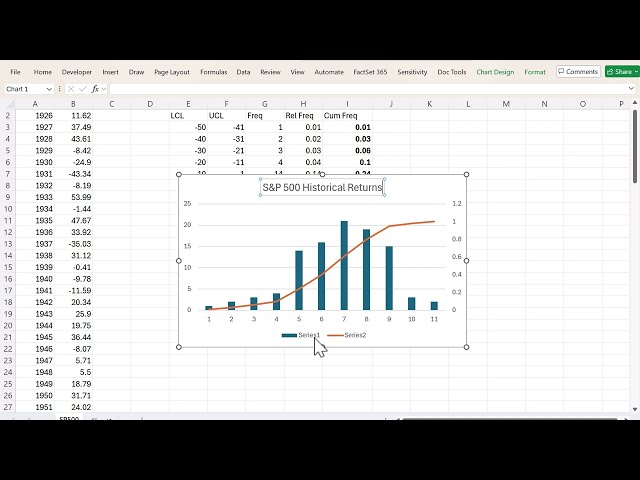
Excel Histogram & Frequency Table | S&P 500 Data Analysis

MattMacarty⁩ Learn how to create a frequency table and histogram in Excel using stock market return data. Master the steps for ...

12:33
Excel Histogram & Frequency Table | S&P 500 Data Analysis

102 views

4 days ago

Pat Obi
Grouped Data Explained: Frequency, Relative Frequency & Graphs in Excel

This video provides a practical introduction to grouped data in descriptive statistics and demonstrates how to organize, summarize ...

11:53
Grouped Data Explained: Frequency, Relative Frequency & Graphs in Excel

51 views

4 days ago

Tapas Digital
How to Consolidate Data from Multiple Sources in a Pivot Table? | #Excel #PivotTable #DataAnalysis

Welcome to my YouTube channel, your ultimate destination for mastering Microsoft Excel! Whether you are a beginner taking your ...

8:52
How to Consolidate Data from Multiple Sources in a Pivot Table? | #Excel #PivotTable #DataAnalysis

0 views

10 hours ago

Tapas Digital
What Is a Pivot Table & How Does It Work? | #Excel #PivotTable #ExcelTips #DataAnalysis

Welcome to my YouTube channel, your ultimate destination for mastering Microsoft Excel! Whether you are a beginner taking your ...

13:21
What Is a Pivot Table & How Does It Work? | #Excel #PivotTable #ExcelTips #DataAnalysis

22 views

6 days ago

BICT
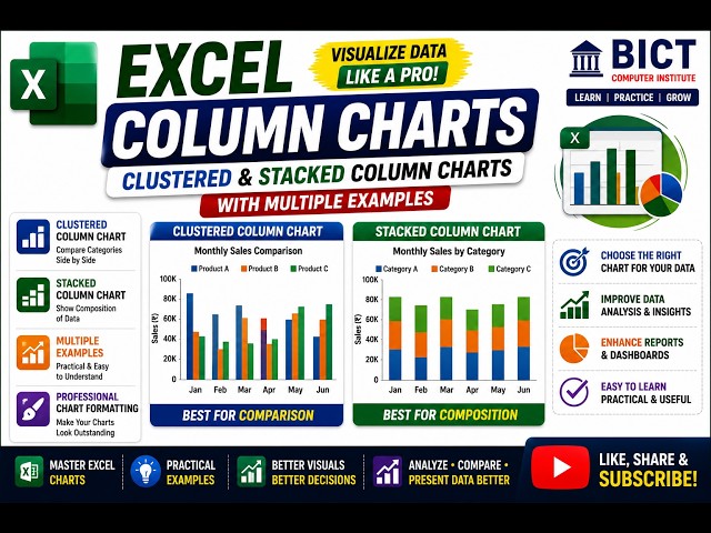
Excel Column Charts Explained  Clustered & Stacked Column Charts with Practical Examples

Learn how to present your data professionally using Excel Column Charts! In this video, you'll learn different ways to visualize ...

16:45
Excel Column Charts Explained Clustered & Stacked Column Charts with Practical Examples

18 views

6 days ago

The Developer
Will AI Replace Data Analyst in 2026?

Get your FREE 1-month hiData trial here: ...

17:33
Will AI Replace Data Analyst in 2026?

3,154 views

1 day ago

Centre of Best Learnings (CBL)
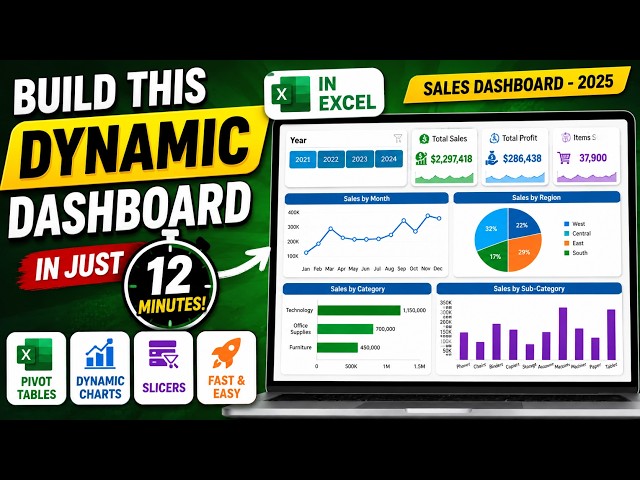
Create dynamic Sales Dashboard in Excel in Just 12 Minutes || Master Pivot Tables

Want to learn how to create a dynamic Sales Dashboard in Excel using over 10000 raw data records? In this step-by-step Excel ...

12:27
Create dynamic Sales Dashboard in Excel in Just 12 Minutes || Master Pivot Tables

92 views

4 days ago

Excel Learn and Apply
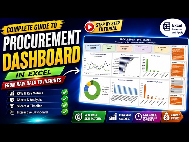
How to Create a Procurement Dashboard in Excel | Step-by-Step Tutorial

Learn how to create a professional Procurement Dashboard in Excel from scratch! In this complete step-by-step Excel tutorial, we ...

11:10
How to Create a Procurement Dashboard in Excel | Step-by-Step Tutorial

216 views

5 days ago

Professional Study Centre
Class 5 -  MIS Sales Report Dashboard in Hindi | Business Data Visualization with Excel

Video Description In this tutorial, viewers will learn how to create a Sales Report Dashboard using a variety of powerful charts and ...

18:35
Class 5 - MIS Sales Report Dashboard in Hindi | Business Data Visualization with Excel

9 views

6 days ago

Technical Miki
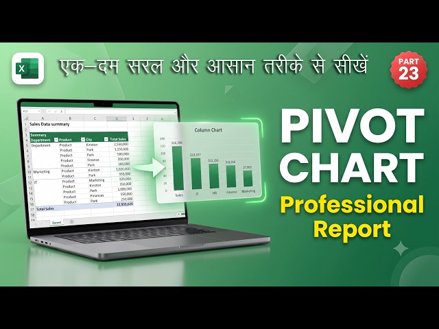
Pivot Chart in Excel | Create Professional Charts from Pivot Tables | Part 23

Pivot Chart in Excel | 📊Create Professional Charts from Pivot Tables | Part 23 You've created a Pivot Table in Excel, but if ...

7:08
Pivot Chart in Excel | Create Professional Charts from Pivot Tables | Part 23

121 views

6 days ago

Analytics Advisors
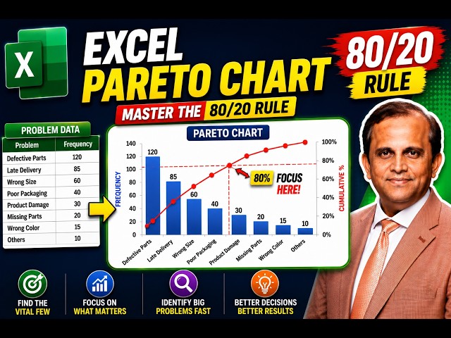
91. Excel Pareto Chart in Under 5 Minutes | Master the 80/20 Rule

My Microsoft Excel Playlist: https://www.youtube.com/playlist?list=PLHrw3fxxgFBRyH308kfvRZnAIevkaKkf0 Join Whatsapp group: ...

4:53
91. Excel Pareto Chart in Under 5 Minutes | Master the 80/20 Rule

7,958 views

7 days ago