Upload date
All time
Last hour
Today
This week
This month
This year
Type
All
Video
Channel
Playlist
Movie
Duration
Short (< 4 minutes)
Medium (4-20 minutes)
Long (> 20 minutes)
Sort by
Relevance
Rating
View count
Features
HD
Subtitles/CC
Creative Commons
3D
Live
4K
360°
VR180
HDR
746 results
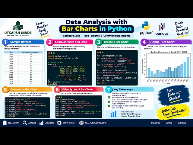
In this practical Python Data Analysis tutorial, we'll learn how to create and understand Bar Charts to compare different categories ...
1 view
2d ago
In this practical Python Data Analysis tutorial, we'll learn how to create Subplots to display multiple charts or visualizations in a ...
5 views
In this practical Python Data Analysis tutorial, we'll learn how to create and understand a Boxplot to analyze the distribution, ...
0 views
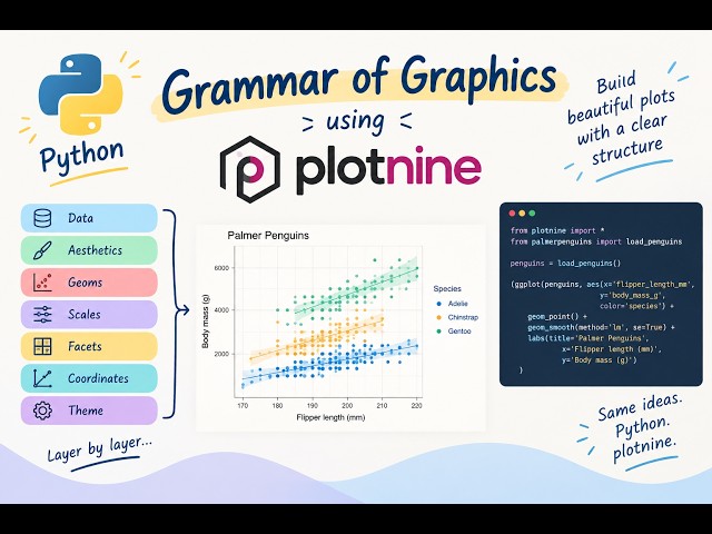
Learn how to create data visualisations in Python using plotnine and the Grammar of Graphics approach. Plotnine follows a ...
49 views
1d ago
How do two variables relate to each other? In this tutorial, we explore Correlation and Regplot using Python to understand ...
3d ago
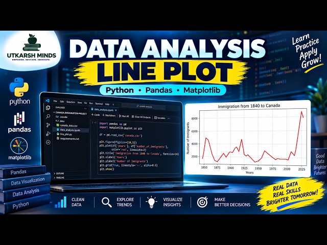
In this practical Python Data Analysis tutorial, we'll learn how to create and understand a Line Plot to visualize data and identify ...
4 views
Data Analyst Basics | Learn Data Analytics from Scratch Want to understand what a Data Analyst does and how to start a career in ...
3 views
4h ago
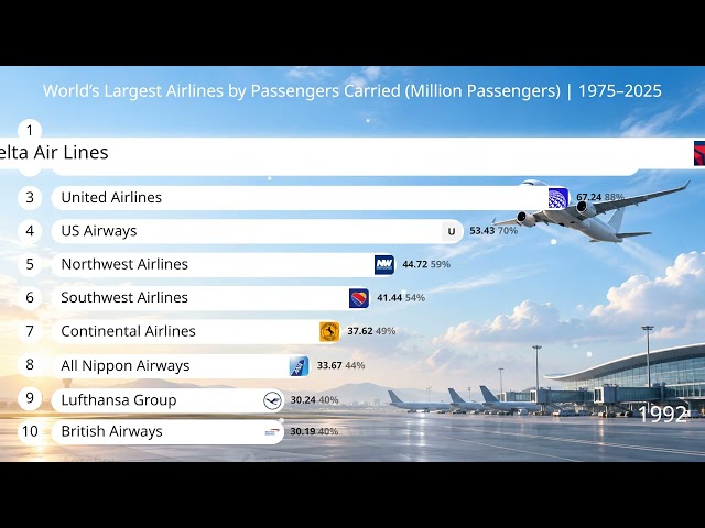
Watch how the world's largest airlines changed over time from 1975 to 2025, ranked by the number of passengers carried each ...
65 views
14h ago
In this practical Python Data Analysis tutorial, we'll learn how to create and understand an Area Plot to visualize data, compare ...
In this practical Python Data Analysis tutorial, we'll learn how to create and understand a Scatter Plot to visualize the relationship ...
6 views
Perfect for beginners and professionals who want to visualize data quickly and effectively What you'll learn in this video: How to ...
56 views
6d ago
In Day 7 of my Excel for Data Analytics series, we're focusing on Data Visualization, turning raw data into clear and meaningful ...
19h ago
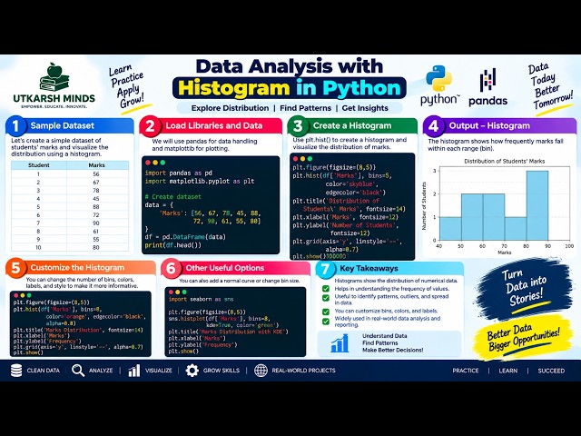
In this practical Python Data Analysis tutorial, we'll learn how to create and understand a Histogram to visualize the distribution of ...
The same data can tell a completely different story depending on how you group it. In this video, we explore how grid size, ...
117 views
Four plots, one dataset, four different conclusions. This episode gives you a three-question method for choosing a plot: what is the ...
429 views
5d ago
Learn how to build a **CSV Data Visualizer using Python, Pandas, and Streamlit** from scratch! In this beginner-friendly ...
Master Data Visualization using Matplotlib & Pyplot for CBSE Class 12 Informatics Practices (IP)! In this video, we cover the ...
17 views
Learn how to design pie charts in Figma using both manual arc controls and a fast plugin method. This tutorial covers circles, ...
9 views
SEO and PPC reports are full of numbers—but numbers alone don't tell a story. In 2027, search marketers need to move beyond ...
2 views
🤯 ChatGPT Can Create ANIMATED CHARTS?! Watch This! What if you could turn simple data into a beautiful animated visualization ...
45 views