Upload date
All time
Last hour
Today
This week
This month
This year
Type
All
Video
Channel
Playlist
Movie
Duration
Short (< 4 minutes)
Medium (4-20 minutes)
Long (> 20 minutes)
Sort by
Relevance
Rating
View count
Features
HD
Subtitles/CC
Creative Commons
3D
Live
4K
360°
VR180
HDR
306,630 results
Subscribe and to the BBC https://bit.ly/BBCYouTubeSub Watch the BBC first on iPlayer https://bbc.in/iPlayer-Home More ...
11,458,757 views
15 years ago
LEARN BUSINESS INTELLIGENCE ============================= BI Analyst Starter Program – https://geni.us/lbia_biasp ...
396,357 views
3 years ago
Let's look at how we can implement design concepts and techniques to maximize the impact of our dashboards and reports.
95,140 views
5 years ago
Following a look at 'Sensemaking' Associate Professor Dr Kai Xu delves into some more tricks of the visualisation trade.
76,176 views
In this video Rob, a Kaggle Grandmaster, quickly and humorously walks through each of the popular plotting and data ...
115,250 views
4 years ago
Tired of Matplotlib's outdated approach? Discover these 5 powerful Python libraries that offer cleaner, more intuitive, and often ...
10,688 views
1 year ago
Ready to become a certified Cognos Analytics v12 Analyst? Register now and use code IBMTechYT20 for 20% off of your exam ...
13,617 views
MENTORSHIP – Applications for the next cohort are open! Apply here → https://theanalyticsaccelerator.com/ We're looking for ...
76,774 views
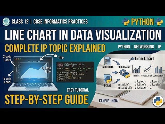
Python Code to create line chart for data visualization.
18 views
1 month ago
Welcome to Part one of a multi part series on Data Visualization. This video will provide an introductory overview of data ...
6,634 views
Data is nothing more than an abstraction of our reality,” says information designer Giorgia Lupi. Acclaimed for her engaging ...
23,538 views
In this video, we will demonstrate the difference between data visualization charts including: - Bar Chart - Line Chart - Bubble ...
201,158 views
6 years ago
Dale shows us 12 tips to design better dashboards. Whichever dashboard tool you are using, the lessons we cover in this video ...
290,903 views
21 views
7 days ago
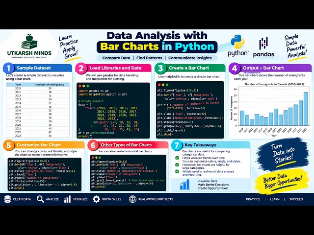
In this practical Python Data Analysis tutorial, we'll learn how to create and understand Bar Charts to compare different categories ...
1 view
2 days ago
15 design principles of building an effective business intelligence or data visualization dashboard in Power BI, Tableau, or any ...
75,096 views
Day 18 of 90 Days of AI: Data Visualization Basics — Choosing the Right Chart A beautiful chart isn't necessarily a useful chart.
9 views
In this practical Python Data Analysis tutorial, we'll learn how to create Subplots to display multiple charts or visualizations in a ...
5 views
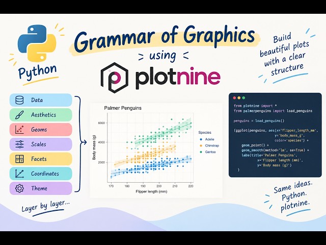
Learn how to create data visualisations in Python using plotnine and the Grammar of Graphics approach. Plotnine follows a ...
45 views
23 hours ago
In this practical Python Data Analysis tutorial, we'll learn how to create and understand a Boxplot to analyze the distribution, ...
0 views